Waitlist Landing Page Copy: Name the Outcome in Six Words or Lose the Visitor
How to write waitlist landing page copy: name the outcome in six to ten words, add one line on how it works, one field, one button and a reason to join.
When a waitlist page underperforms, founders usually blame the design and spend a week on the gradient.
In our experience it's rarely the design. Try this test instead: show your page to someone who has never heard of your product, take it away after four seconds, and ask what it does. If they can't answer, no amount of visual polish will save the page, because the visitor leaves before the polish matters.
Write the outcome, in the visitor's language, in six to ten words, above the fold. Everything else on a waitlist page supports that sentence. Three habits stop founders from writing it, and one structure reliably produces it.
Three habits produce copy nobody understands in four seconds
They're different failures with different fixes, and most weak pages commit at least two.
Abstraction. "Reimagining how teams collaborate." This describes thousands of products and commits to none. It feels safe because it can't be wrong, but a claim that can't be wrong can't be judged either, and a visitor who can't judge leaves. Replace it with the specific thing: "Shared inboxes that don't lose replies."
Feature lists. "AI-powered, real-time, end-to-end, enterprise-ready." Those are ingredients, not a meal. Nobody wants AI; they want the late invoice chased without making the phone call. Features belong further down, after the visitor agrees the outcome is worth having.
Founder voice. "We're a small team passionate about beautiful software." Your visitor hasn't agreed to care about you yet. Save it for the about page.
All three describe you, your technology or your category. The visitor is asking about themselves.
Four lines in a fixed order produce a page that passes the test
The structure is boring, which is why it works.
Line one: the outcome. What's true for the visitor afterwards. Six to ten words, no category nouns.
Line two: the mechanism. One sentence on how, so the outcome is believable rather than just claimed.
Line three: the ask. One email field and one button. The button names the reward, not the mechanic: "Get early access", not "Submit".
Line four: the reason to act today. A place in line, a cohort size, founder pricing, a launch date. Something real. Without it, an email field is a request for a favor. A launch countdown is one of the simplest ways to make the date concrete.
Don't invent the words for line one; harvest them. Go to the forum threads, support tickets and reviews where people describe your problem unprompted, and take their phrasing. Founders tend to write a more abstract, more technical version of what customers actually say. A headline built from your reader's own words passes the four-second test without needing to be clever.
Everything below the fold (features, screenshots, FAQ, team) is for the visitor who has already decided and wants to justify it. It should never push the form down.
Social proof works only when the number is specific and true
Inflated numbers are the fastest way to lose a technical audience, and in advertising they can be a legal problem: the US Federal Trade Commission's rule on consumer reviews and testimonials prohibits fake reviews and testimonials.
Specific and small beats round and large. "1,247 on the list" reads as a number someone counted. "10,000+ founders" reads as a number someone chose, and readers discount it.
If you have forty subscribers, say forty. If you have none, don't fabricate. Use a reason to act you genuinely control instead: "First 500 get founder pricing" is a promise you can keep and needs no audience.
Testimonials follow the same rule. One real sentence from a named person beats five polished quotes attributed to initials.
Stop editing once the page passes, because the remaining upside is elsewhere
Copy has a ceiling. Once a stranger passes the four-second test, more wordsmithing is procrastination in a productive costume.
Our view of the order of impact: distribution beats copy, copy beats structure, structure beats aesthetics. A perfect page nobody visits converts nothing.
So write the four lines, test them on two people who owe you nothing, fix what they couldn't answer, then leave the page alone and go find visitors.
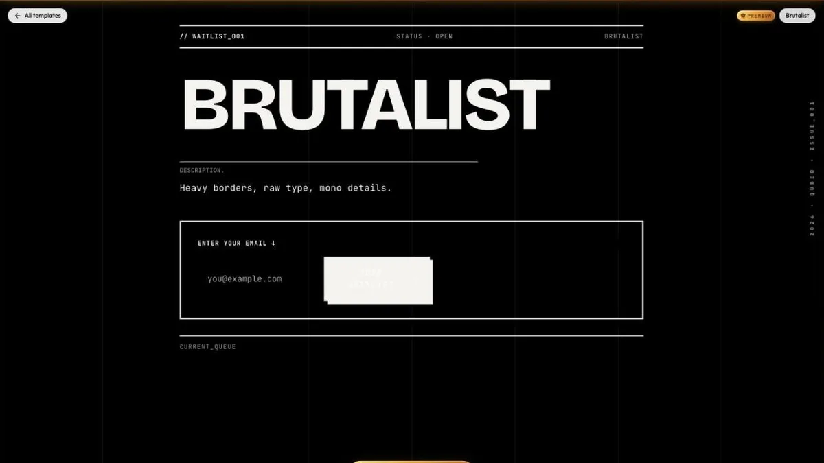
Start from a template that already has the structure. Every Qubed template puts one email field and one button up front, so the only thing left to write is the sentence that matters. Bold, text-led styles like Brutalist or the black & white templates put your headline center stage. If you just need an announcement page, the coming soon page builder works the same way.
Your page doesn't need to be beautiful. It needs to be understood.
Build your waitlist page free
Pick a template, write your headline and publish. Referrals, a launch countdown and stats are built in on every plan.
Browse free templatesRelated guides
- Waitlist Page Design: Structure Converts, Aesthetics Only QualifyWaitlist page design has two jobs: the look tells visitors the page is for them, and the structure gets them to sign up. Pick fast, then fix structure.
- How to Build a Waitlist: Step-by-Step Guide (2026)How to build a waitlist that grows before launch: write the promise, pick a template, add referrals and a countdown, publish, get signups, then launch.
- Why Waitlists Fail: Most Causes Are Distribution, Not ProductWhy waitlists fail: no traffic, no clear promise, no reason to join now, an invisible referral loop, or a founder who stopped. How to fix each one.