What makes a good playful & pastel launch page
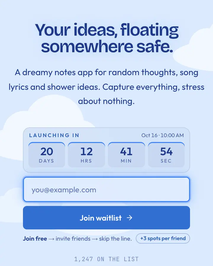
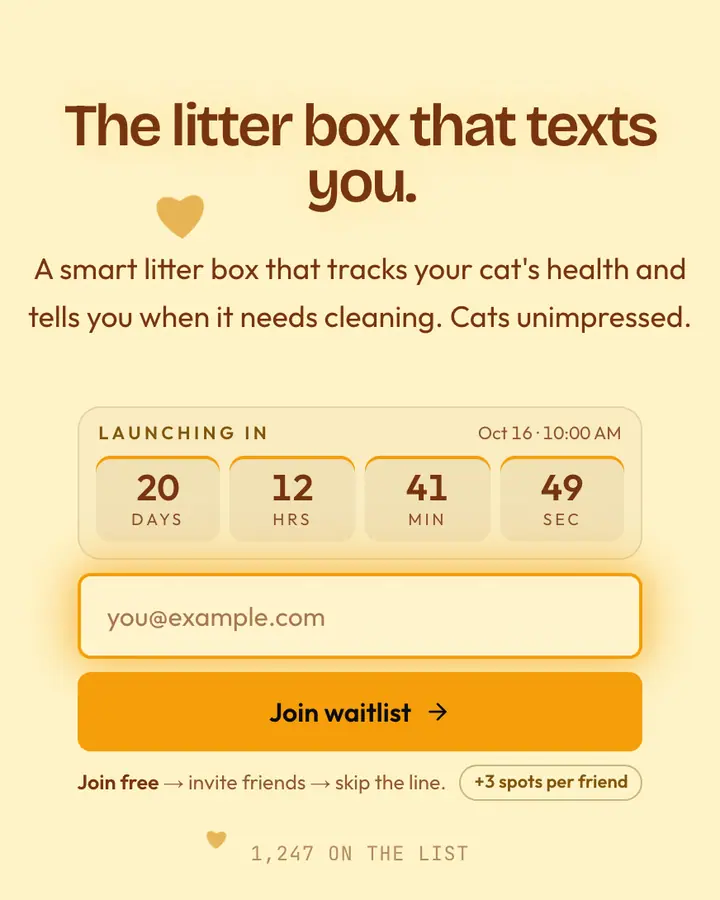
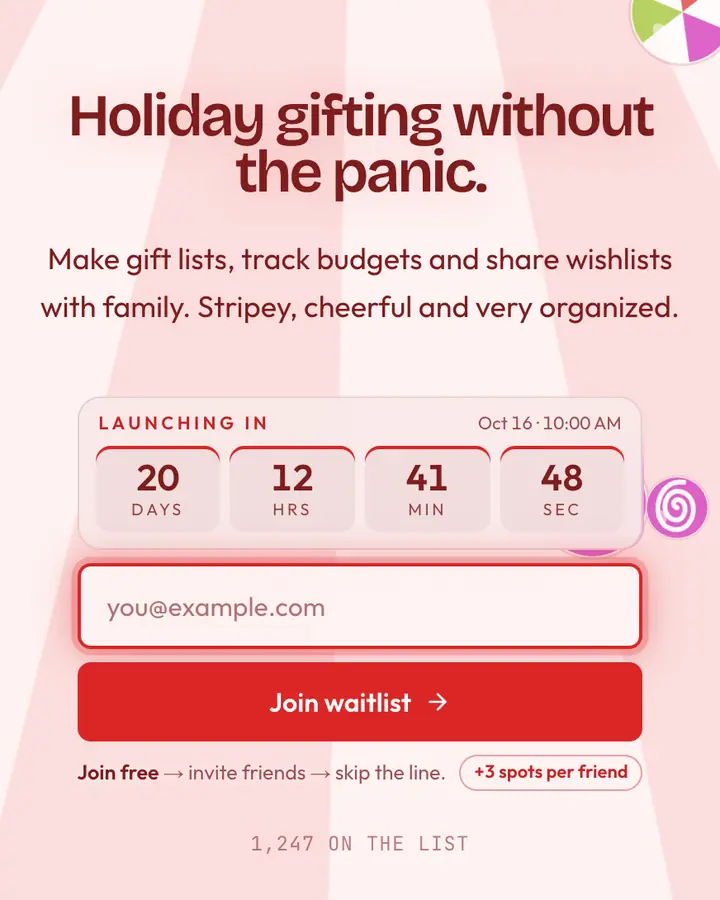
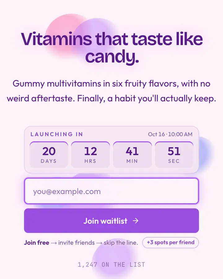
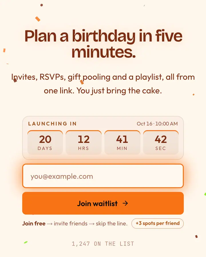
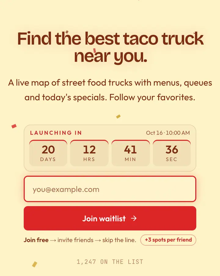
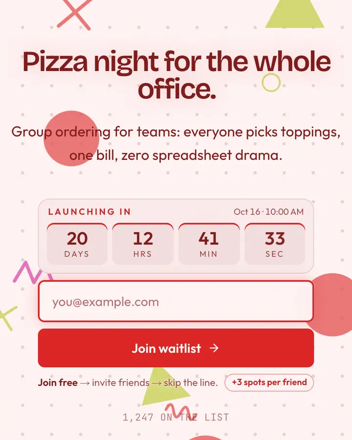
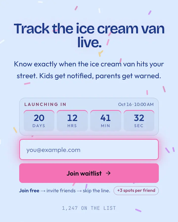
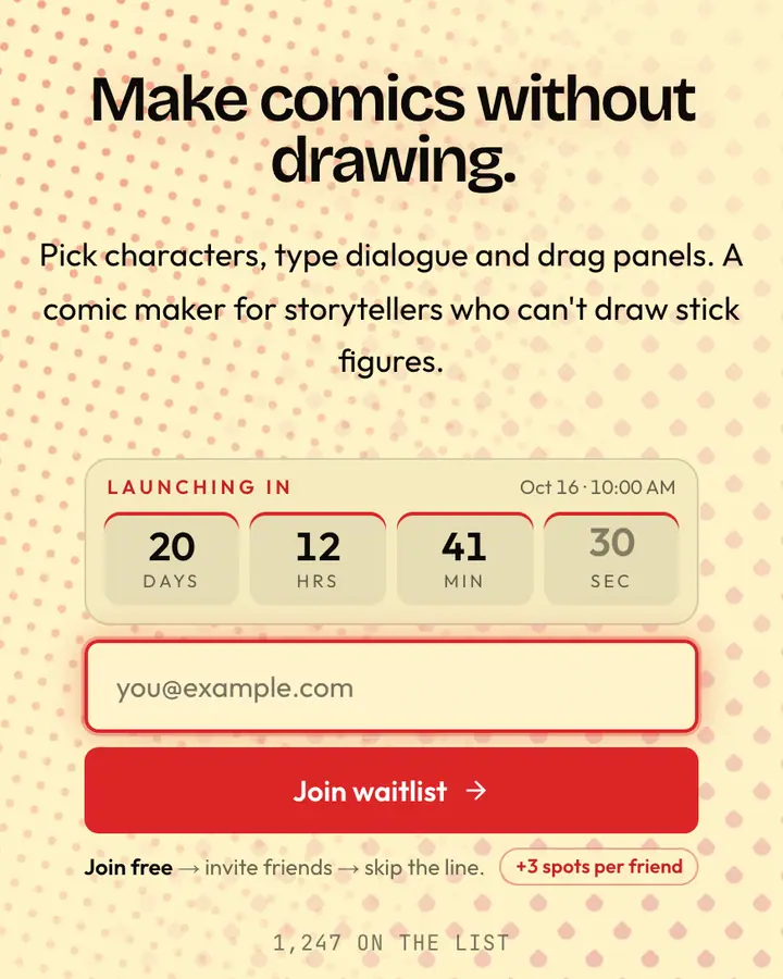
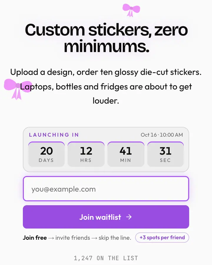
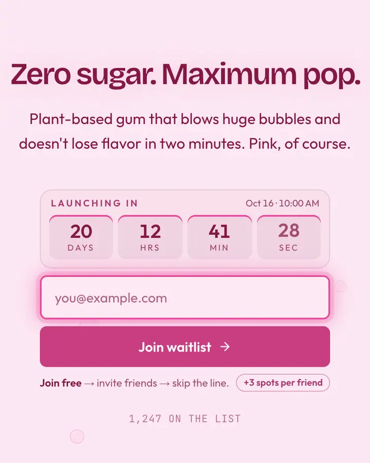
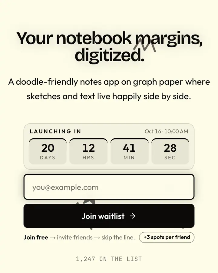
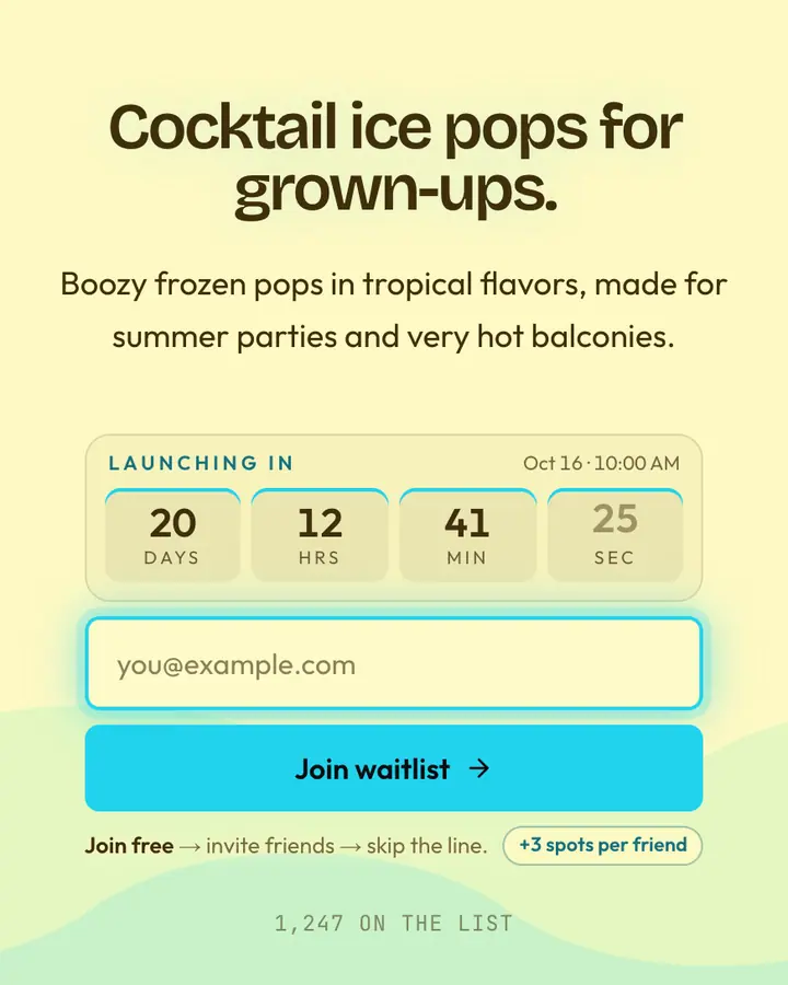
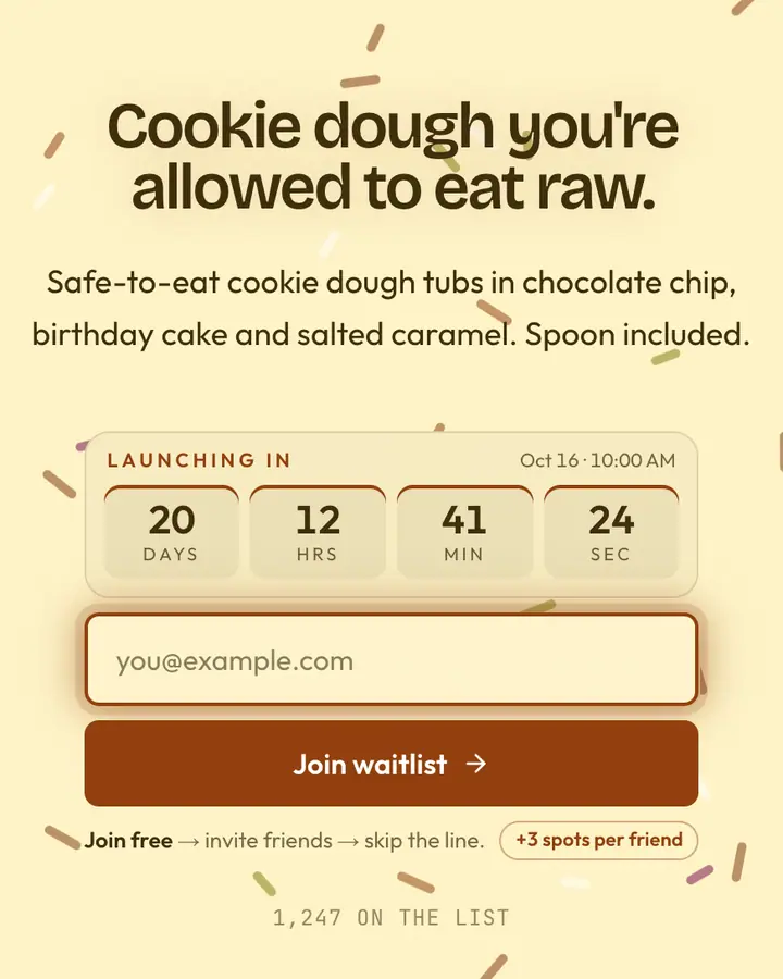
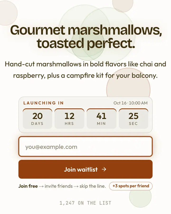
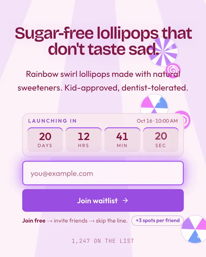
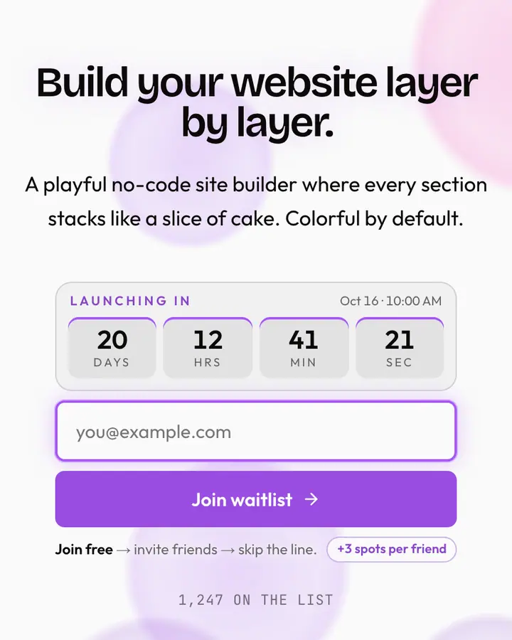
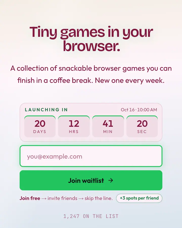
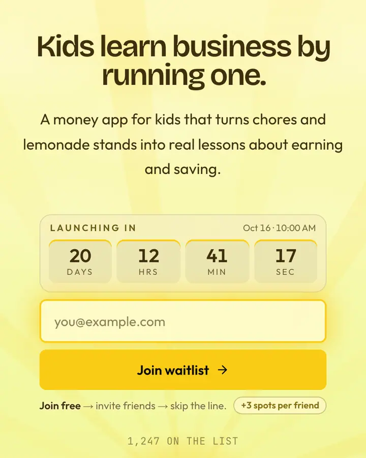
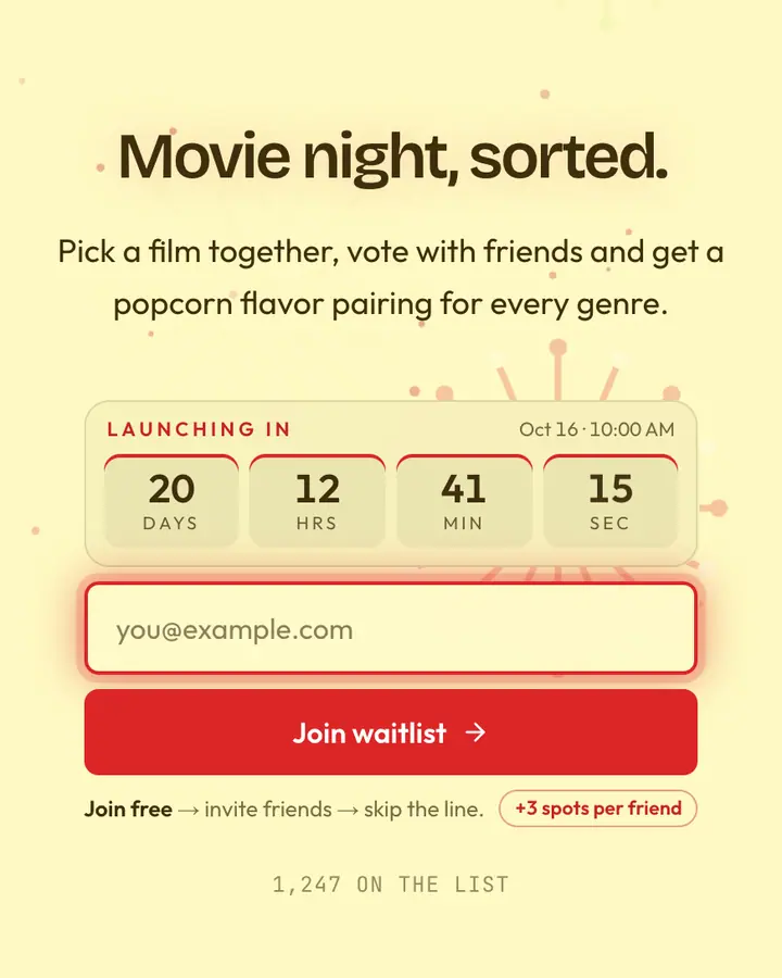
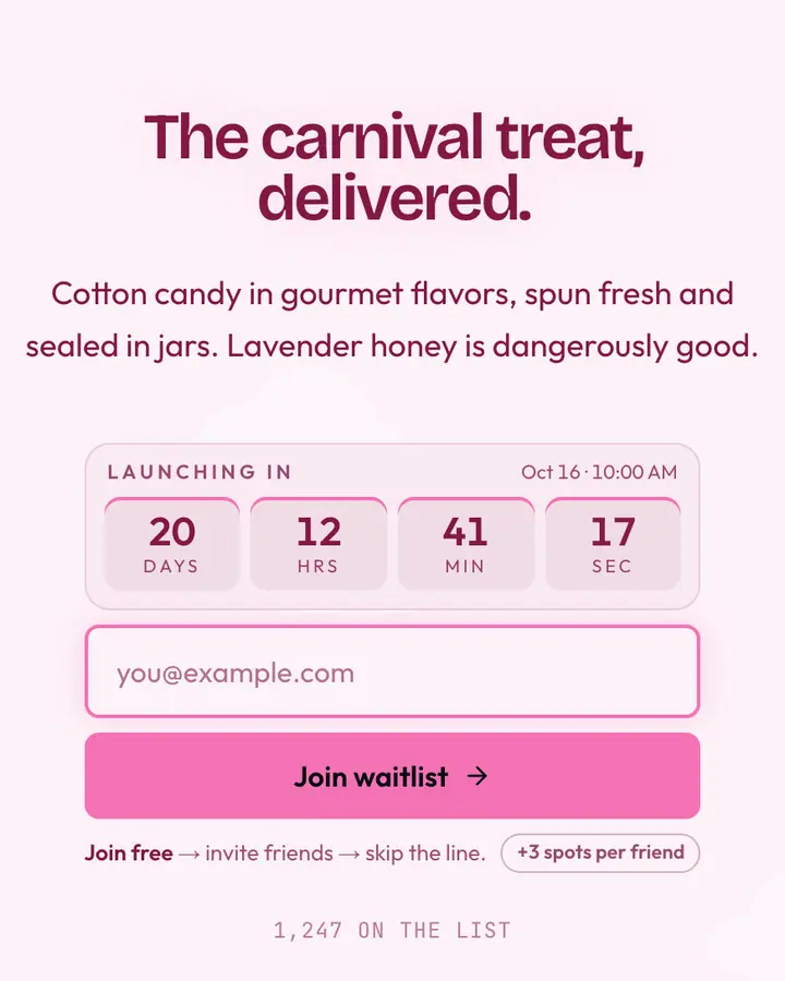
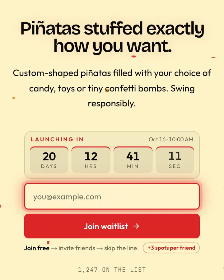
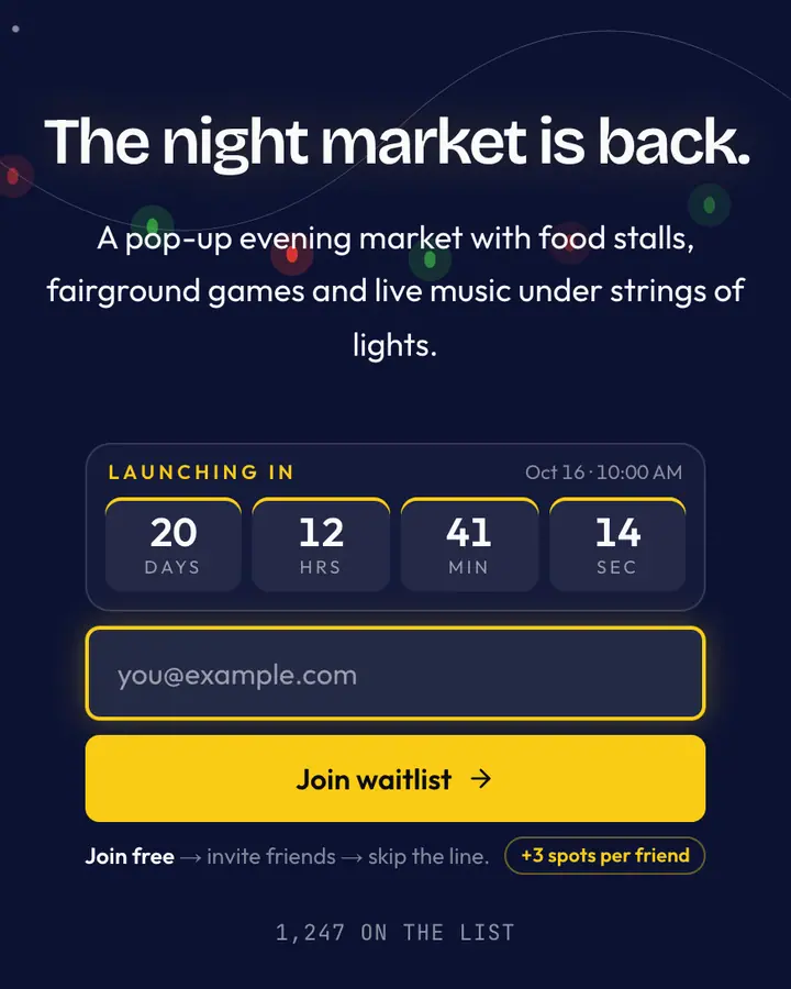
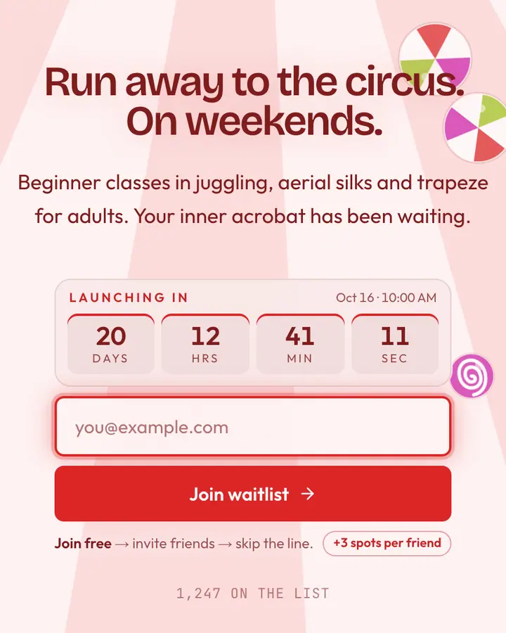
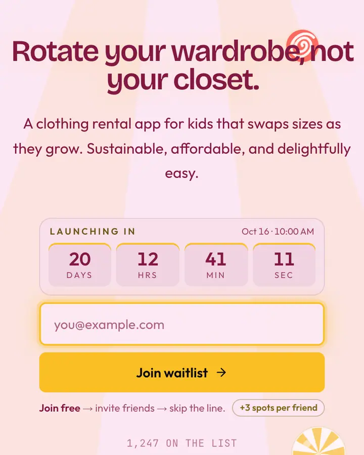
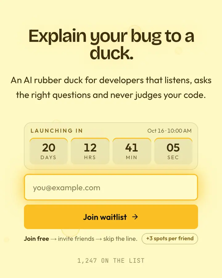
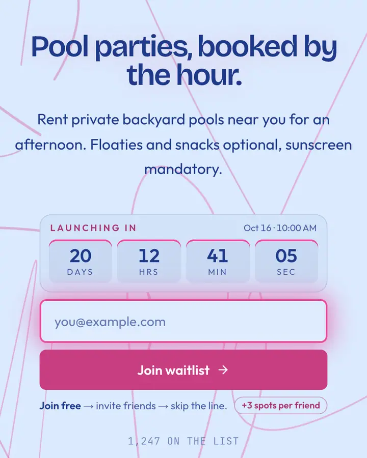
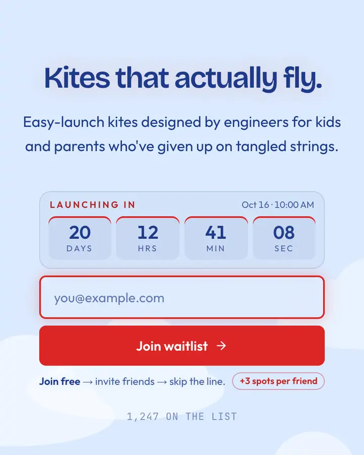
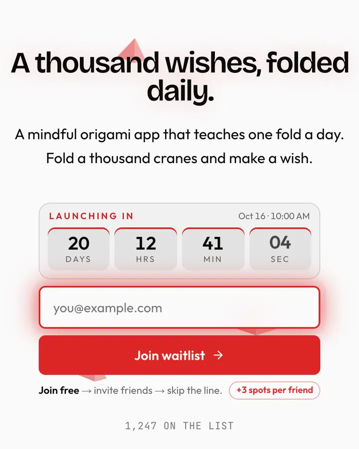
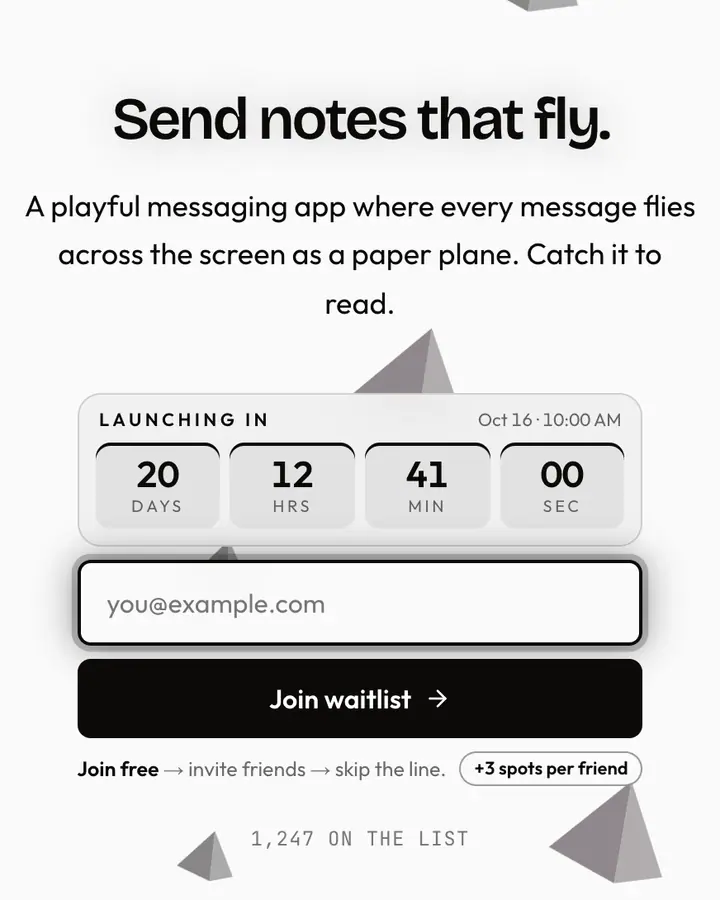
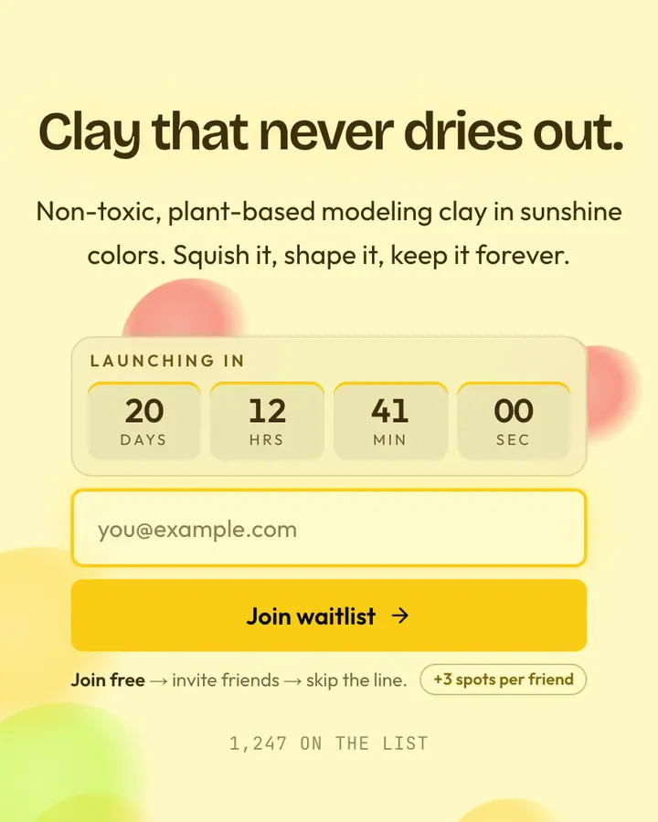
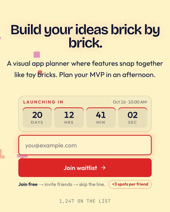
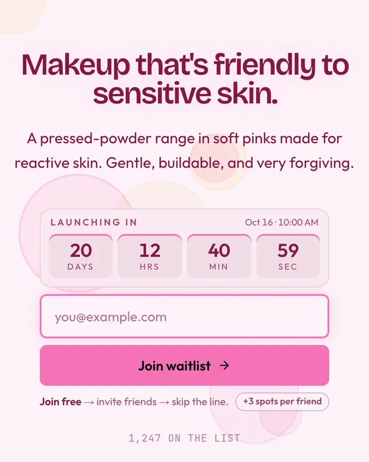
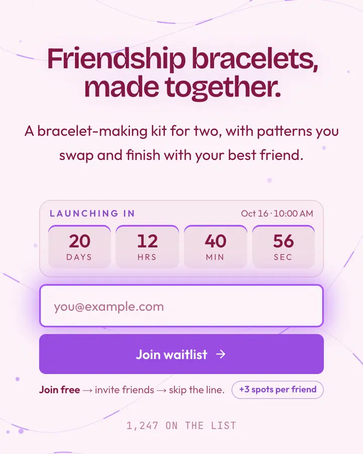
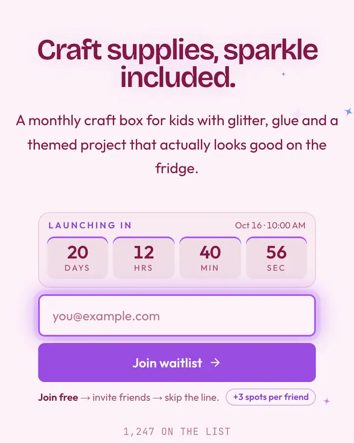
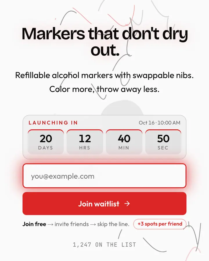
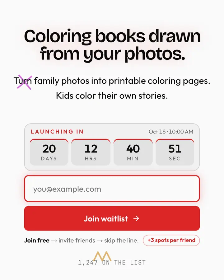
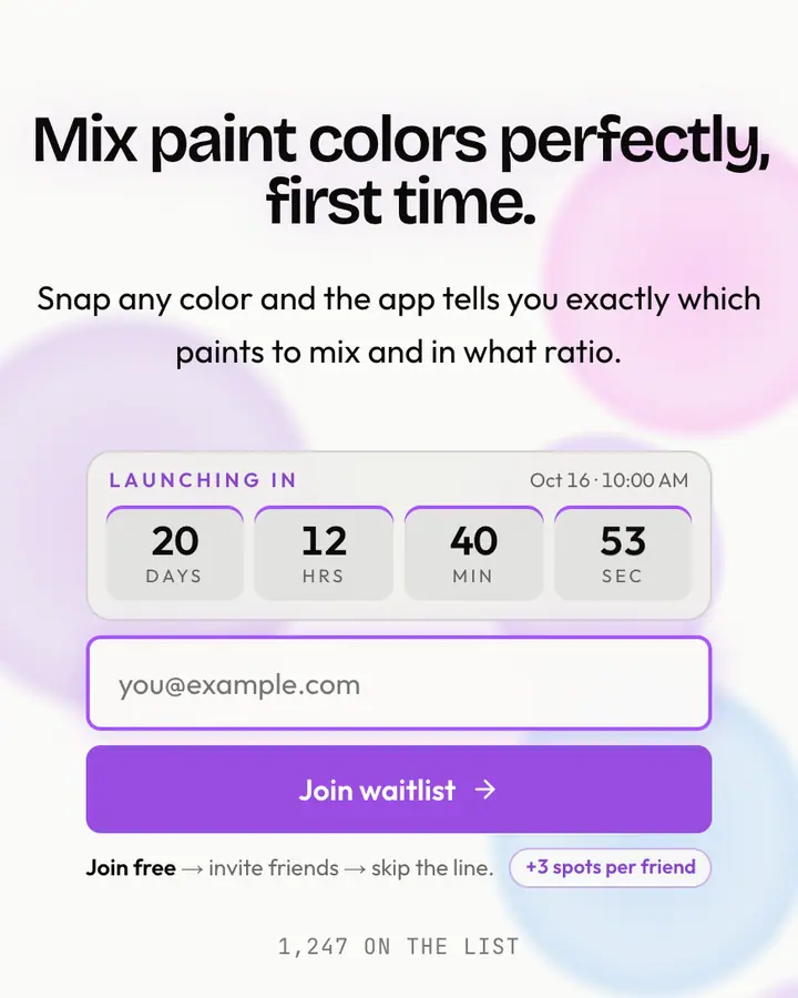
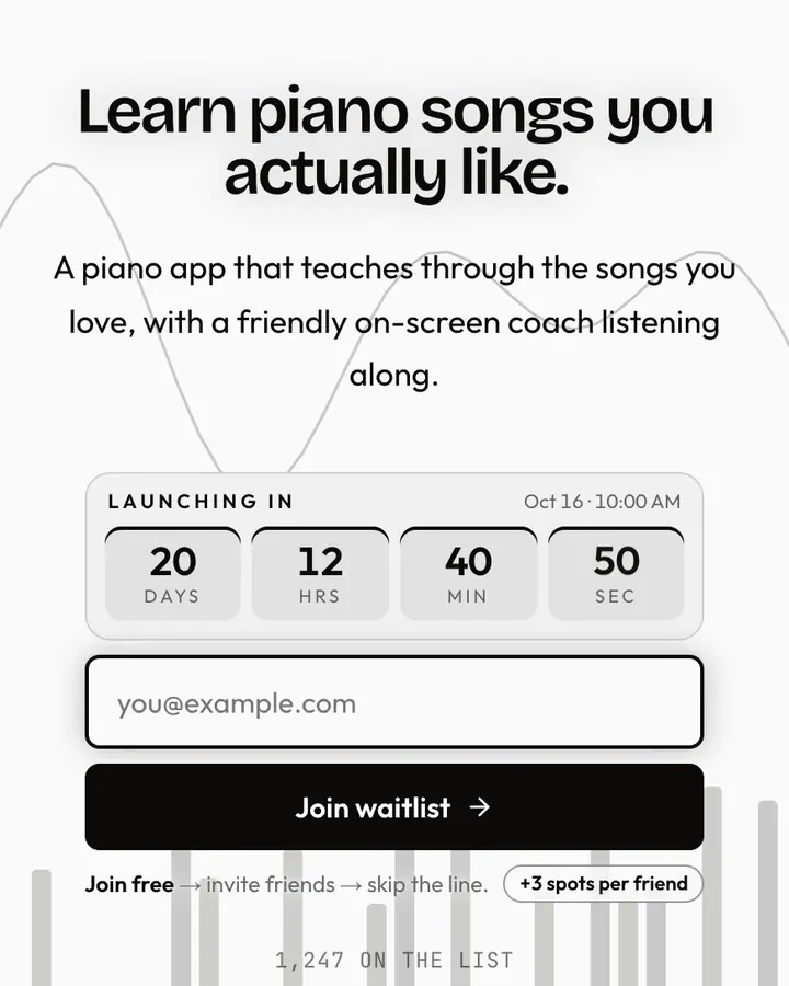
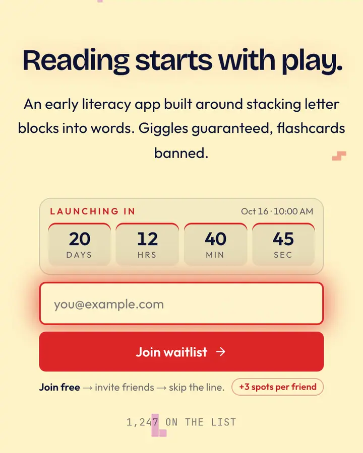
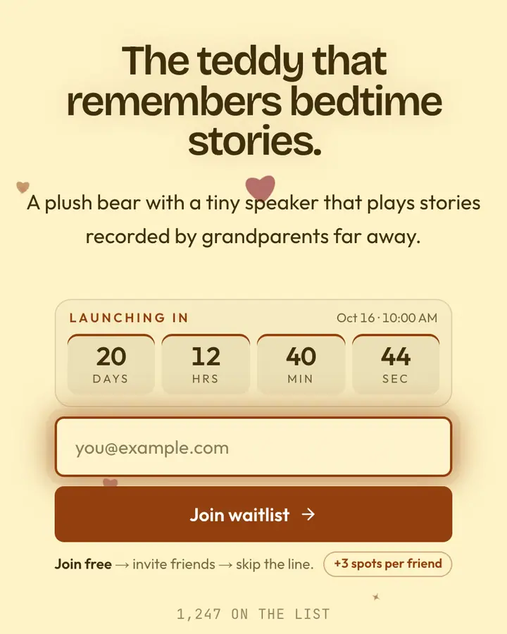
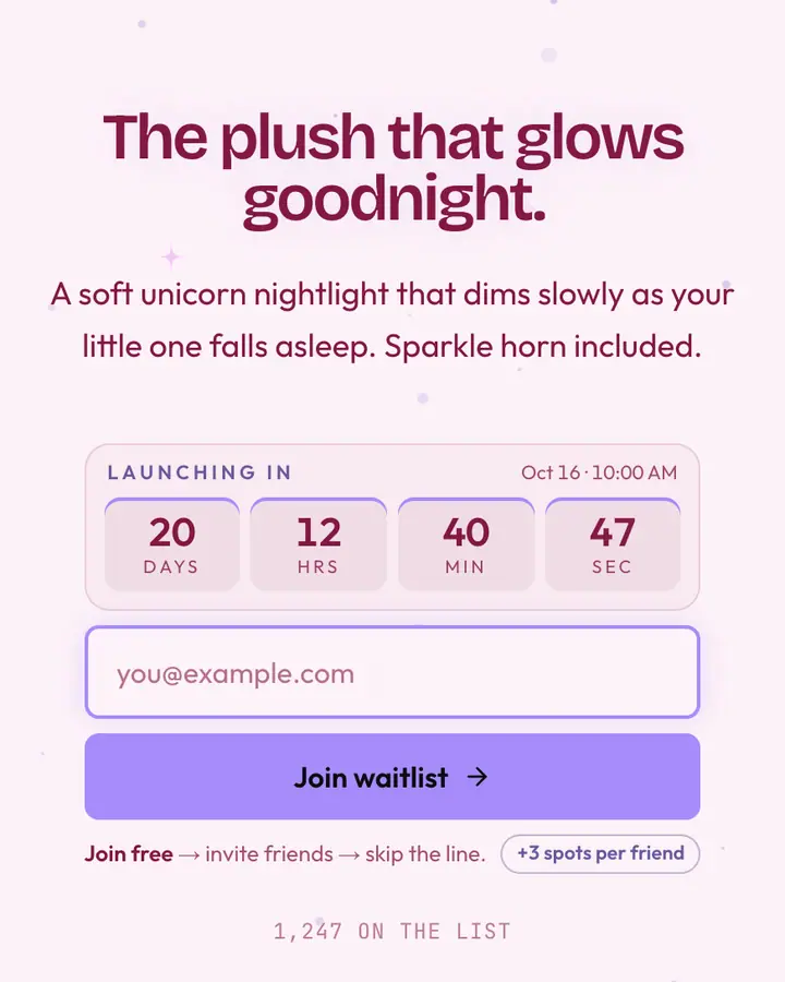
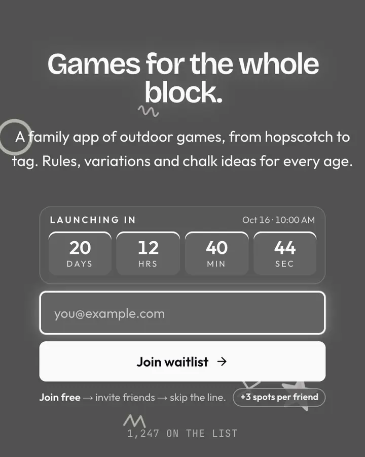
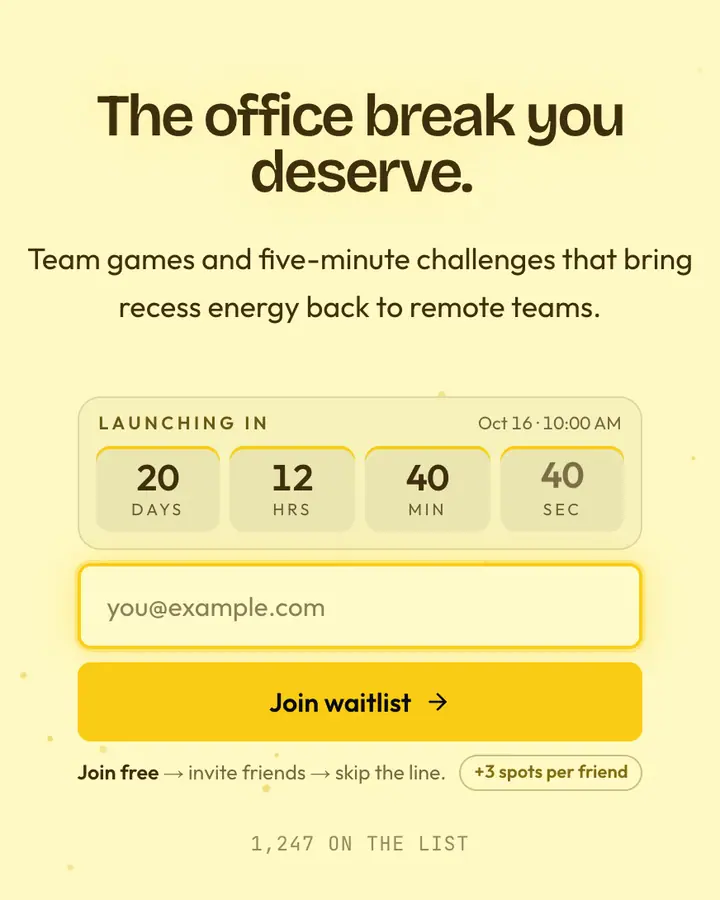
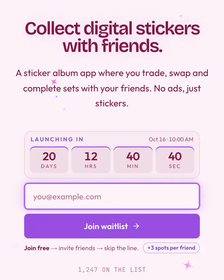
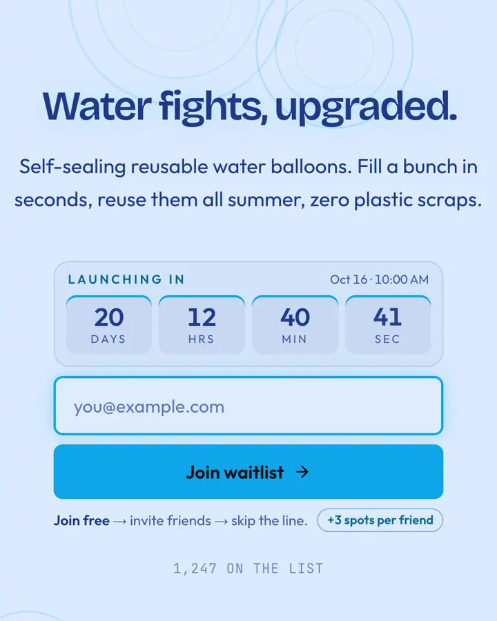
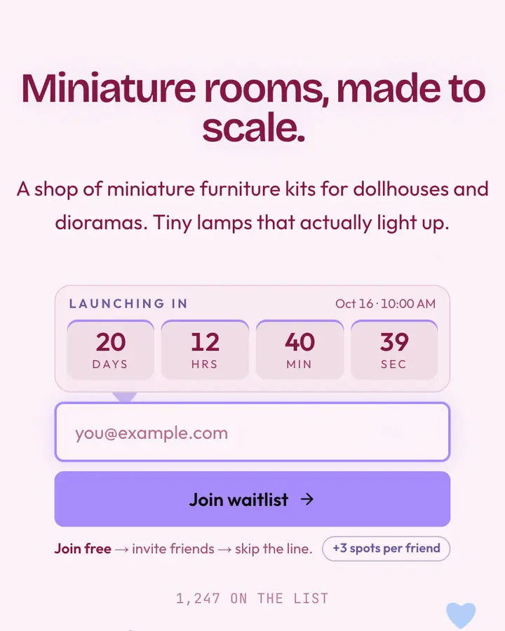
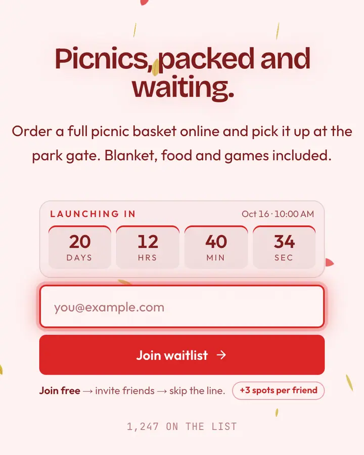
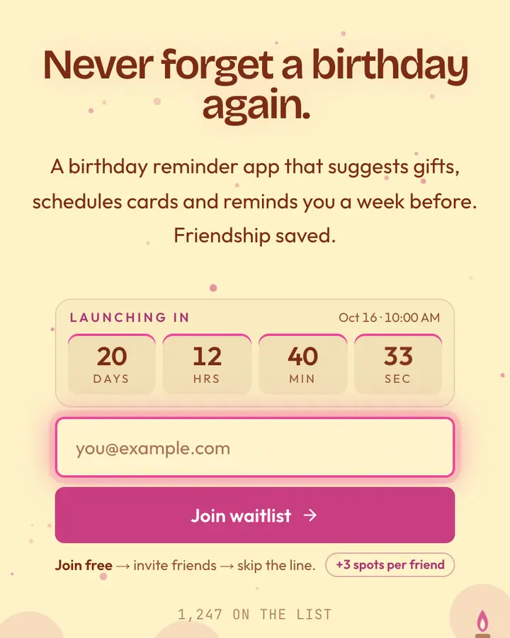
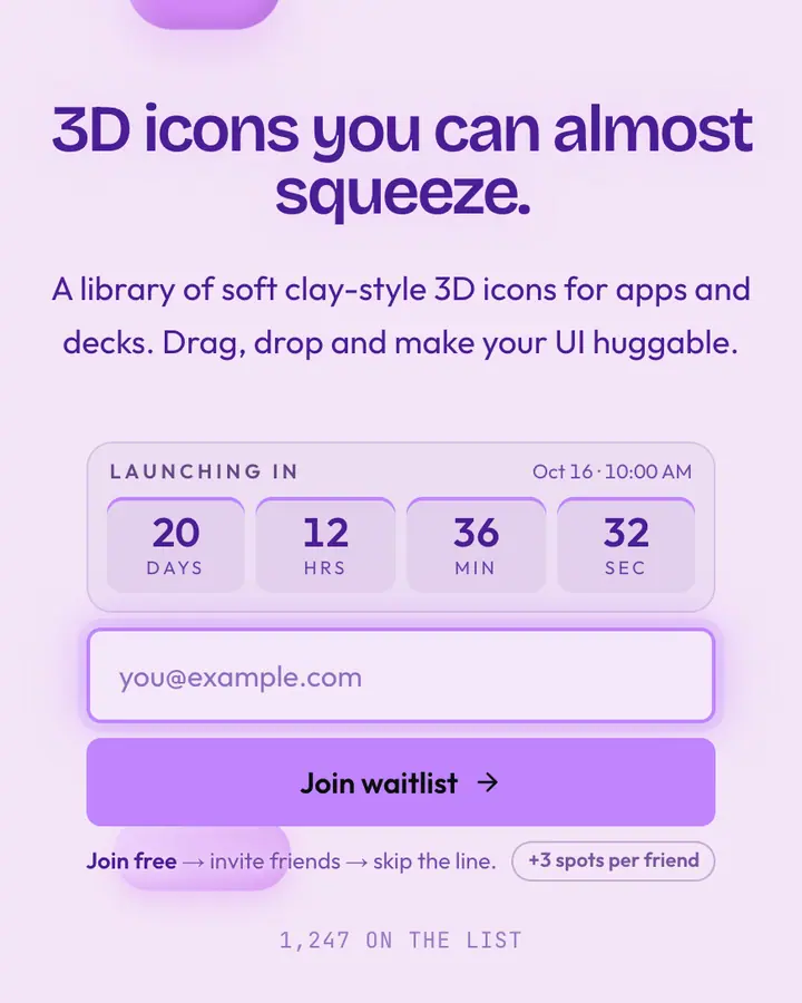
Playful doesn't mean unclear. A good pastel launch page still leads with one sentence that says what the app does, then uses color and motion to make it feel approachable. Soft backgrounds need a darker, saturated button, or the call to action disappears into the candy.
Rounded corners, bouncy motion and illustrated details (confetti, doodles, balloons) lower the stakes of signing up, which is exactly right for consumer apps and impulse-friendly products. Keep the copy warm and short, and write the referral message like an invitation to a party rather than a growth tactic. If you're launching an app, tell people which platforms come first and when; a countdown to launch day gives the page a reason to be revisited.
Best playful & pastel templates for…
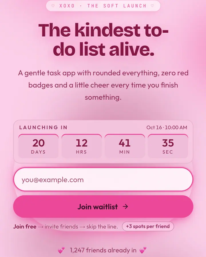
- For consumer mobile apps: Pastel, a soft palette with rounded everything.
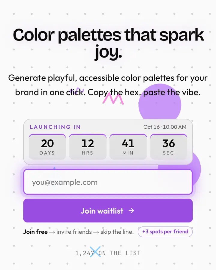
- For friendly productivity apps: Claymorphism Studio, 3D-soft shapes and pillowy buttons in a hand-built layout.
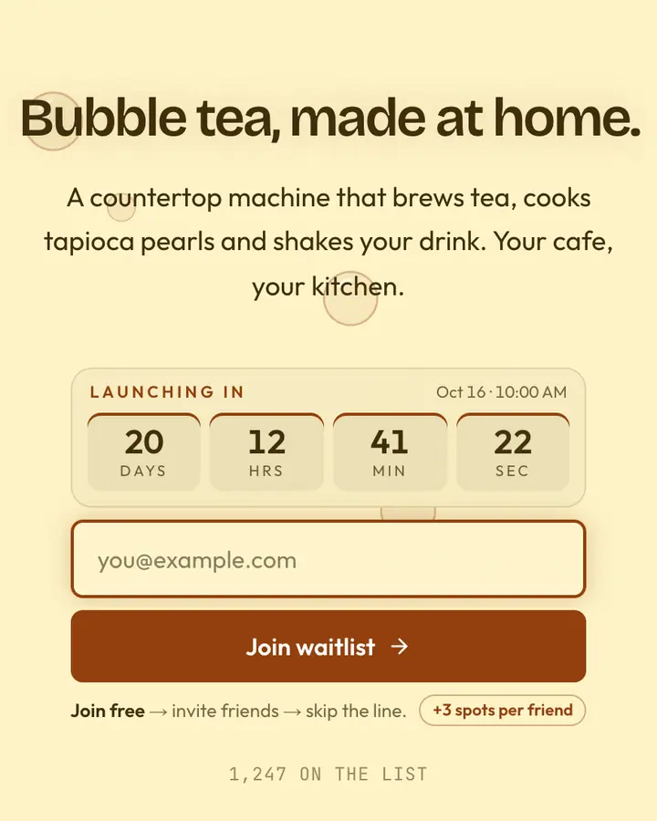
- For food and drink brands: Bubble Tea, milky tapioca tones with a playful accent.
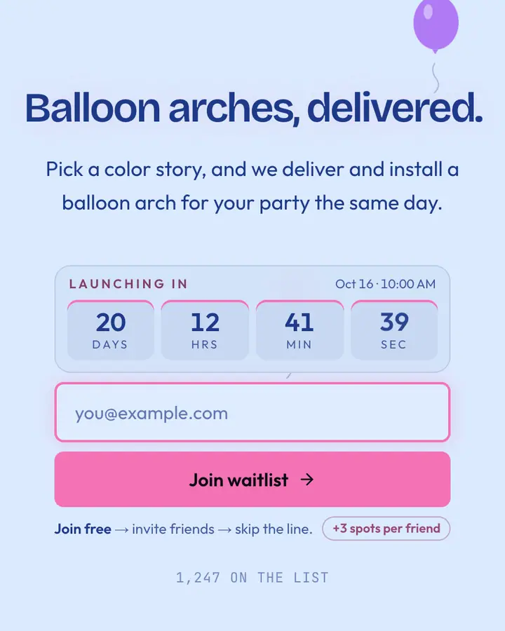
- For party and social games: Balloon Party, floating balloons on a clear blue sky.
Playful & Pastel templates FAQ
What is claymorphism?
A UI style with soft, inflated-looking shapes: rounded corners, inner and outer shadows and pastel colors that make buttons look like clay. Claymorphism Studio is built around it.
Will pastel buttons be readable?
The templates pair pastel backgrounds with a deeper accent for the button, and the signup form adjusts its text color to stay readable if you pick a very light accent.
Is a playful template right for a kids' product?
The look fits, but signups should come from parents: write the copy for adults, and remember you're collecting their email address, not a child's.