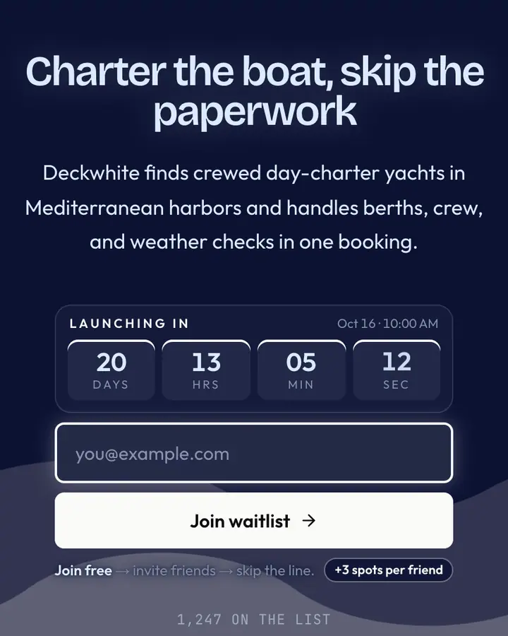
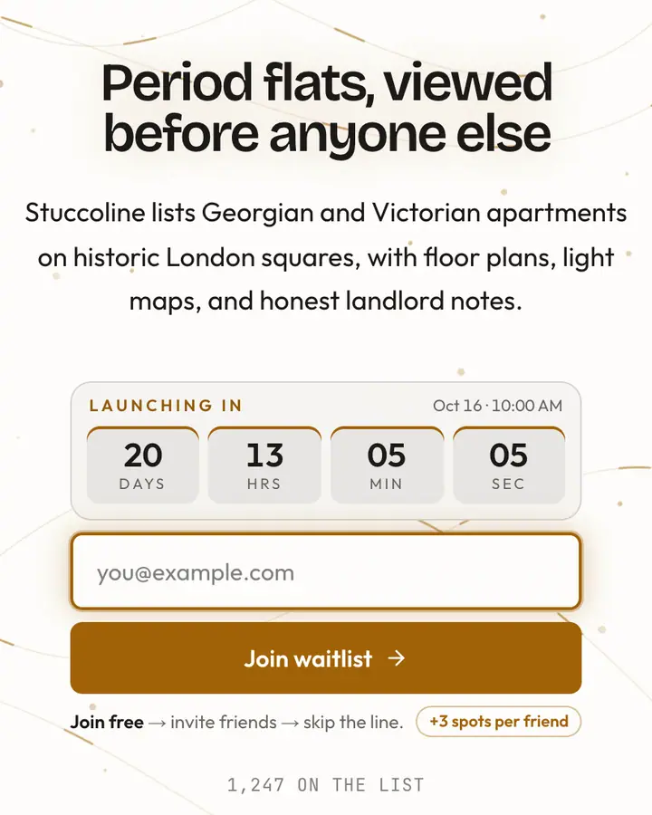
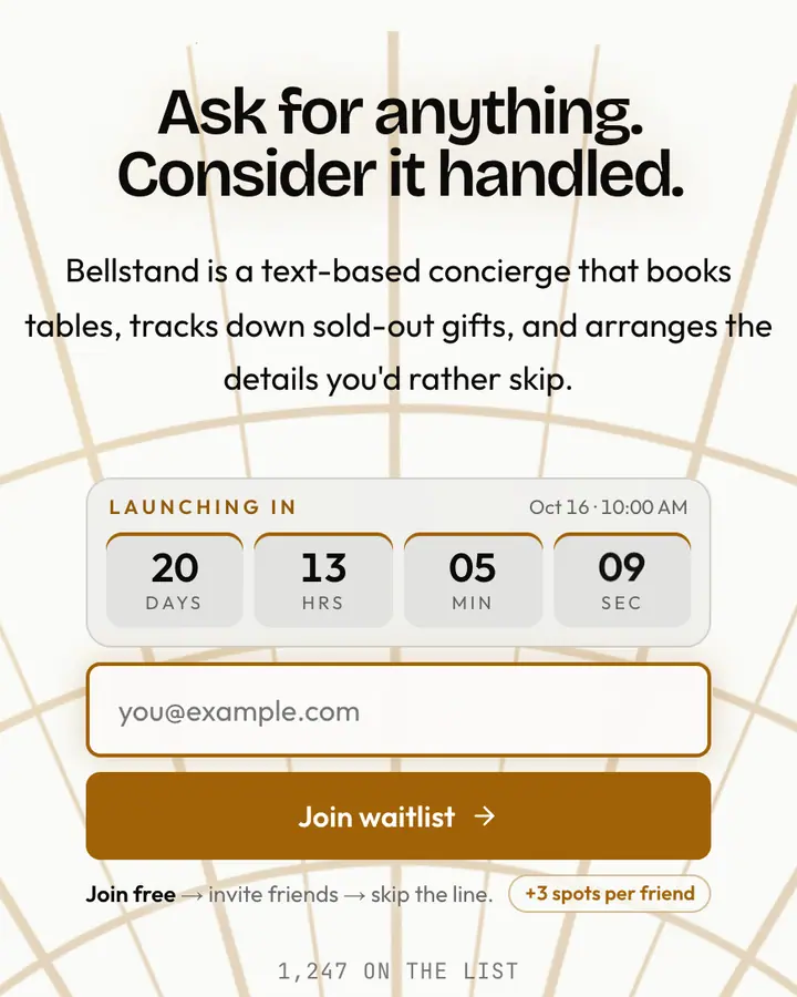
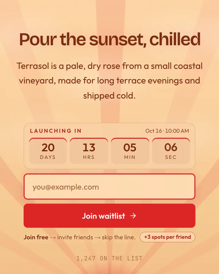
What makes a good luxury launch page
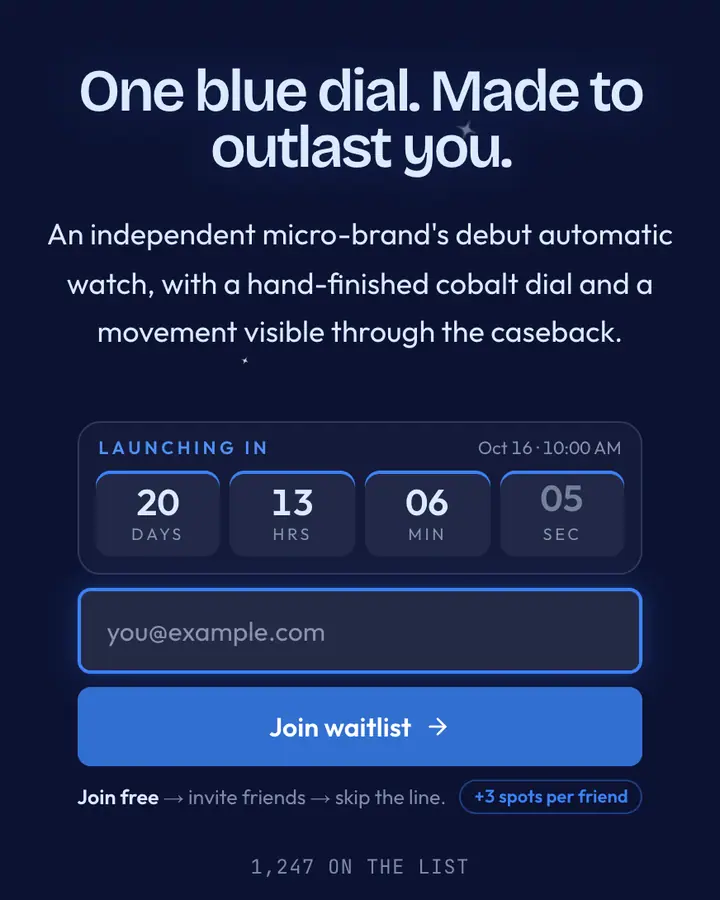
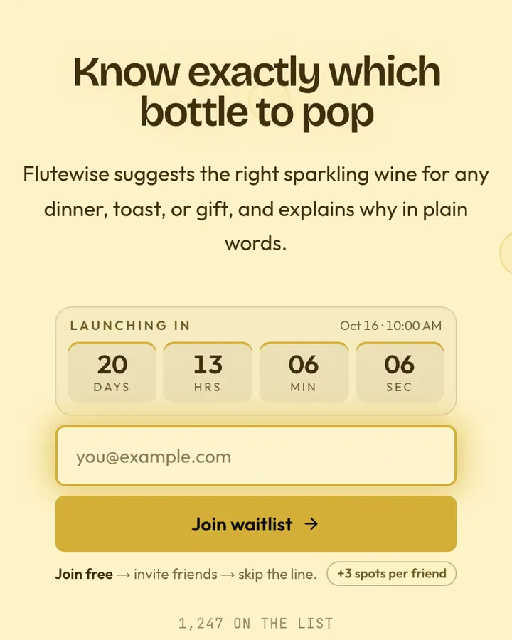
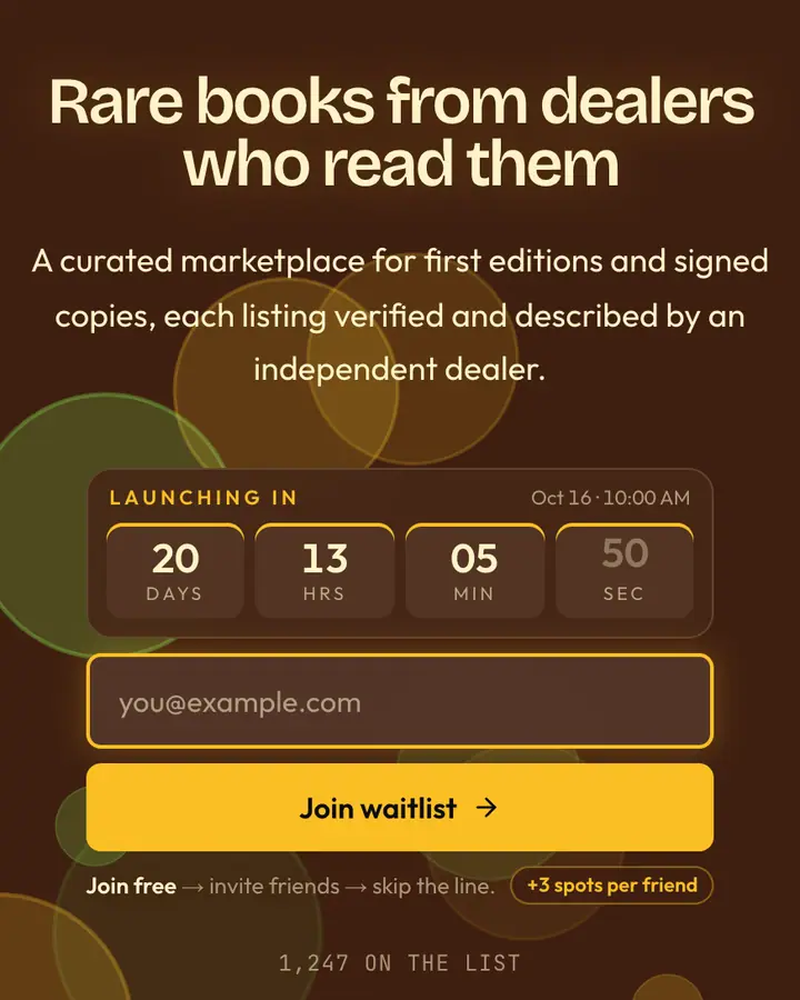
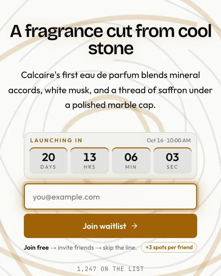
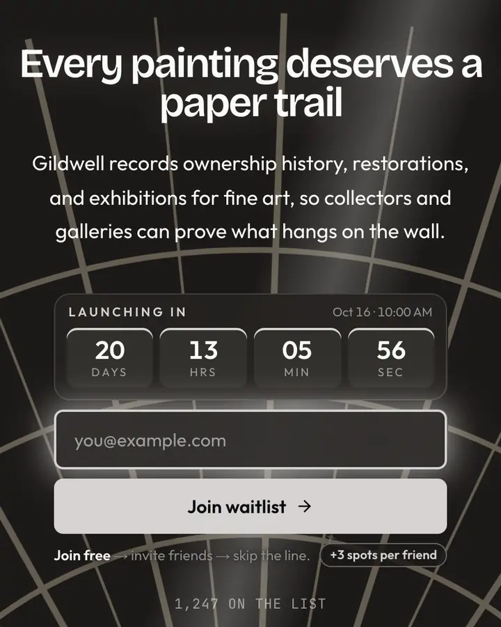
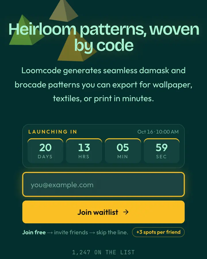
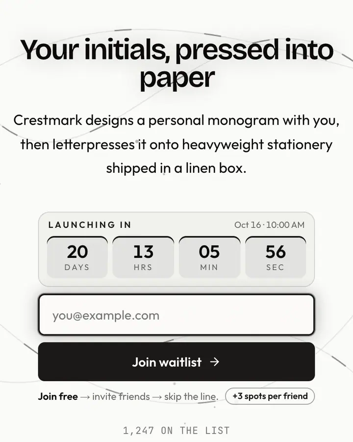
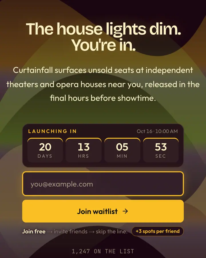
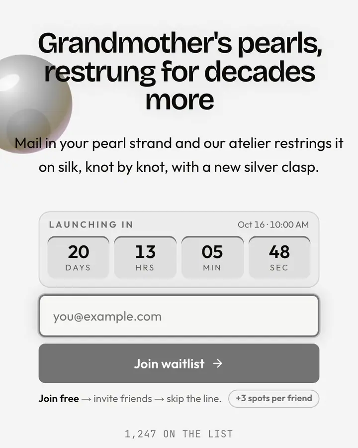
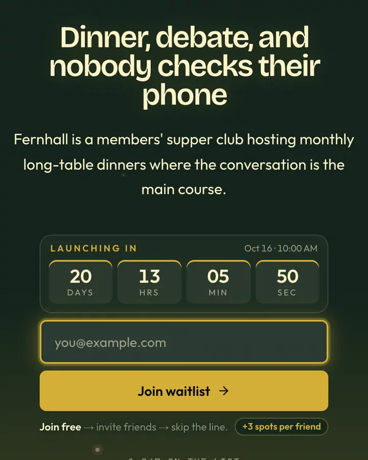
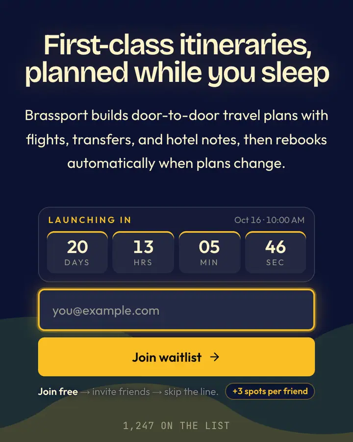
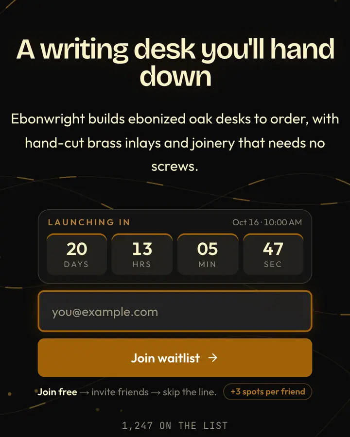
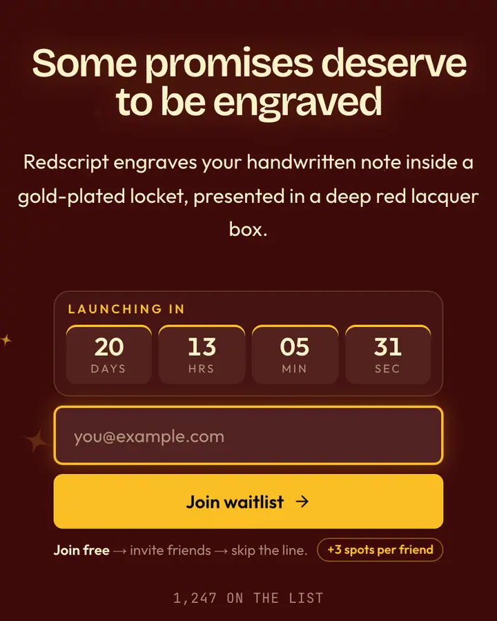
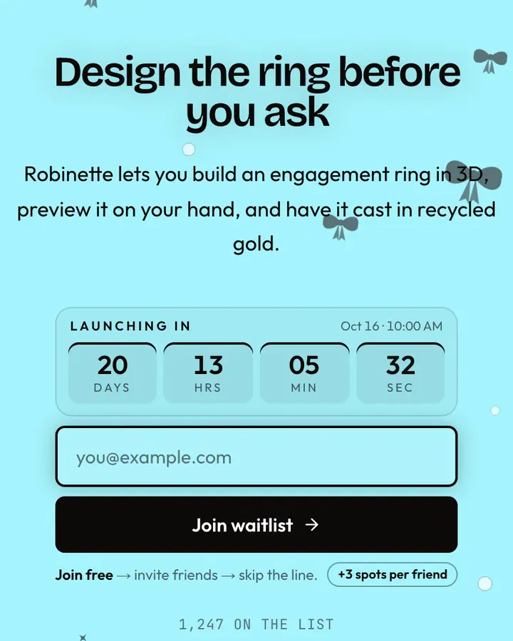
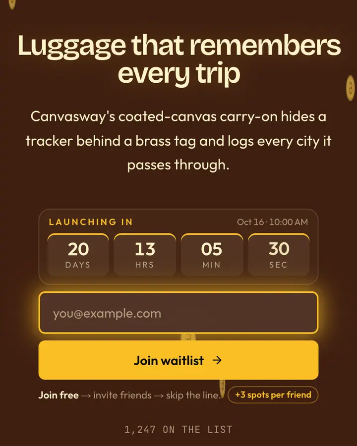
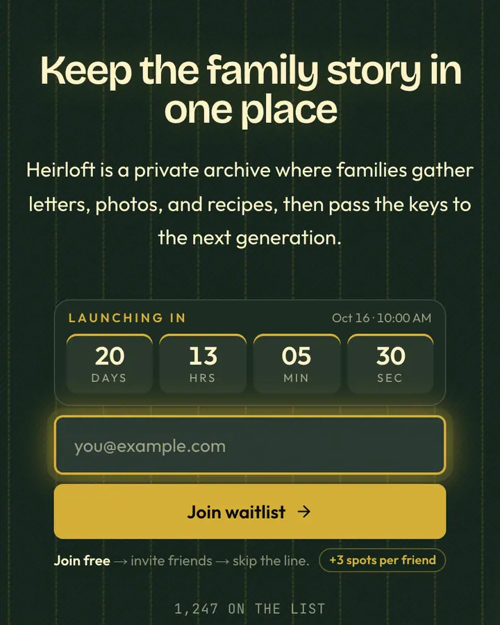
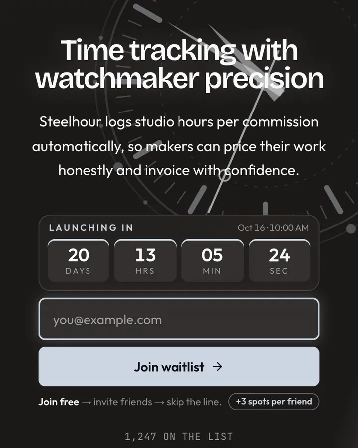
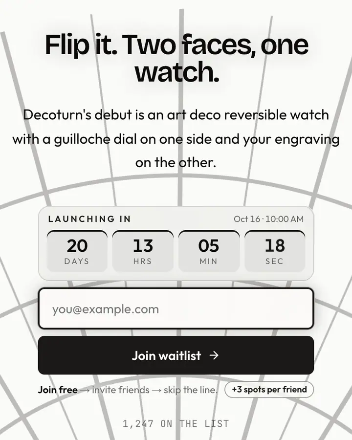
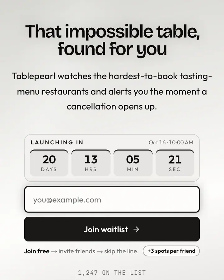
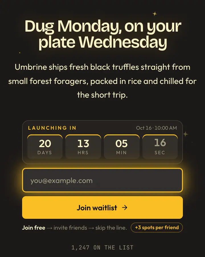
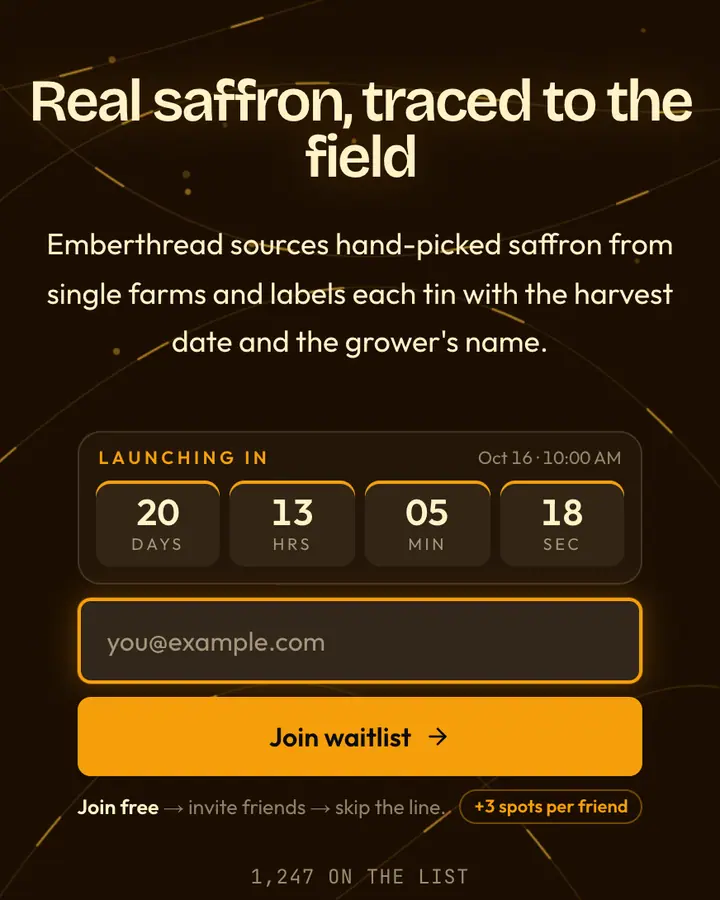
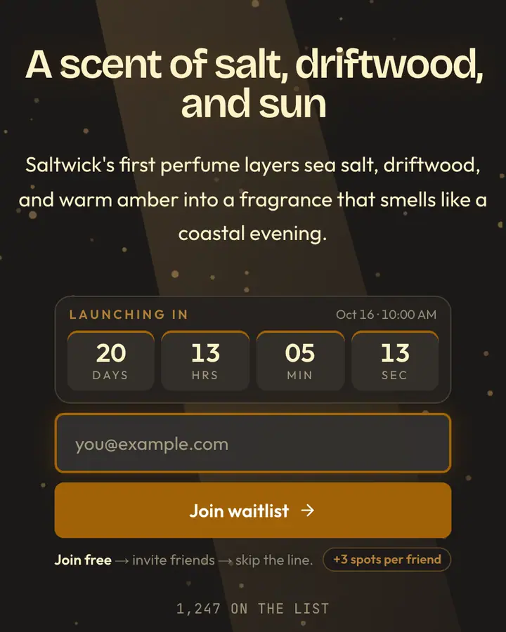
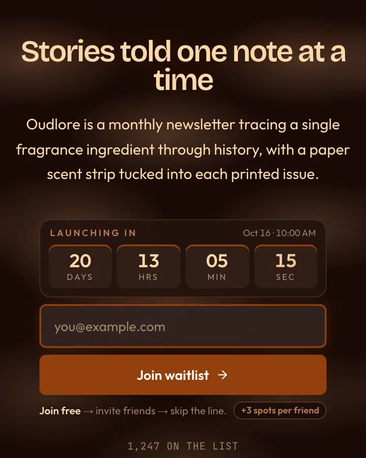
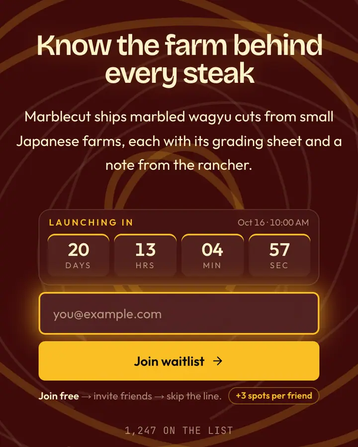
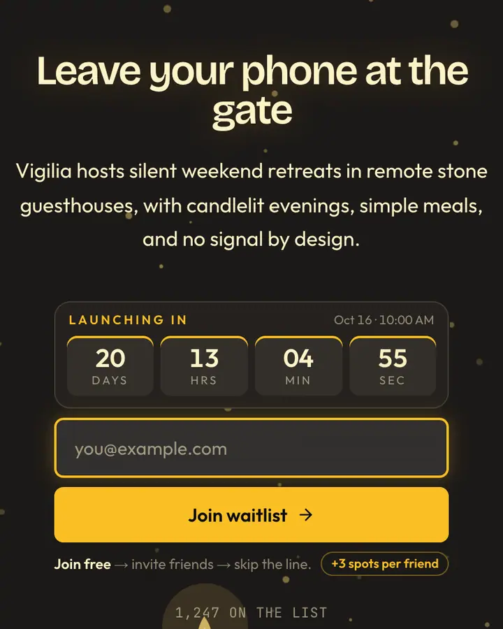
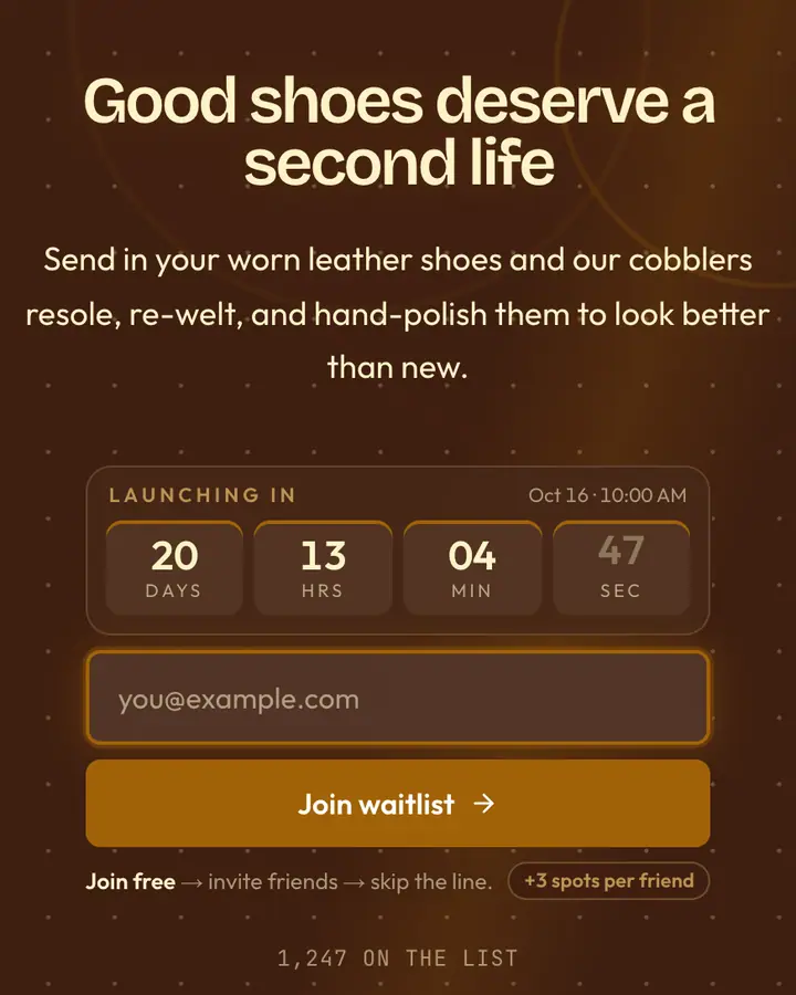
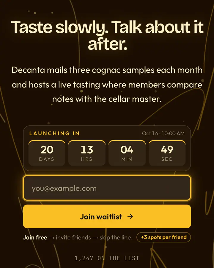
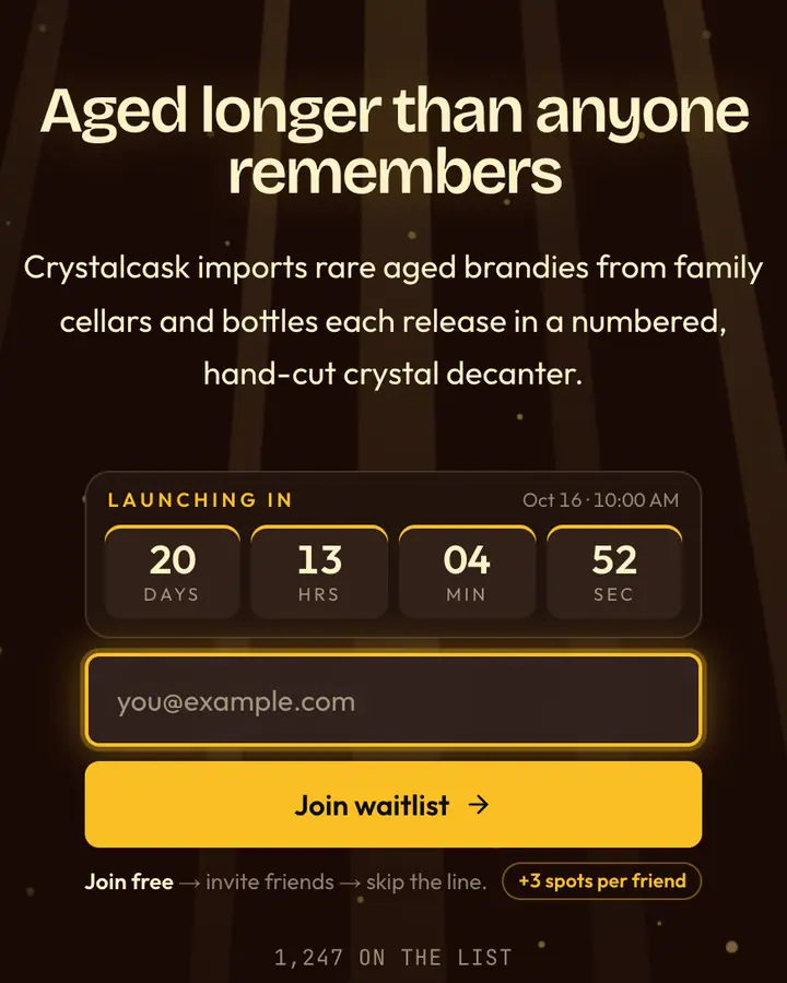
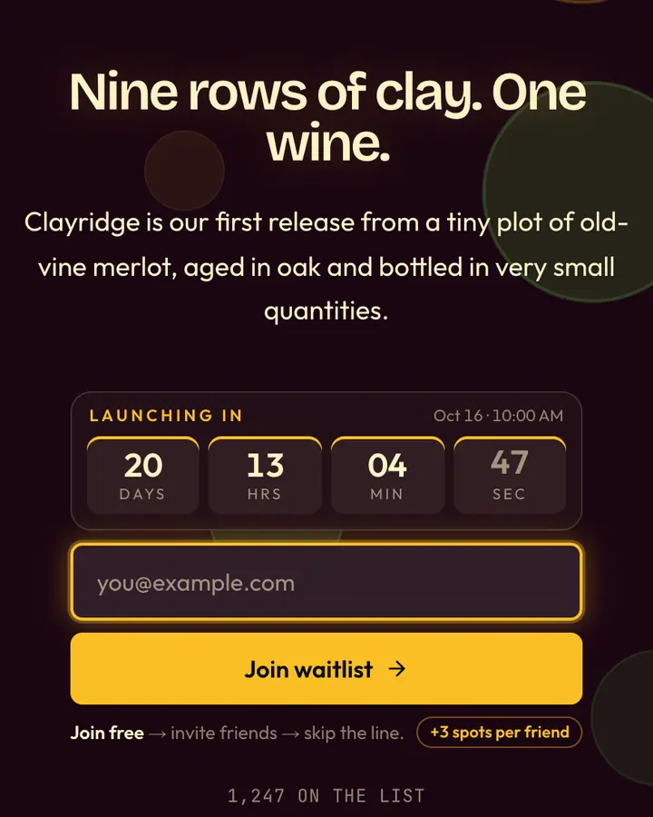
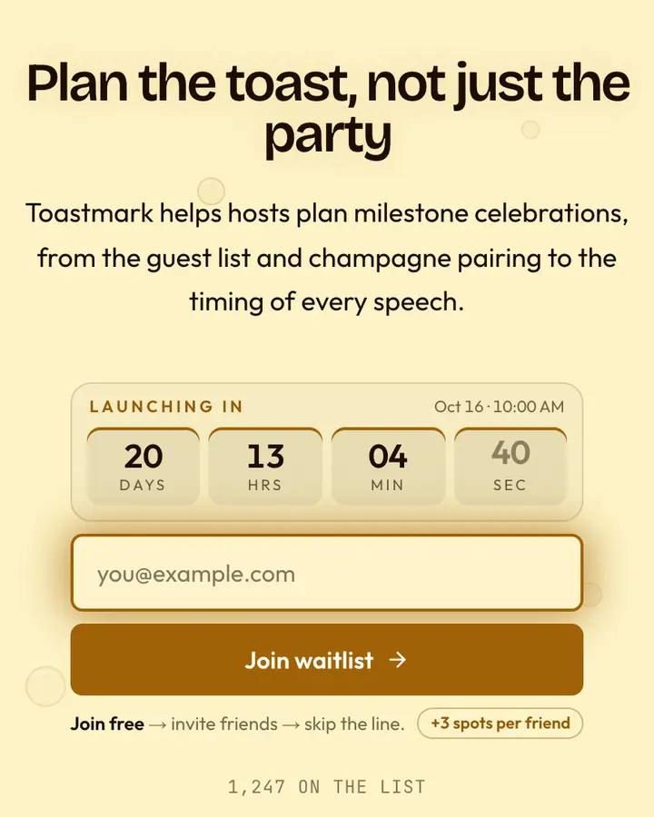
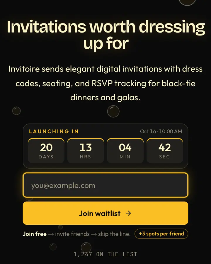
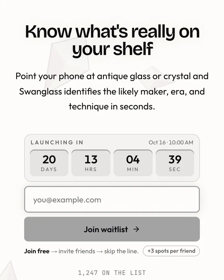
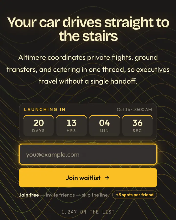
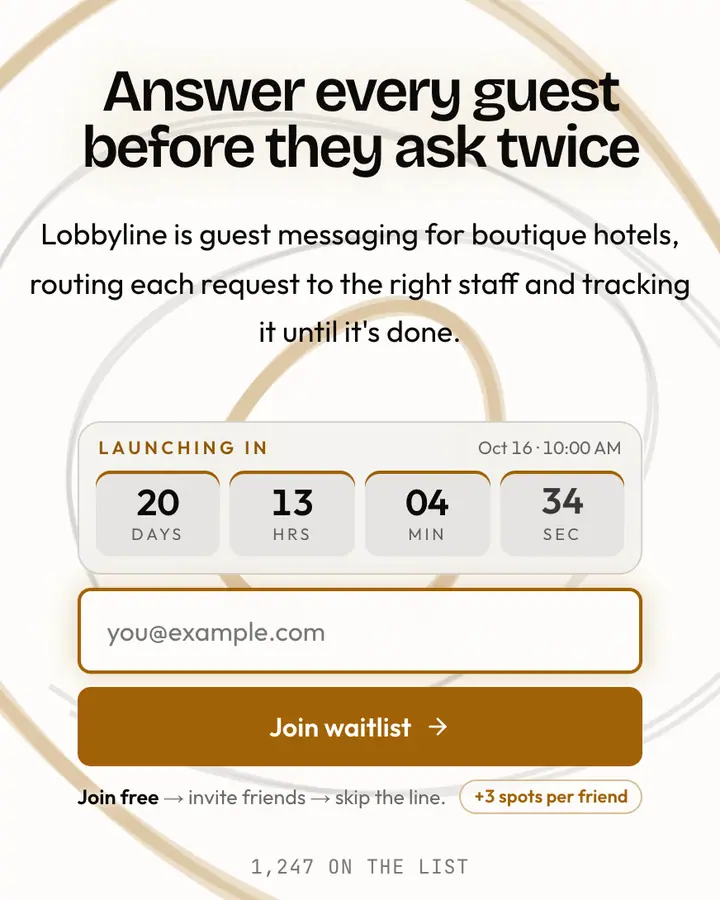
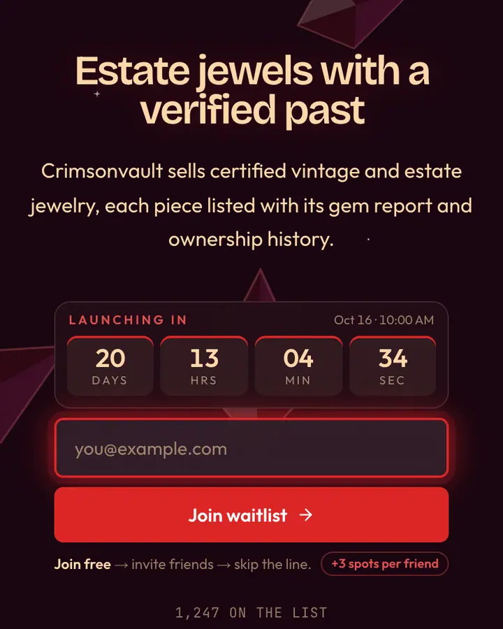
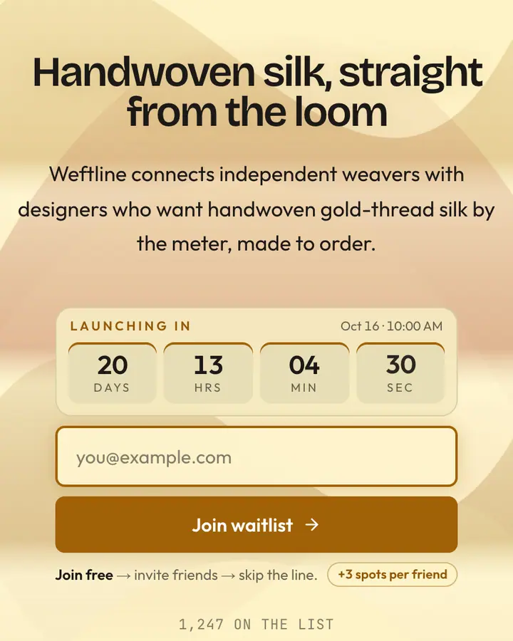
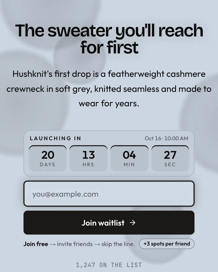
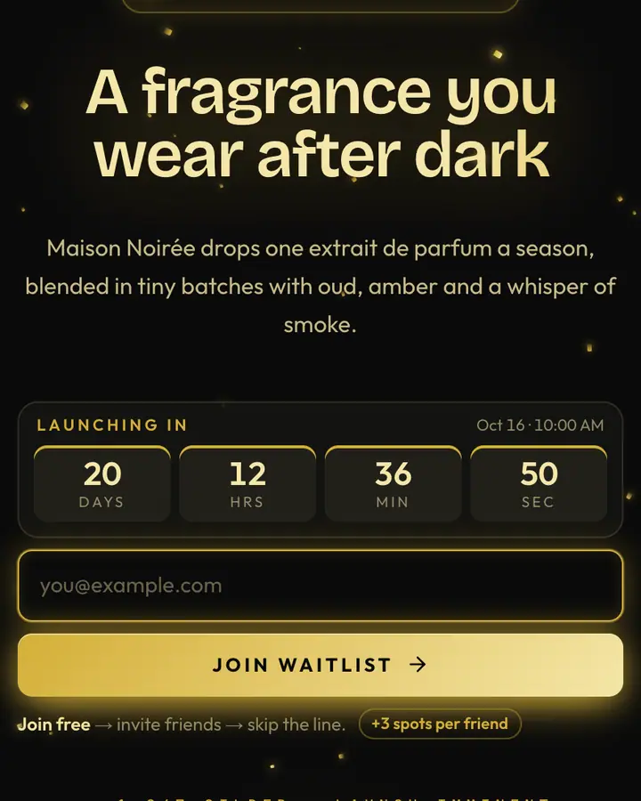
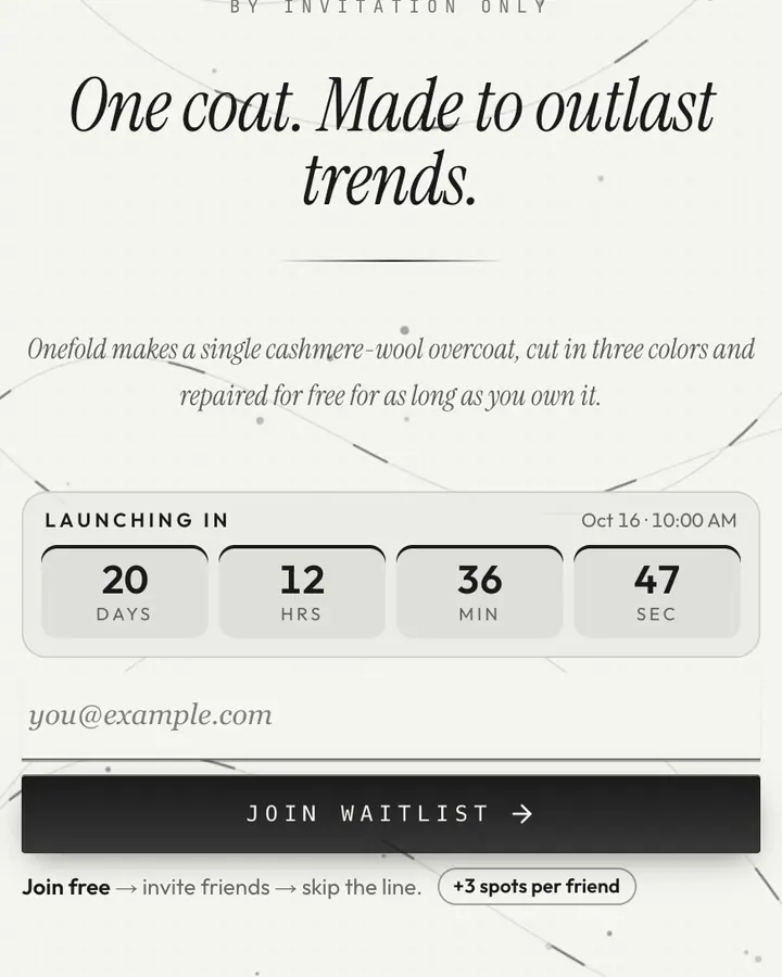
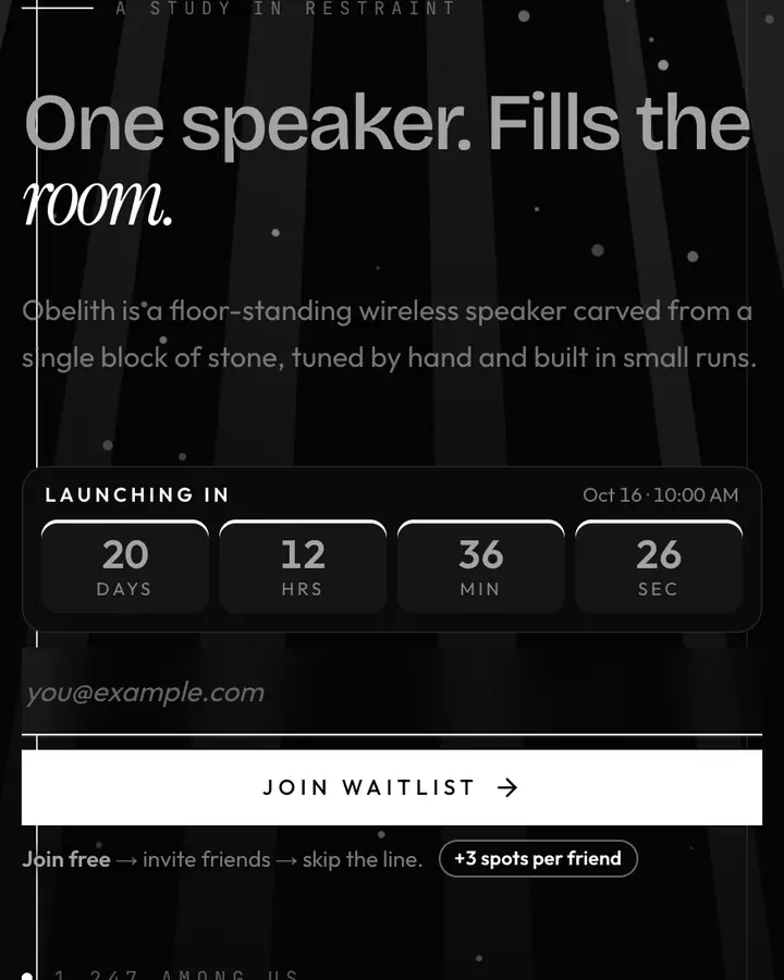
Luxury is mostly what you leave out. A good premium launch page has fewer words than you think, generous margins and one material (gold, velvet, marble) carried through the whole page. The accent should look like metal or gemstone, never a bright UI blue.
Scarcity is part of luxury, but only honest scarcity works: if the first edition really is 200 pieces, say so; if it isn't, don't. Use the waitlist as a private preview list and let the referral panel read like a guest list, where members bring members. Serif headlines, small caps and slow motion (drifting gold threads, soft light) signal patience, and patience signals value. Keep the button label calm, like "Request access" or "Join the list", rather than "Sign up now!".
Best luxury templates for…
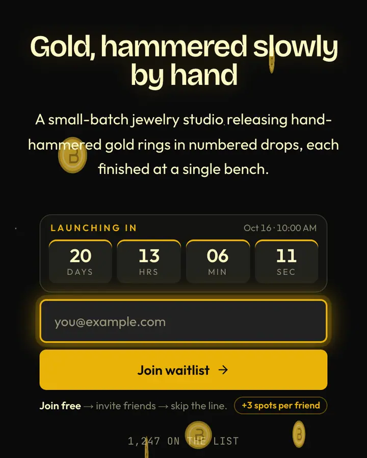
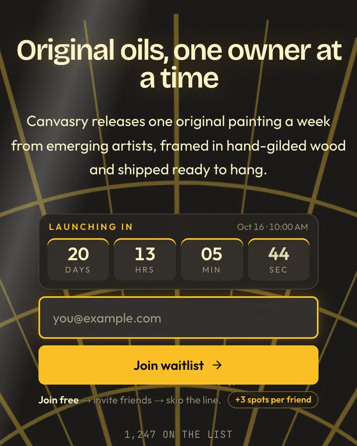
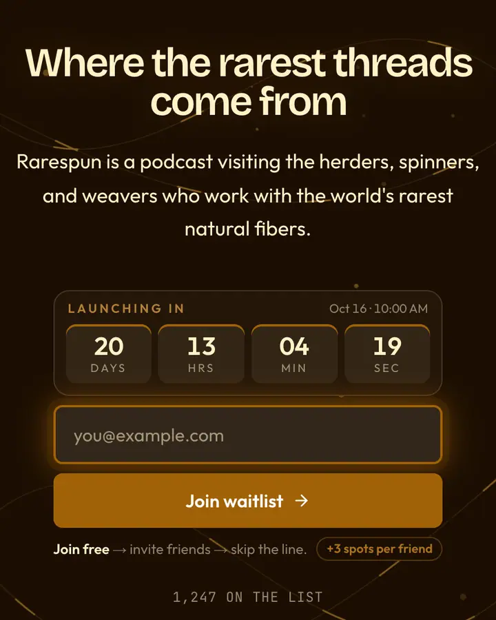
- For fragrance, jewelry and watch drops: Midnight Gold, black and gold with filaments of light and serif type.
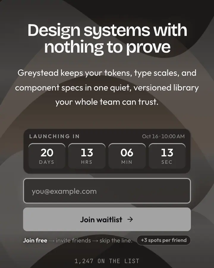
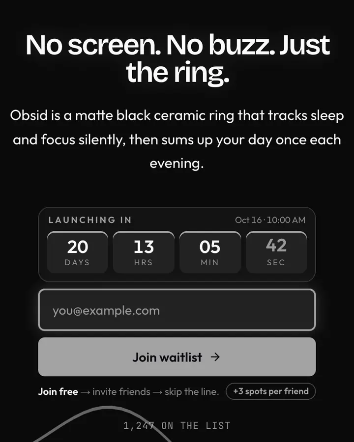
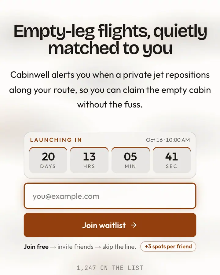
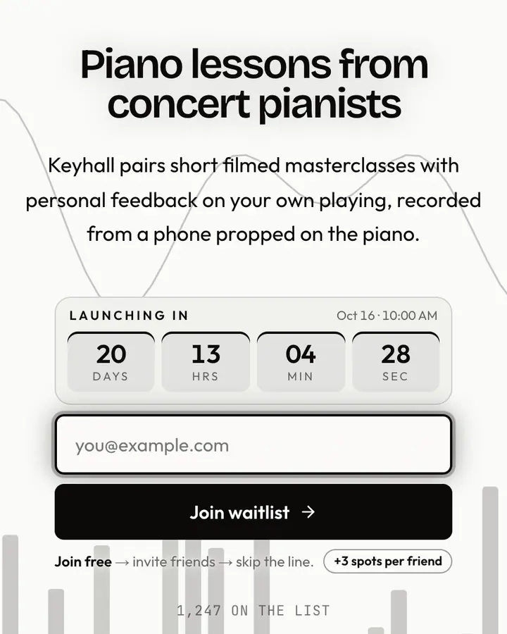
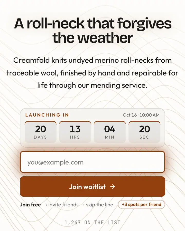
- For premium subscriptions and studios: Quiet Luxury, vast whitespace, one horizon line and nothing extra.
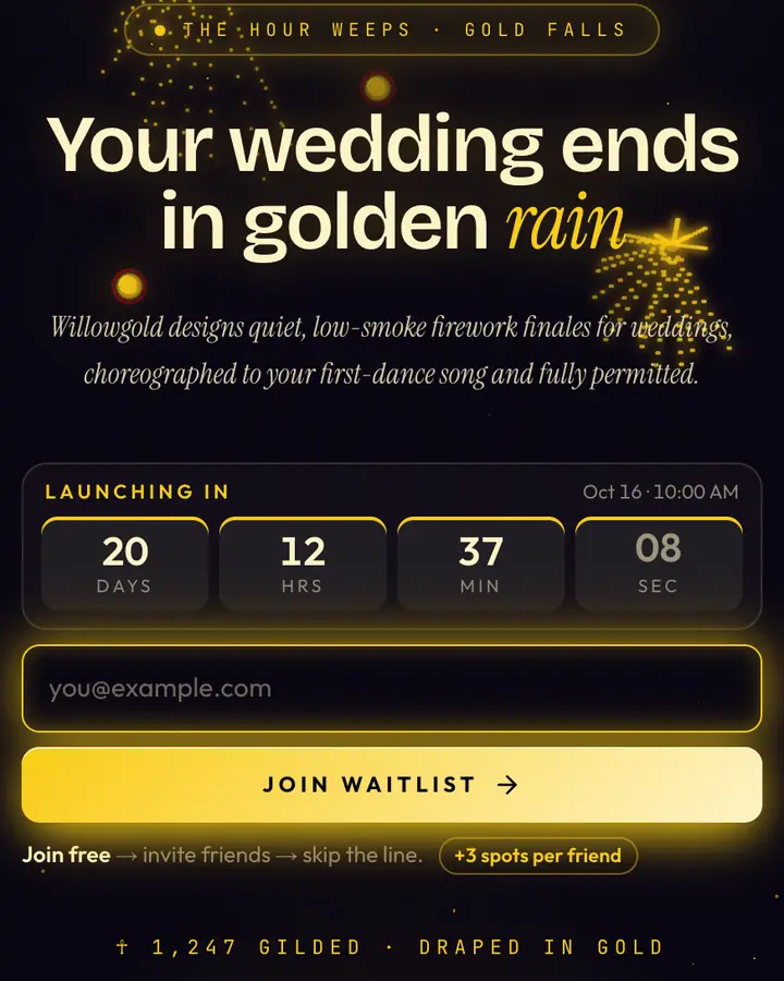
- For launch-night reveals: Golden Willow, weeping gold trails over a velvet sky.
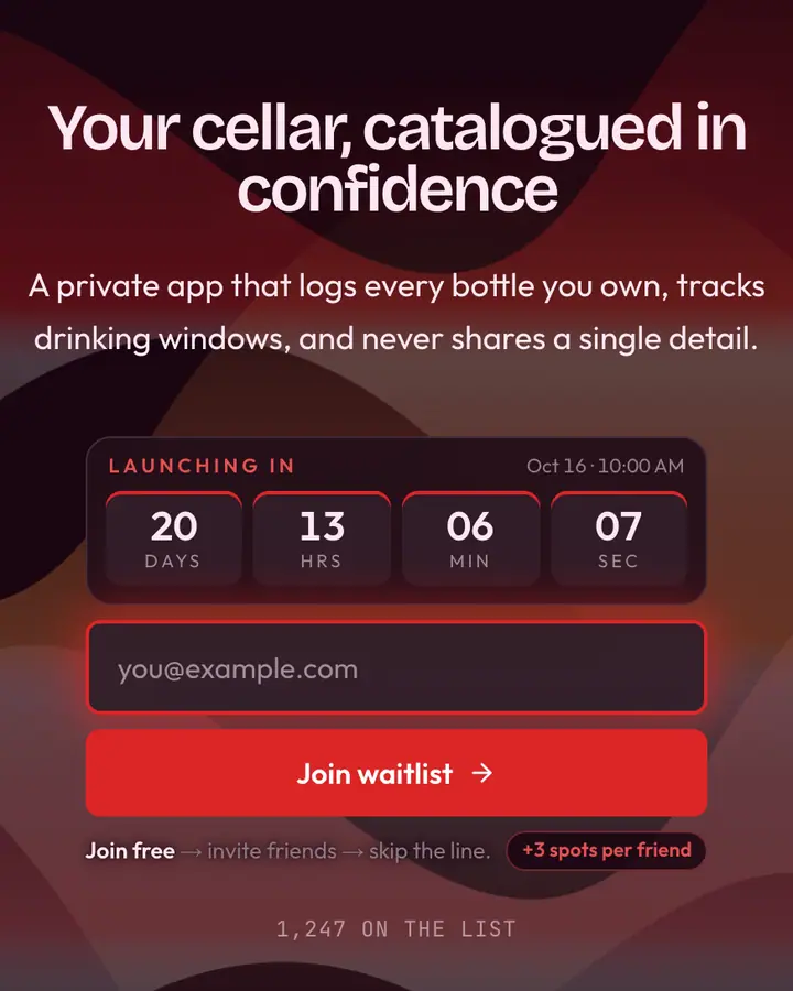
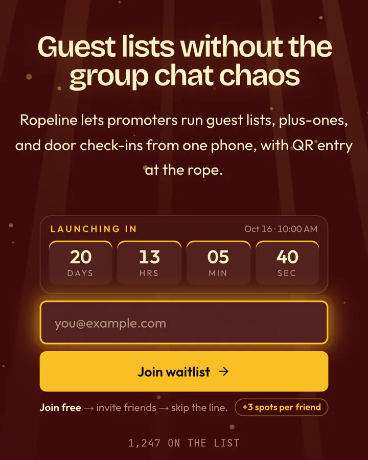
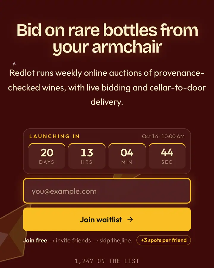
- For members' clubs: Royal Velvet, deep burgundy under frosted glass, quiet wealth.
Luxury templates FAQ
Can a waitlist feel exclusive without fake scarcity?
Yes. Make the list the only way to see the collection first and let referrals move people up, but only state limits that are true. Qubed never adds fake counters or countdowns you didn't set.
Can I use my own brand typeface?
Not yet. Each template ships with its own type pairing; custom font upload is on the roadmap. You can change every color and all of the copy today.
Can I hide the subscriber count?
Yes. The subscriber count is a page setting, so a members'-club launch can keep the numbers private while still running referrals.