What makes a good nature & organic launch page
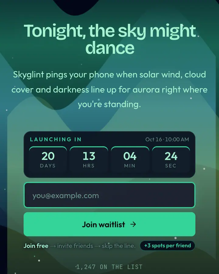
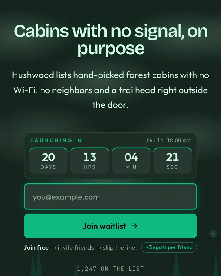
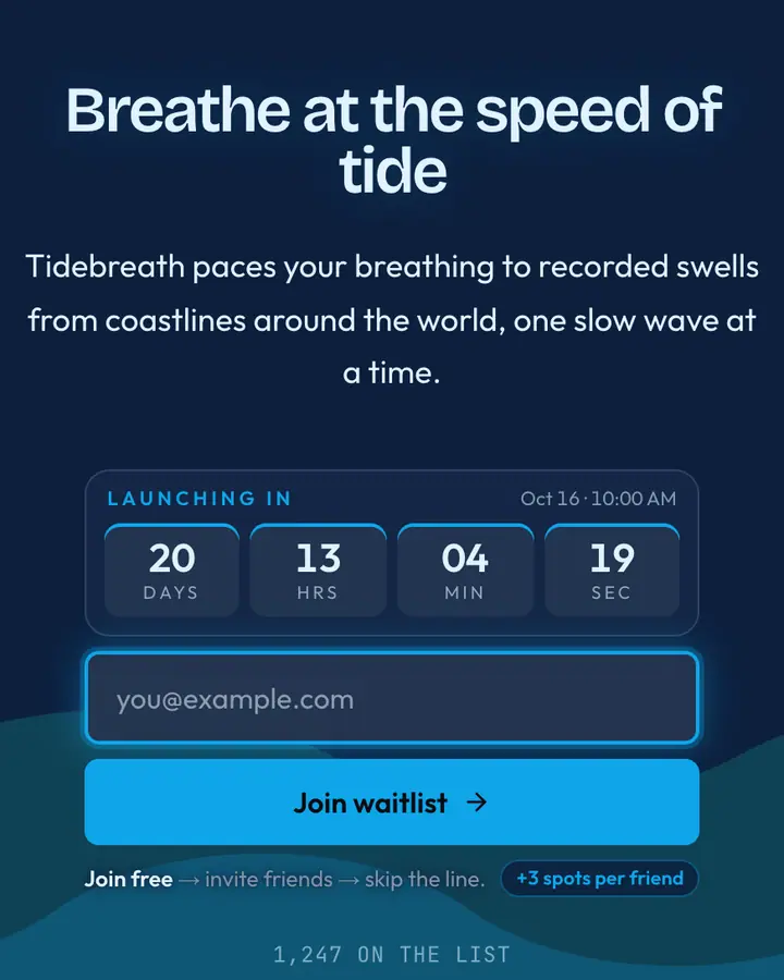
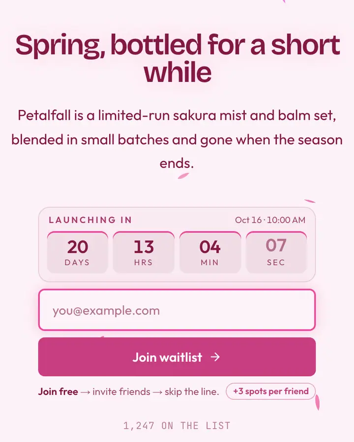
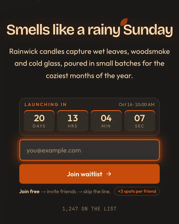
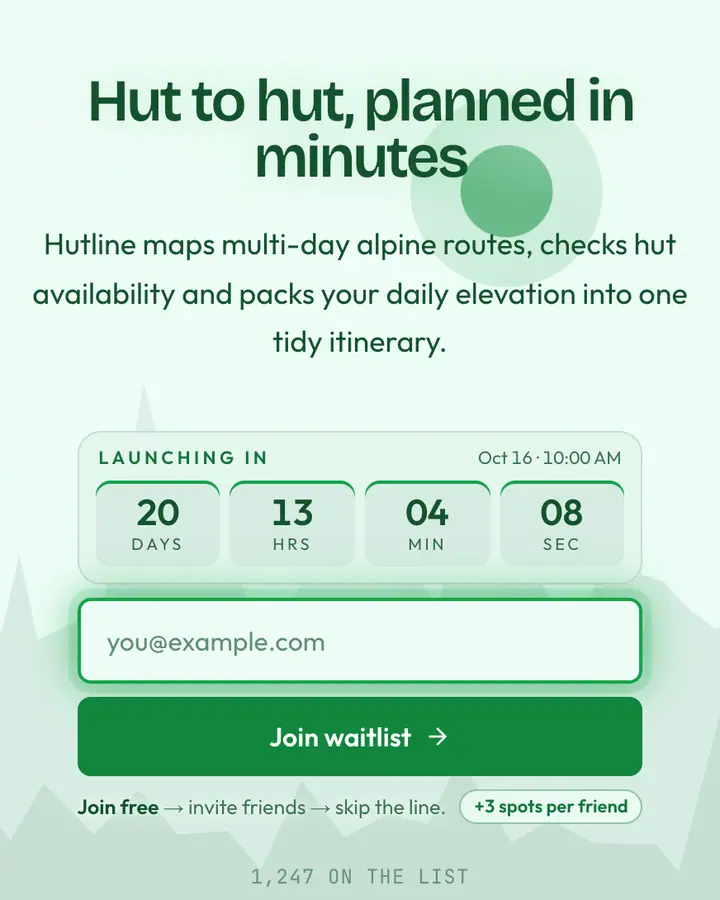
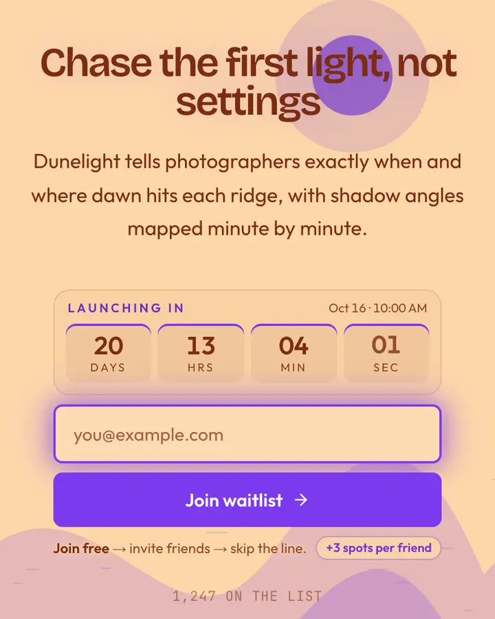
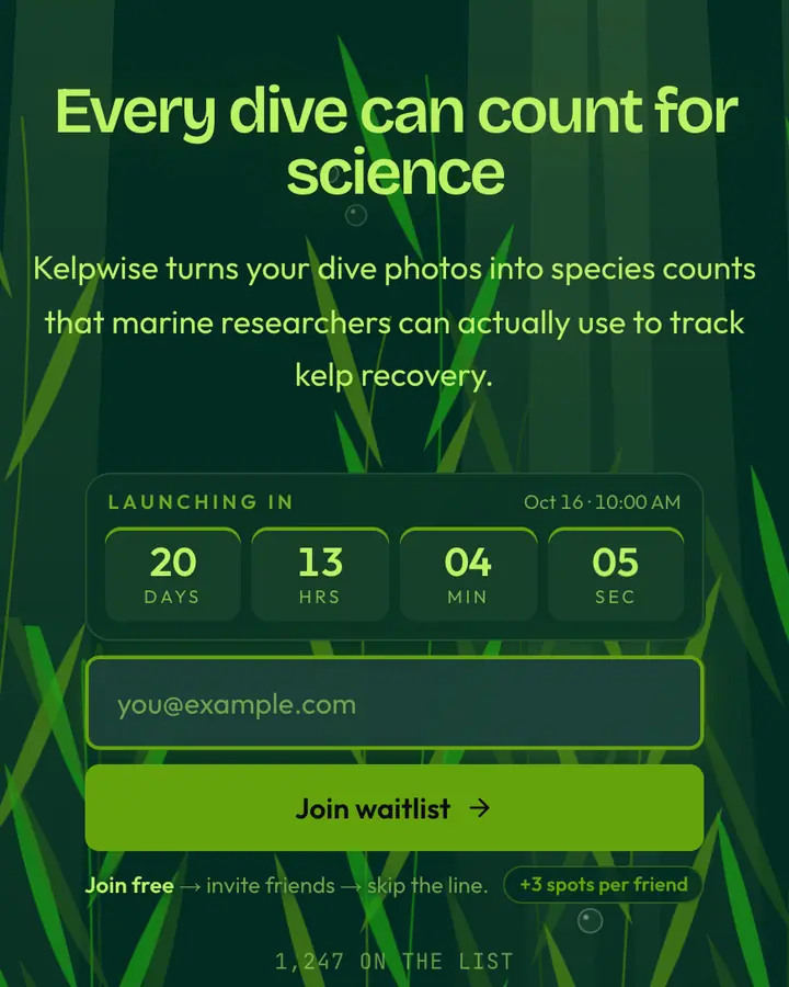
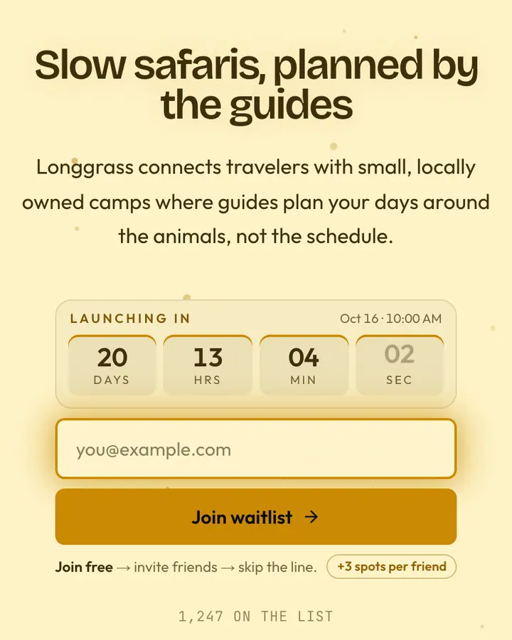
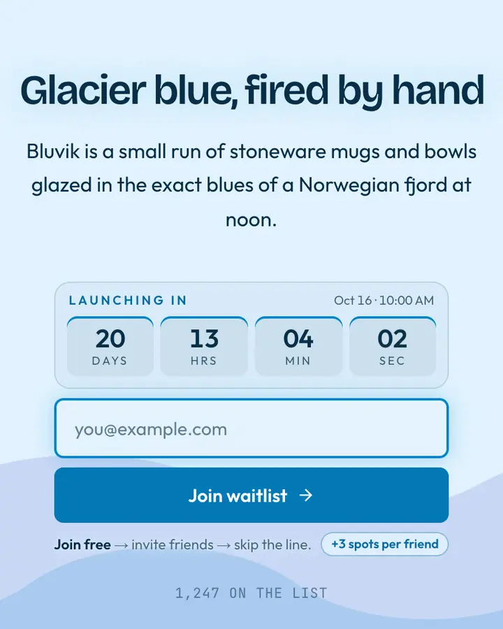
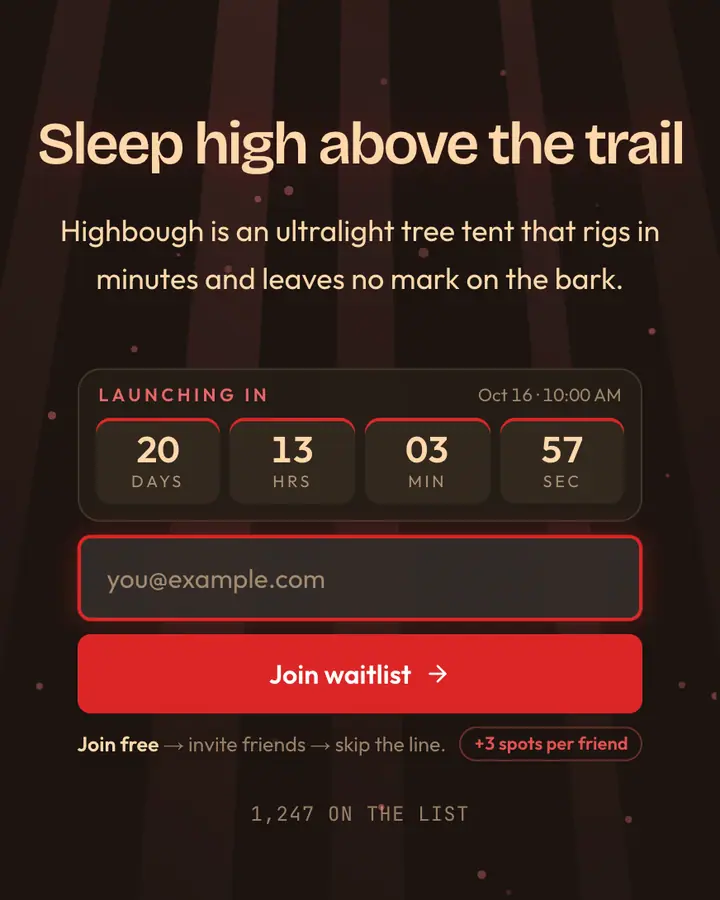
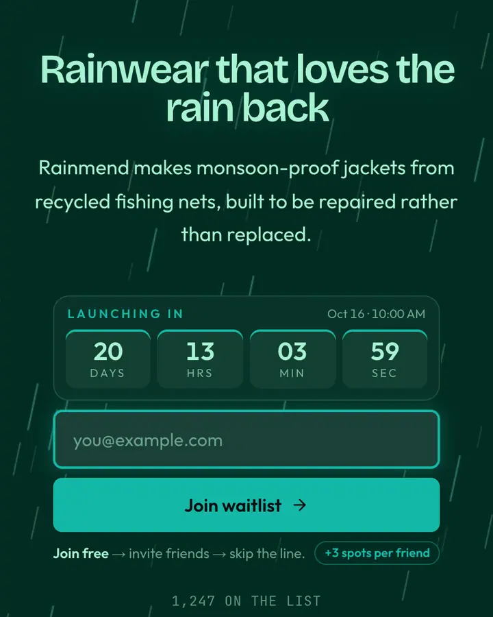
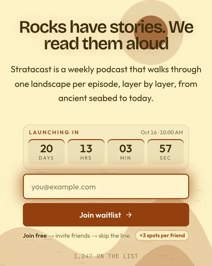
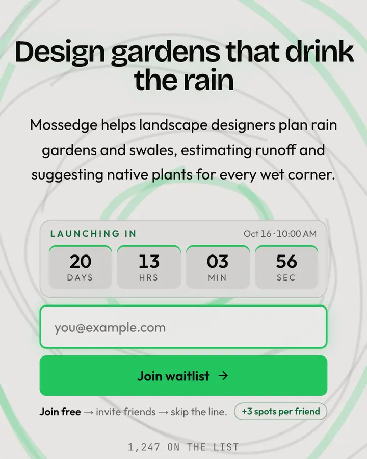
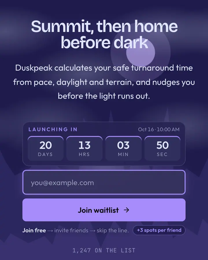
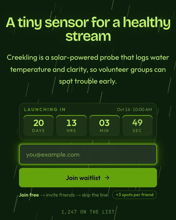
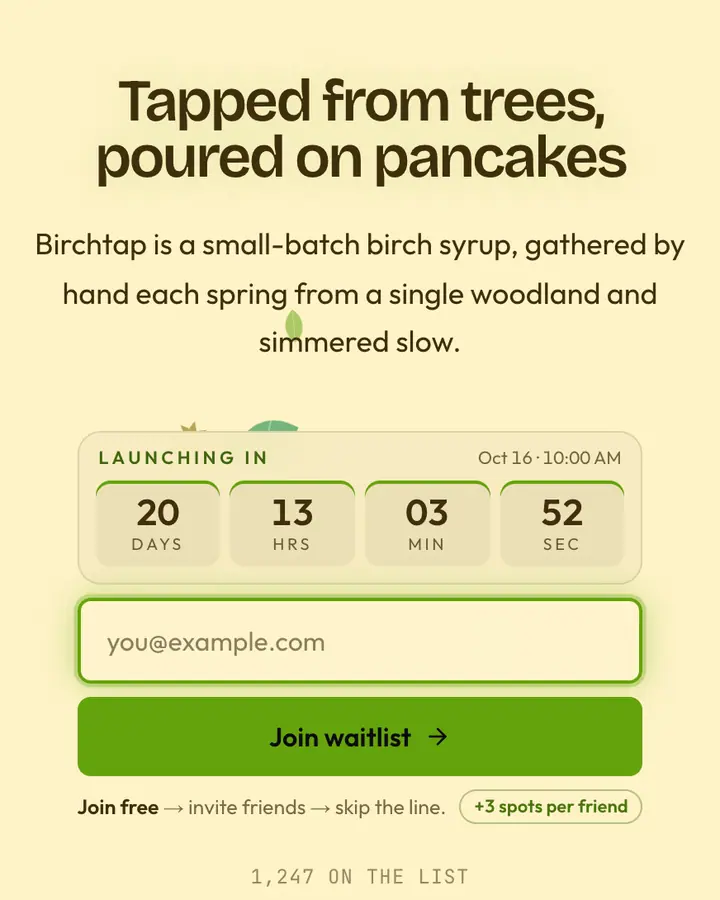
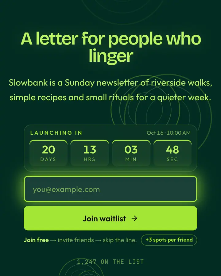
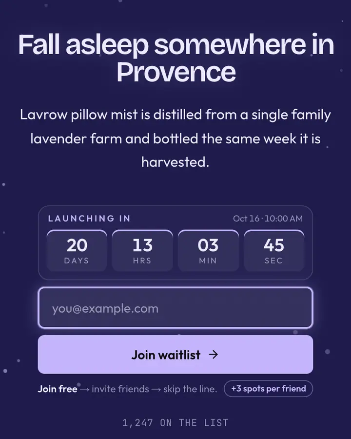
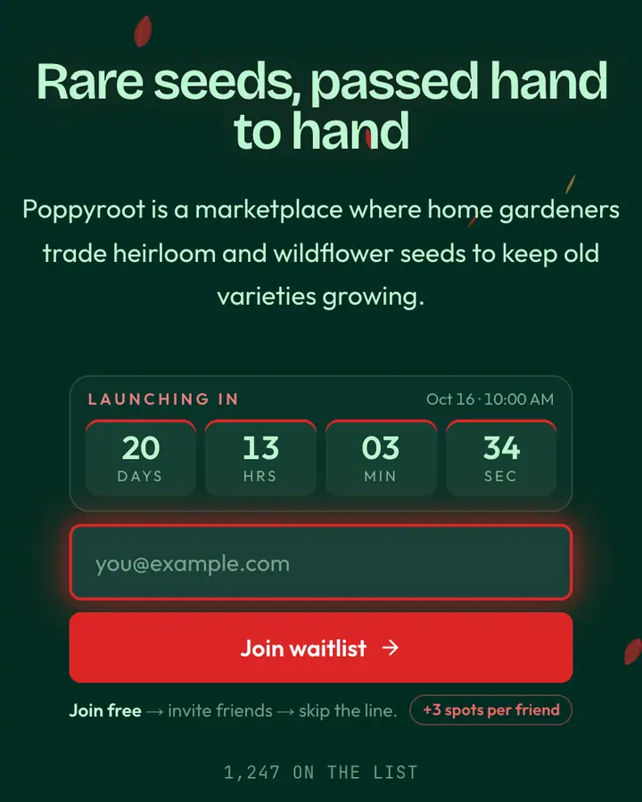
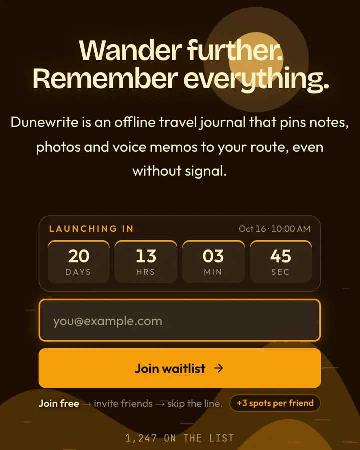
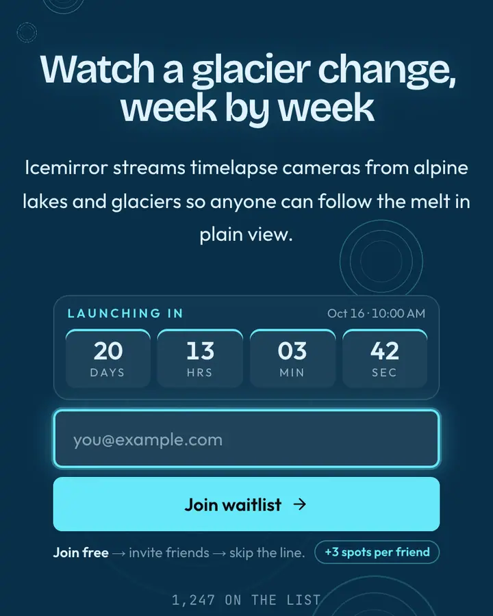
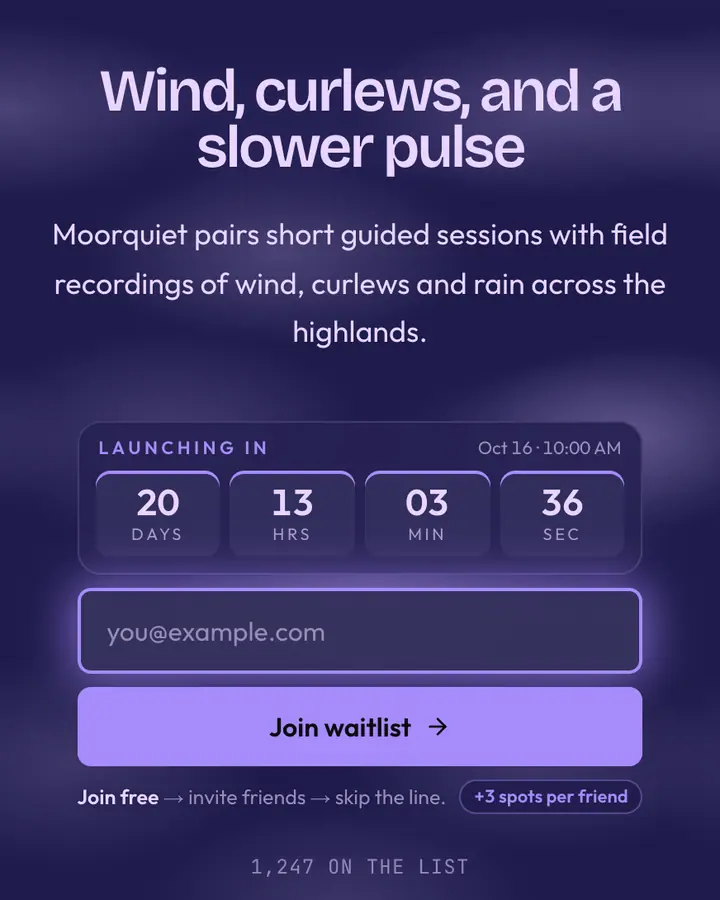
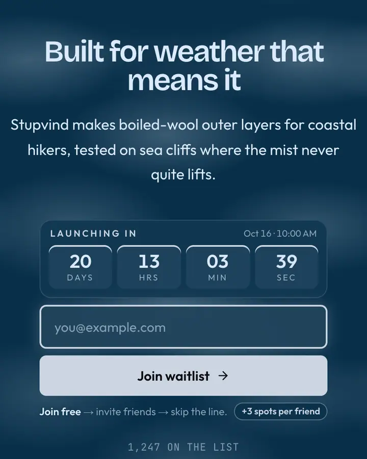
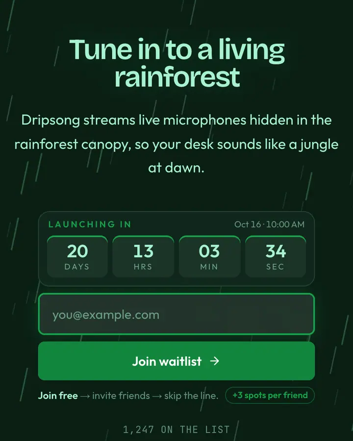
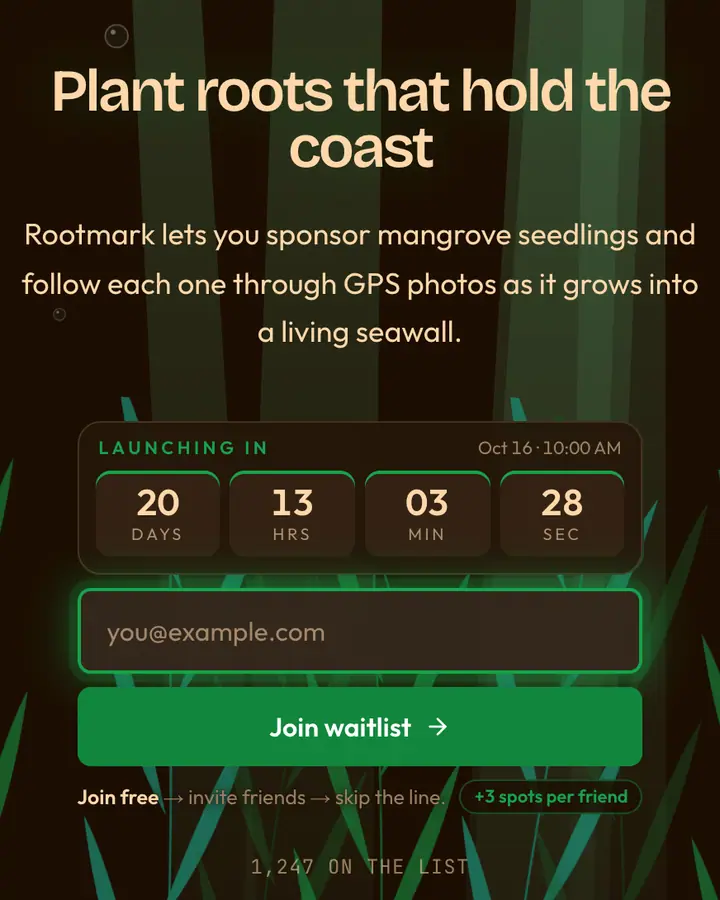
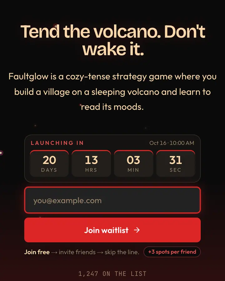
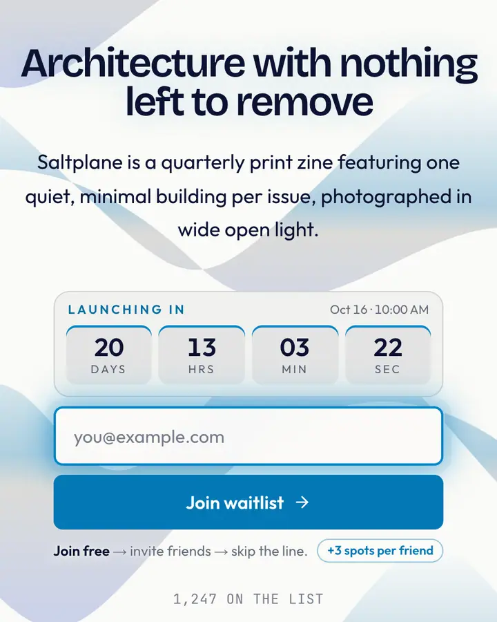
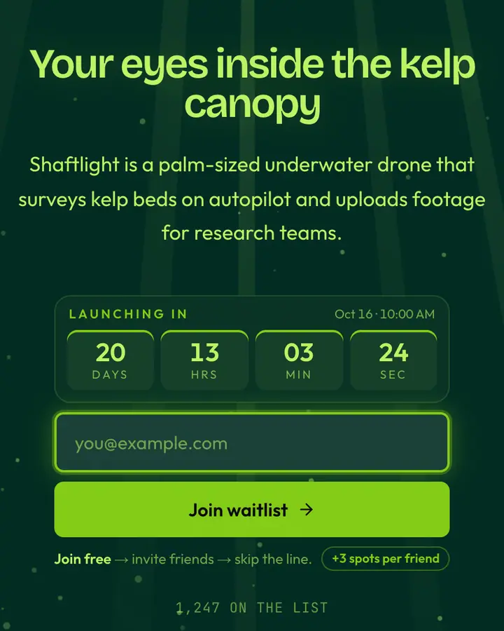
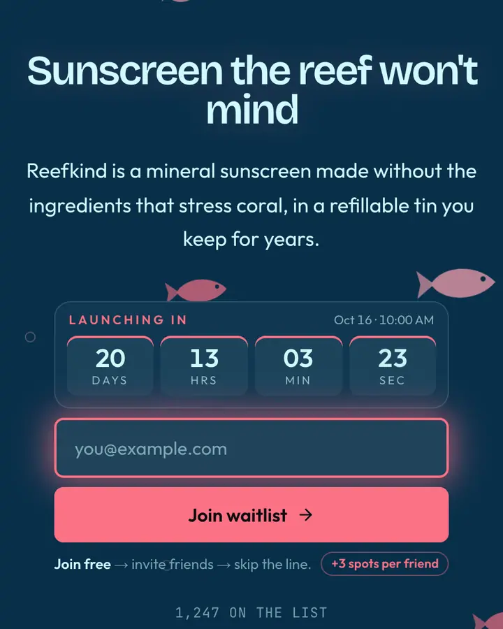
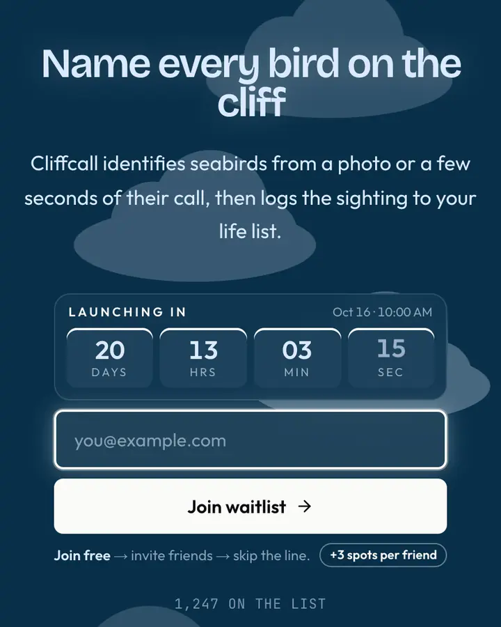
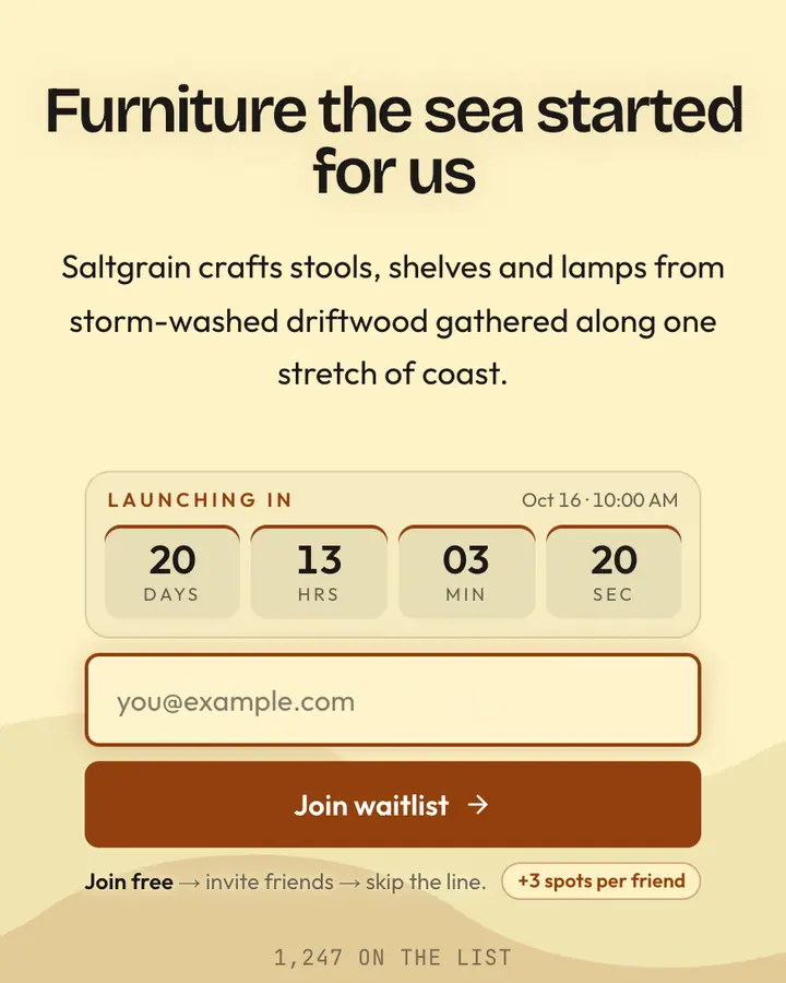
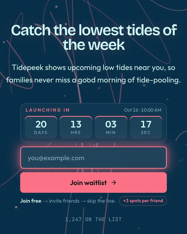
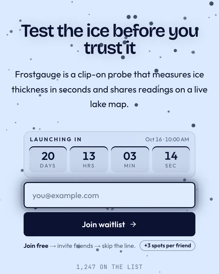
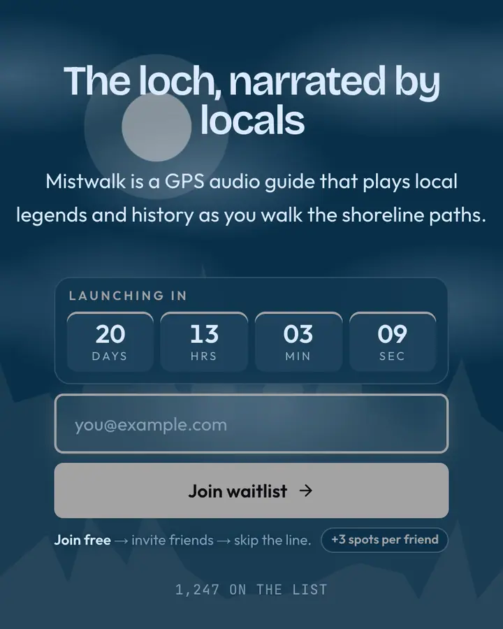
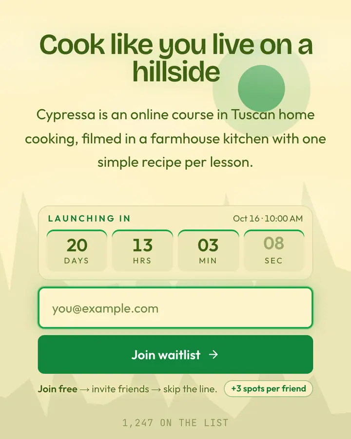
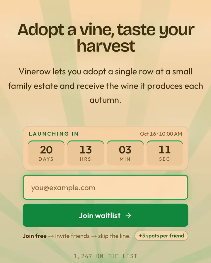
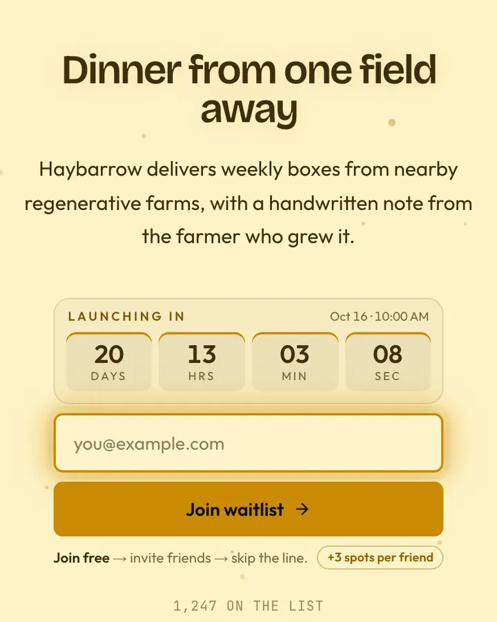
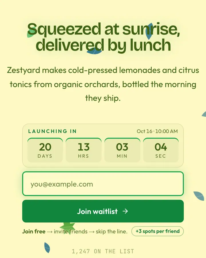
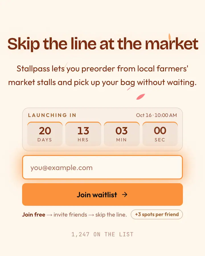
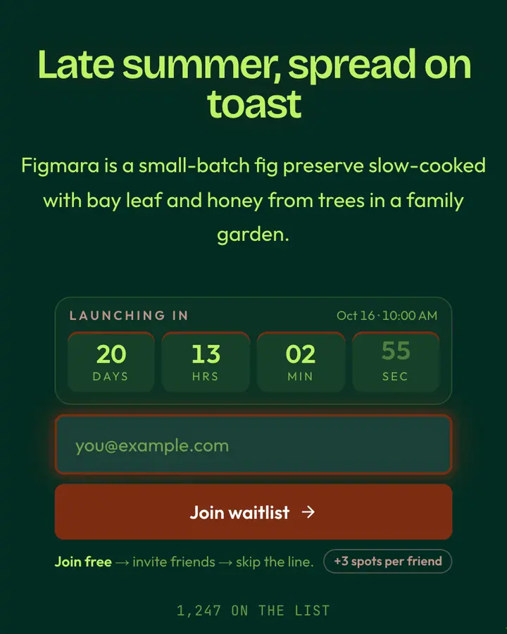
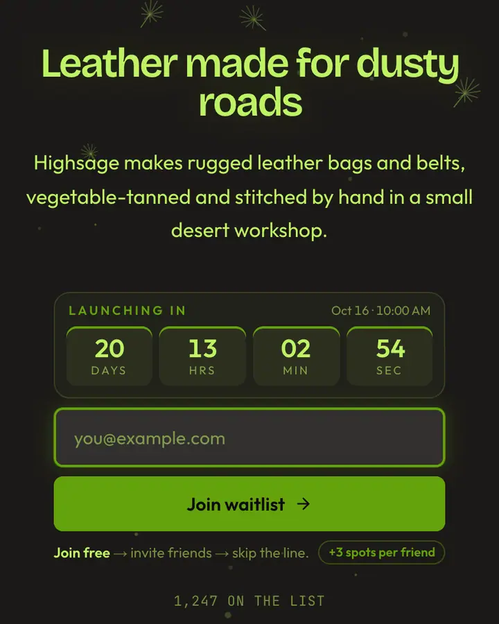
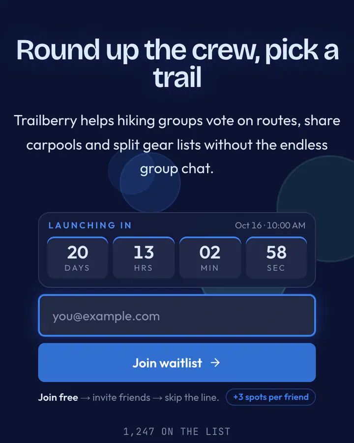
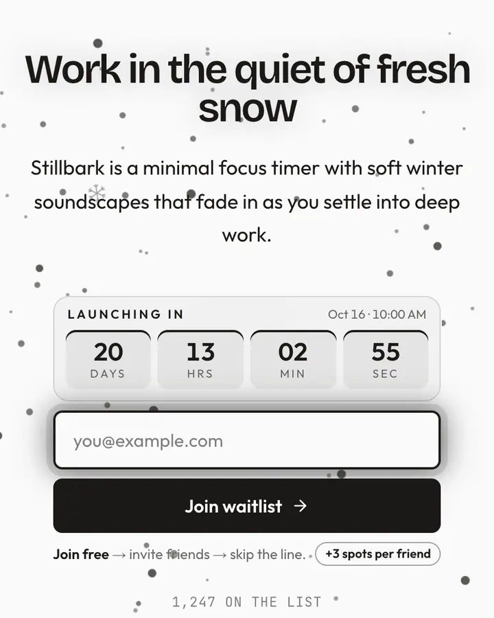
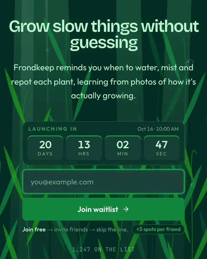
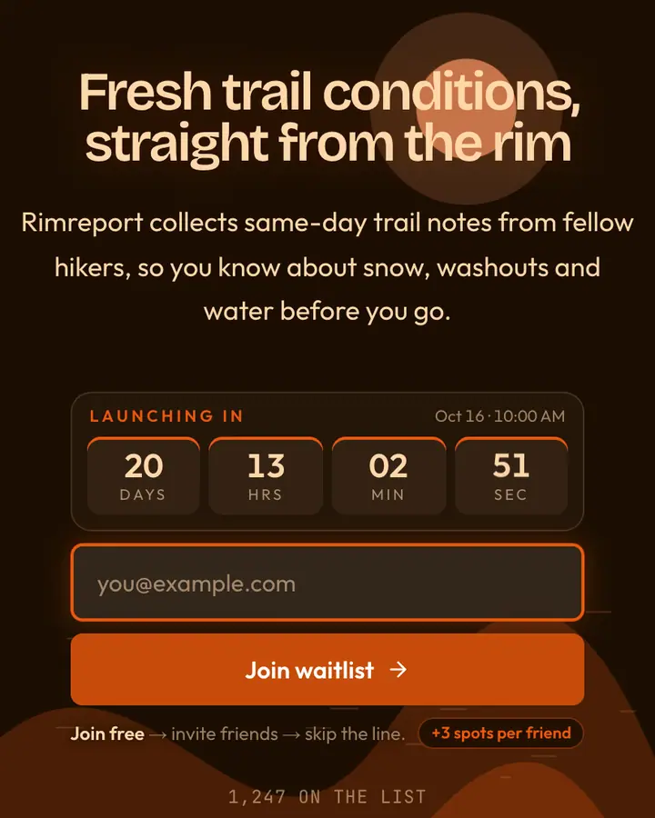
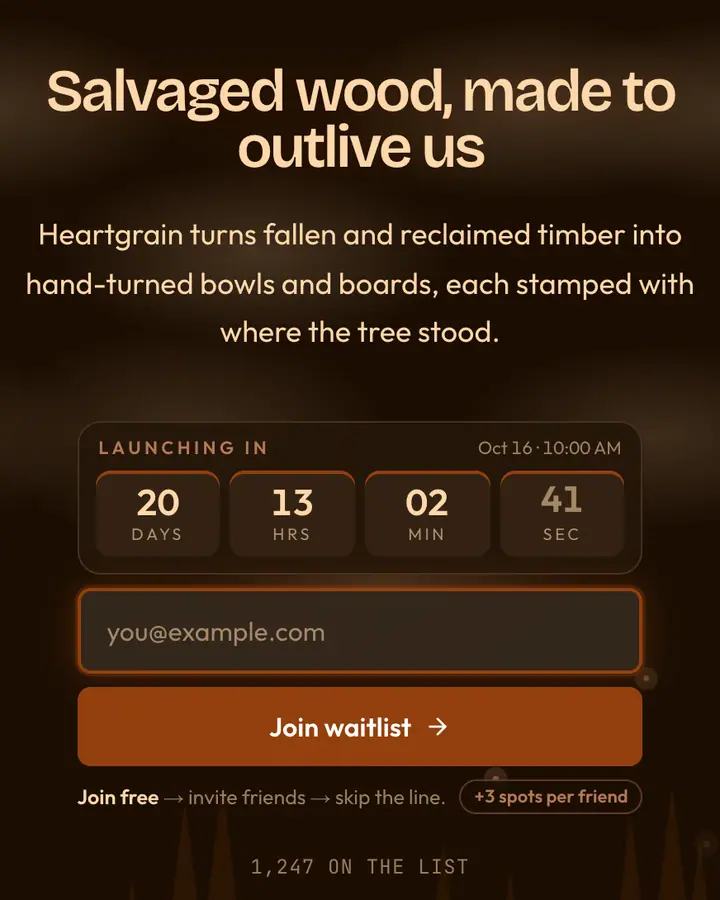
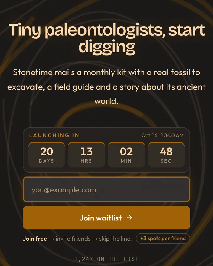
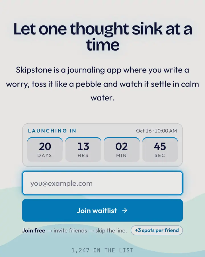
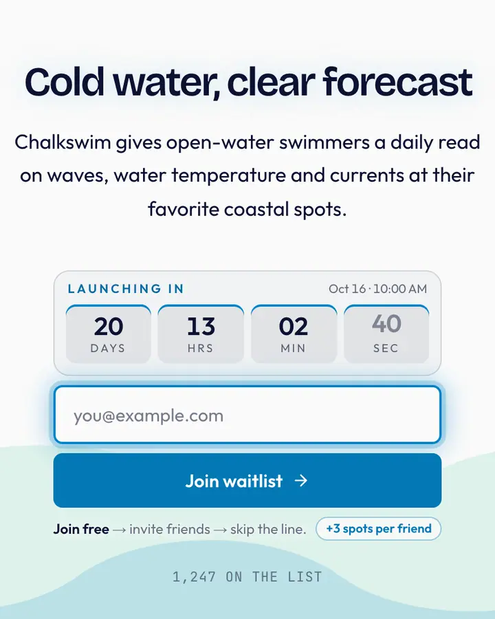
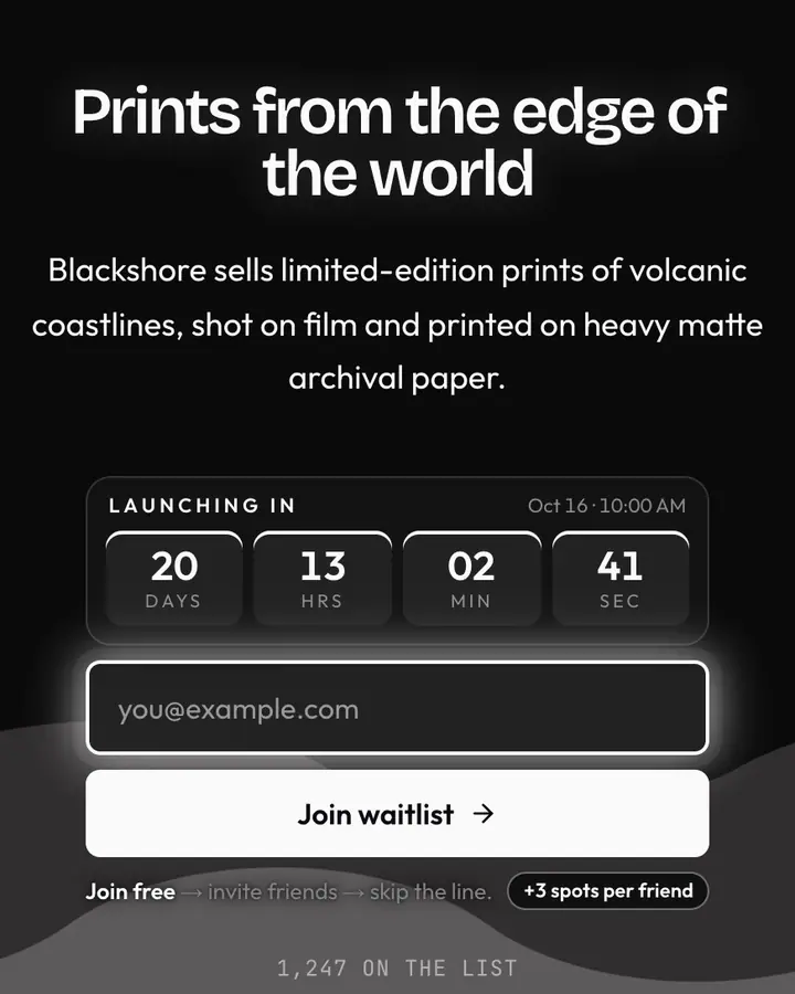
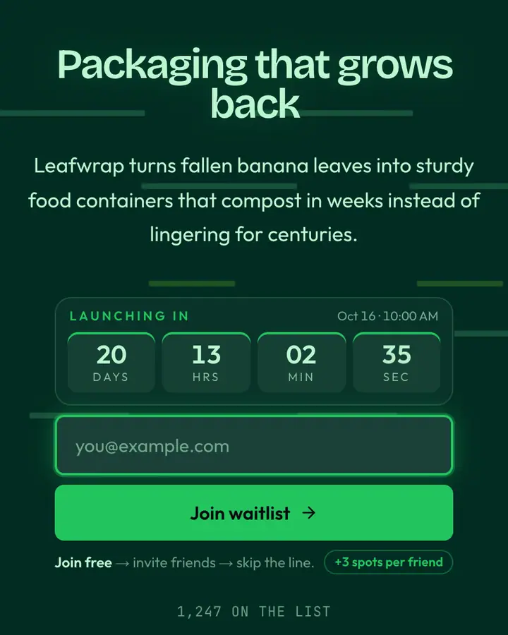
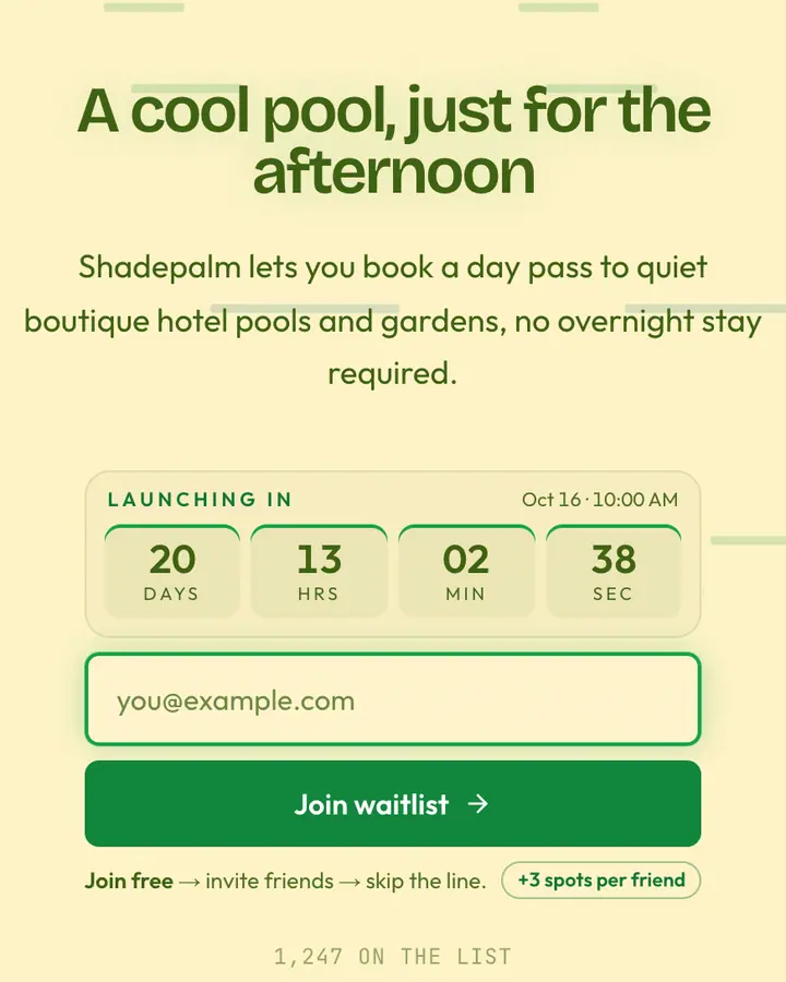
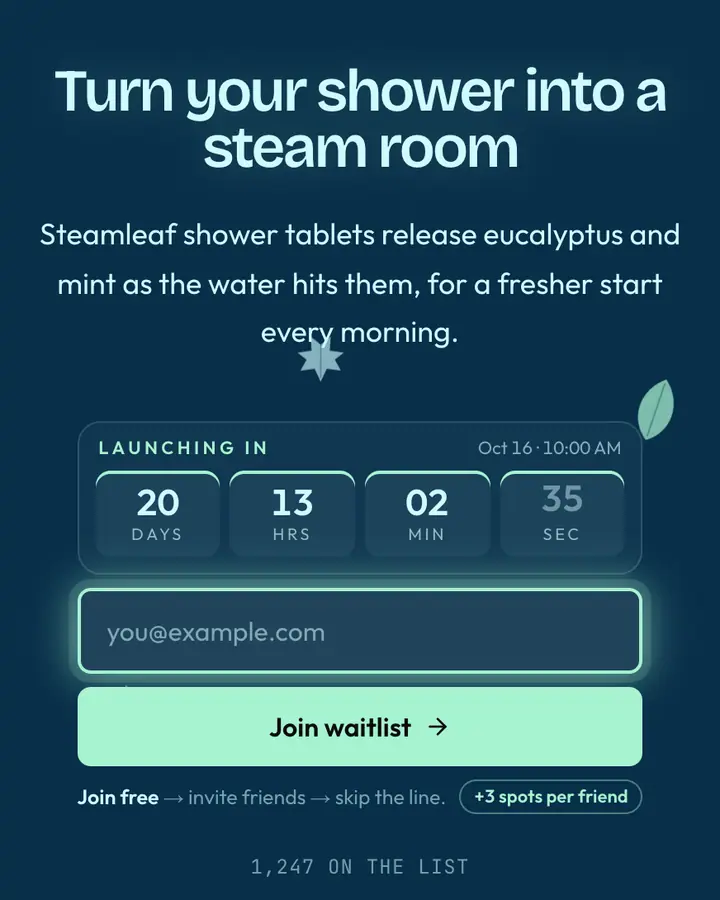
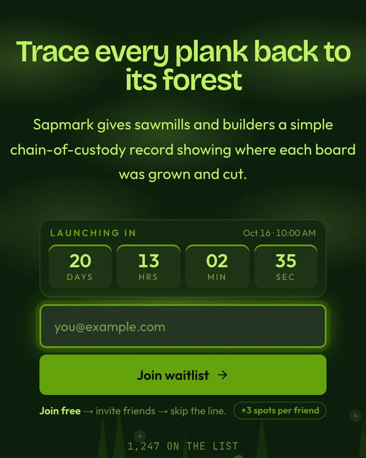
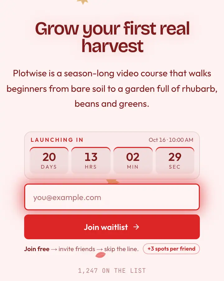
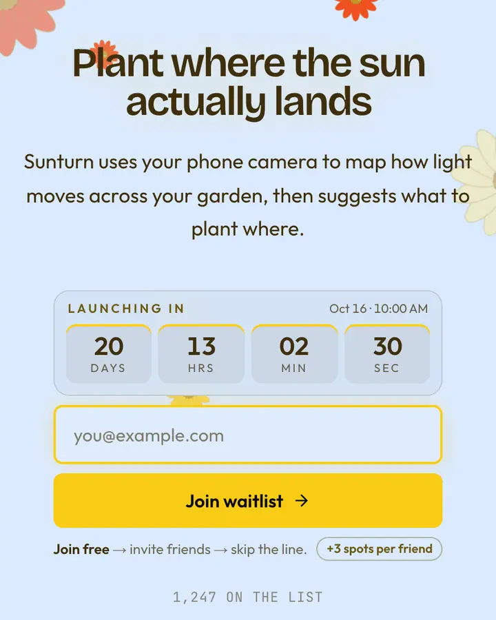
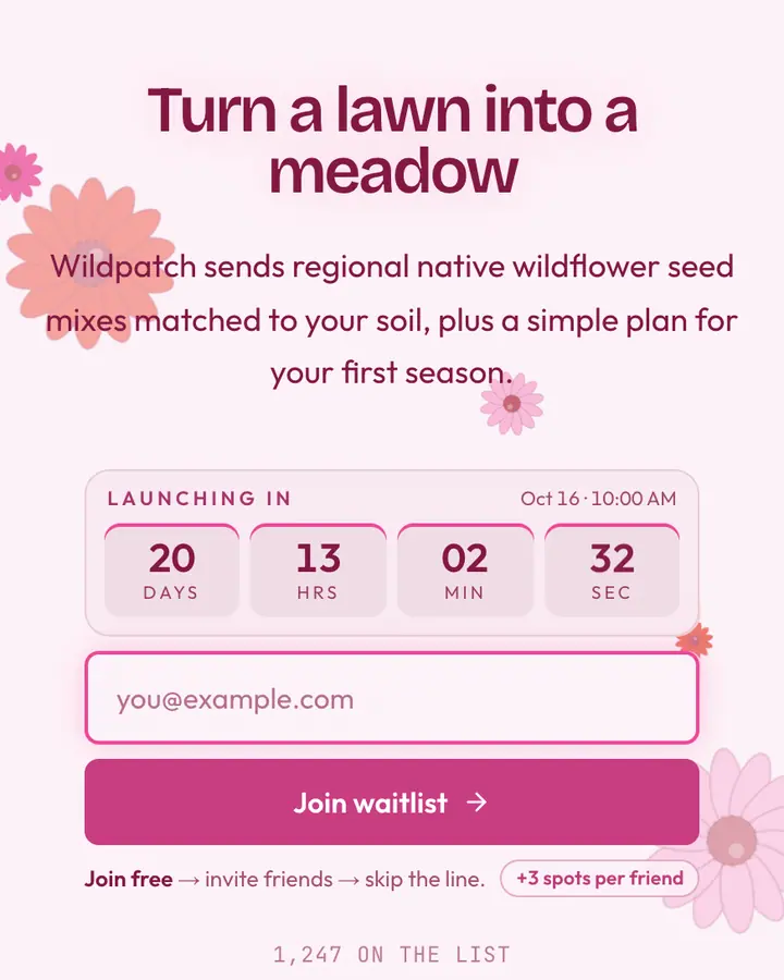
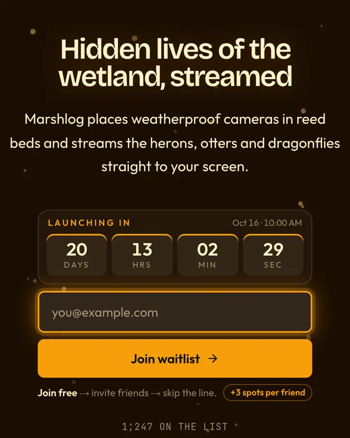
An organic launch page should slow the visitor down just enough to feel the brand, then get out of the way. Choose a palette from one landscape and stick to it: moss and stone, sand and indigo, glacier blue and white. Mixed biomes look like stock photography.
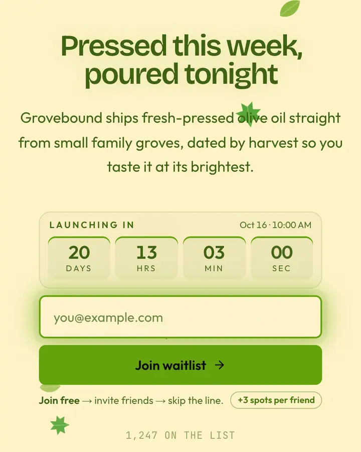
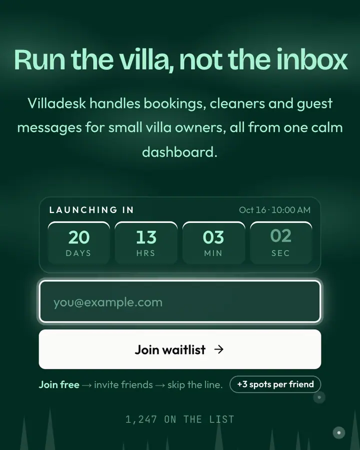
Motion is the difference between a nature page and a nature photo. Gentle, repeating movement (leaves, water, fog) makes the page feel alive without competing with the form, and it stays still for visitors who prefer reduced motion. Write warm, plain copy: what changes in the customer's day, and when they get it. Sustainable brands should make only claims they can back; the page looks trustworthy, so the words have to be too. Light templates suit morning and wellness products; dark ones suit sleep, night sky and deep-ocean themes.
Best nature & organic templates for…
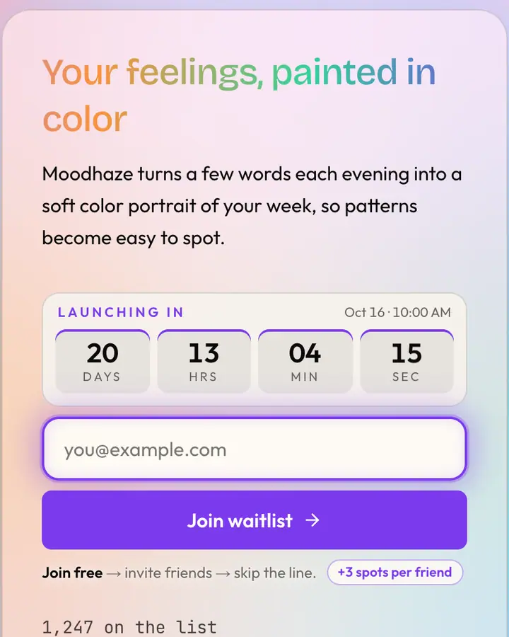
- For wellness and mindfulness apps: Aurora, drifting color blobs behind frosted glass on a warm light base.
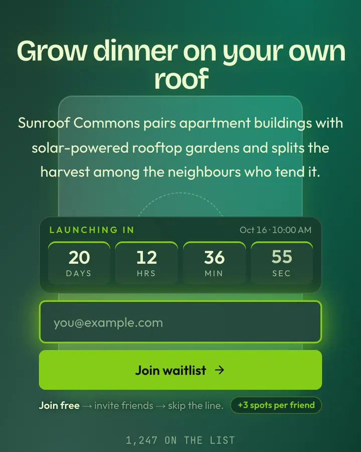
- For climate and sustainability startups: Solarpunk Oasis, a glassmorphic card on a sun-drenched leafy field, built as its own layout.
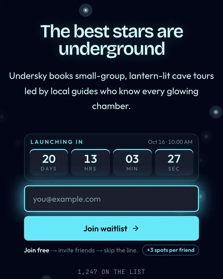
- For sleep and night-time products: Northern Lights, aurora ribbons across a dark sky.
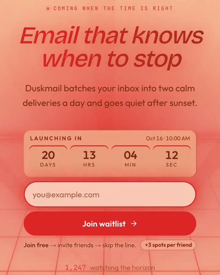
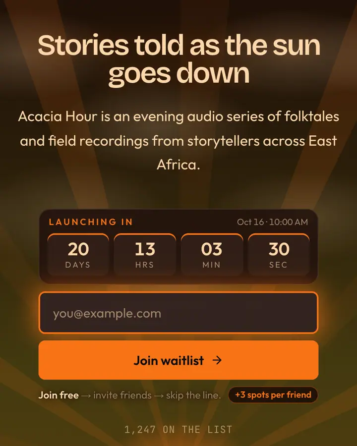
- For travel and lifestyle brands: Sunset, a warm, slow gradient that feels like the end of a good day.
Nature & Organic templates FAQ
Which nature template suits a wellness app?
Light templates with soft motion, such as Aurora, Cherry Blossom or Desert Dawn, feel calm and approachable. Dark ones like Northern Lights suit sleep and evening routines.
Do the animated backgrounds respect reduced motion?
Yes. Visitors whose device asks for reduced motion see a still frame instead of falling leaves or moving water.
Can I add my own photo as the background?
Not today. Backgrounds are part of each template's design; you can change every color and all of the copy, and add your logo on Pro.