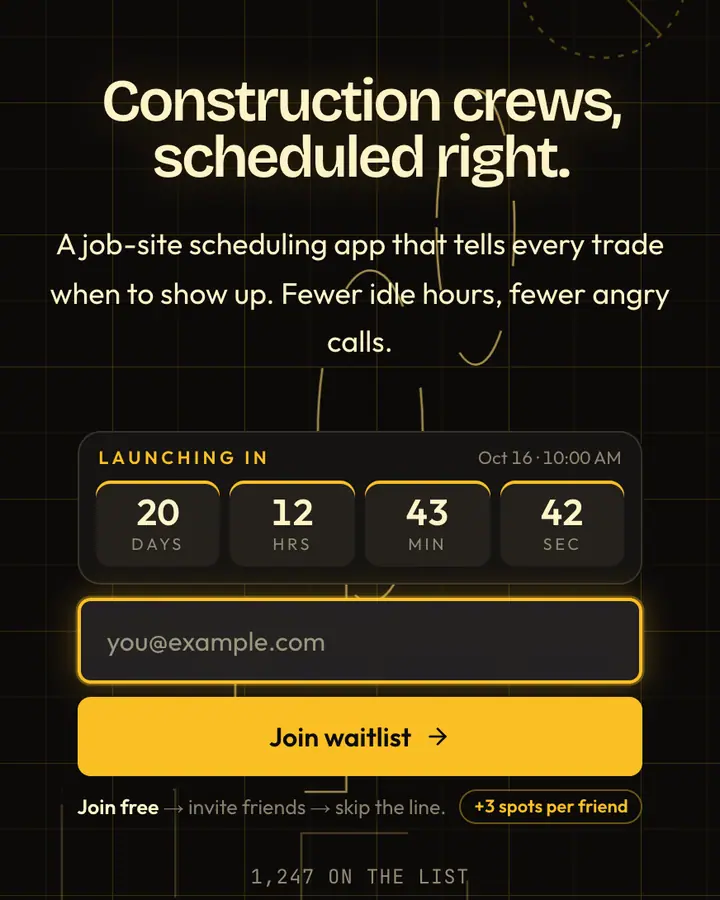

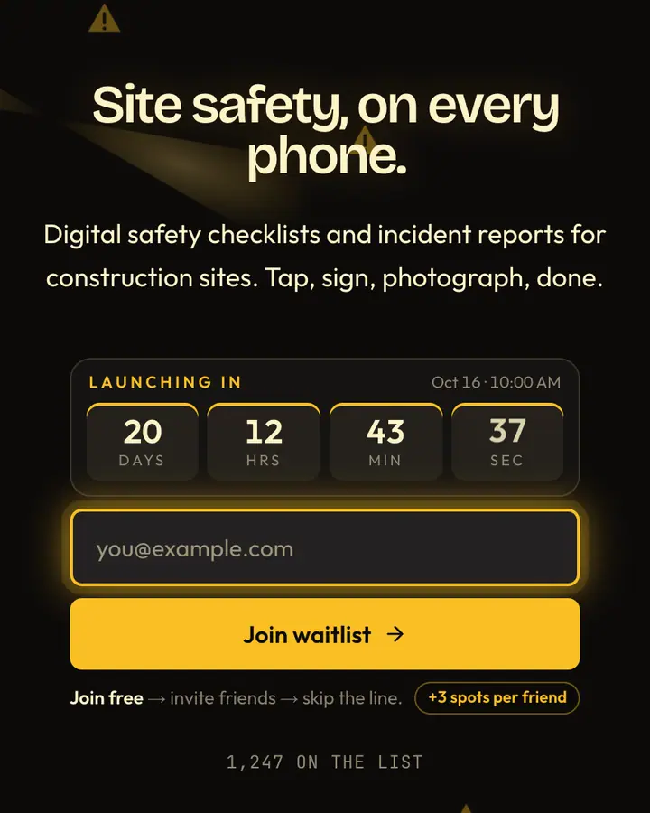
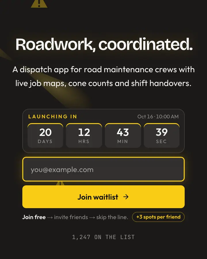

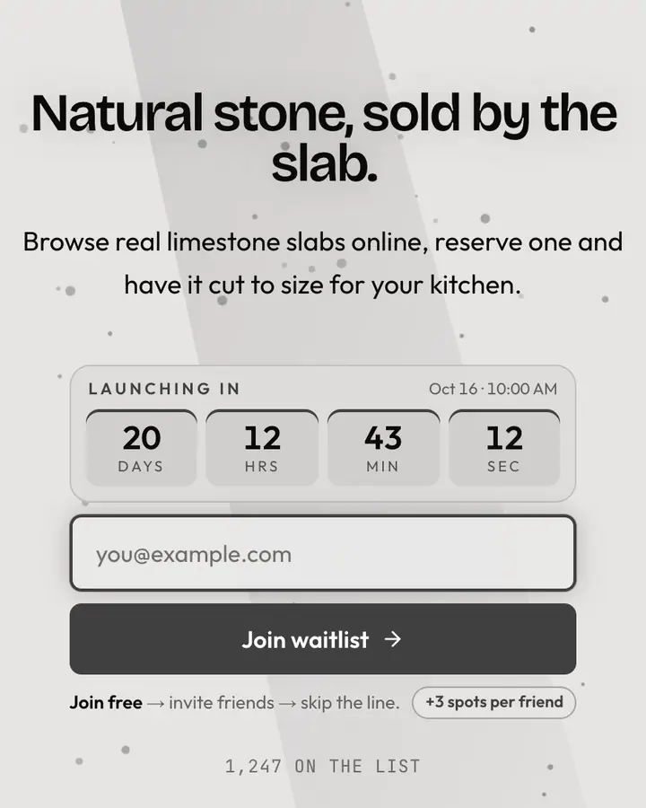

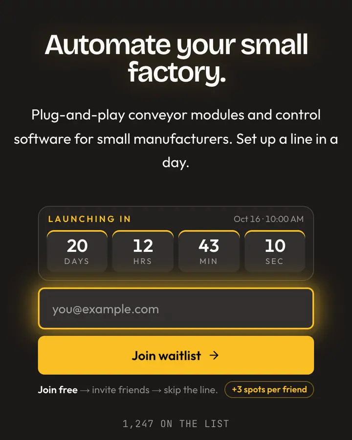

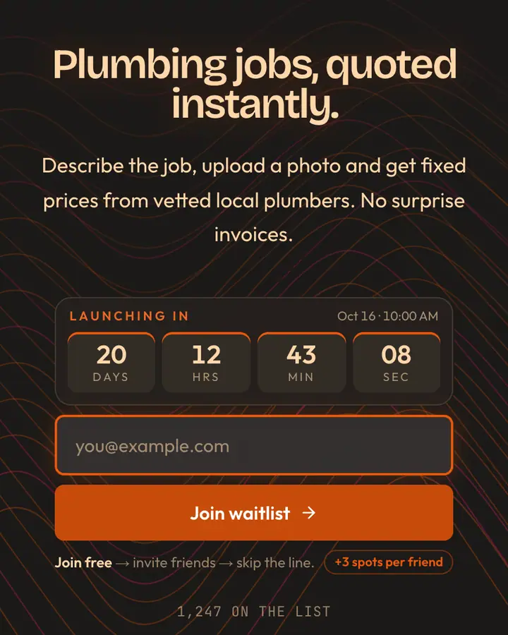
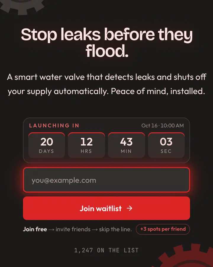
What makes a good industrial & brutalist launch page
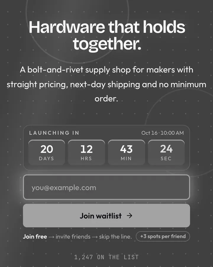
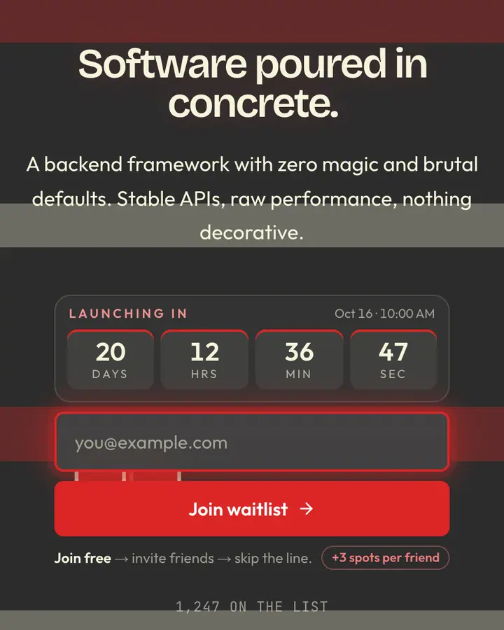
Brutalism in web design means honesty: visible structure, heavy borders, default-looking type used on purpose. It works for launches that want to look engineered rather than decorated. Keep the grid visible, the type large and the copy blunt: what it does, who it's for, when it ships.
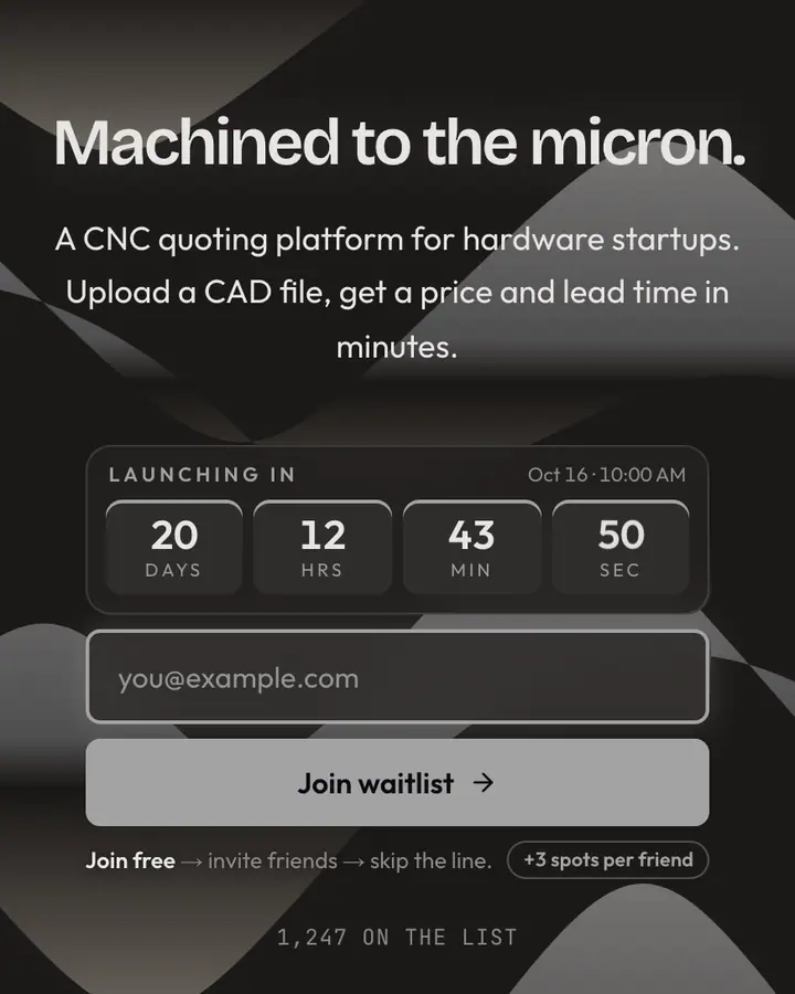
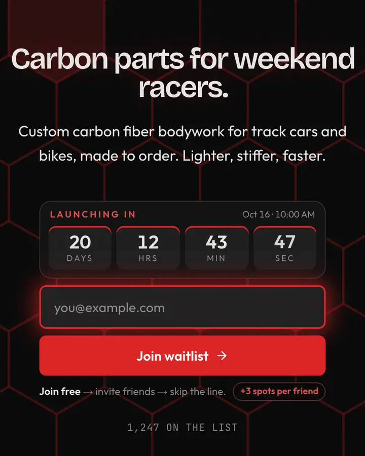
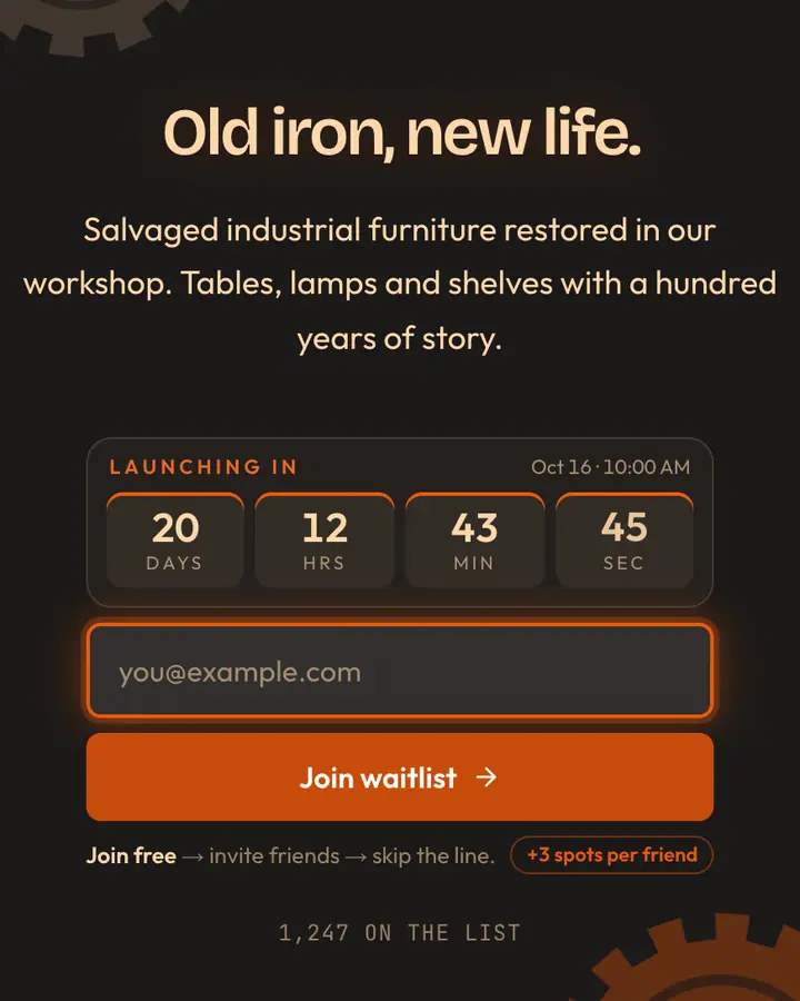
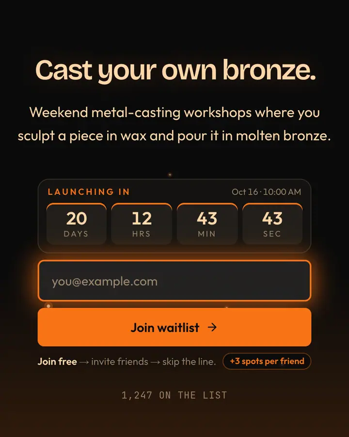
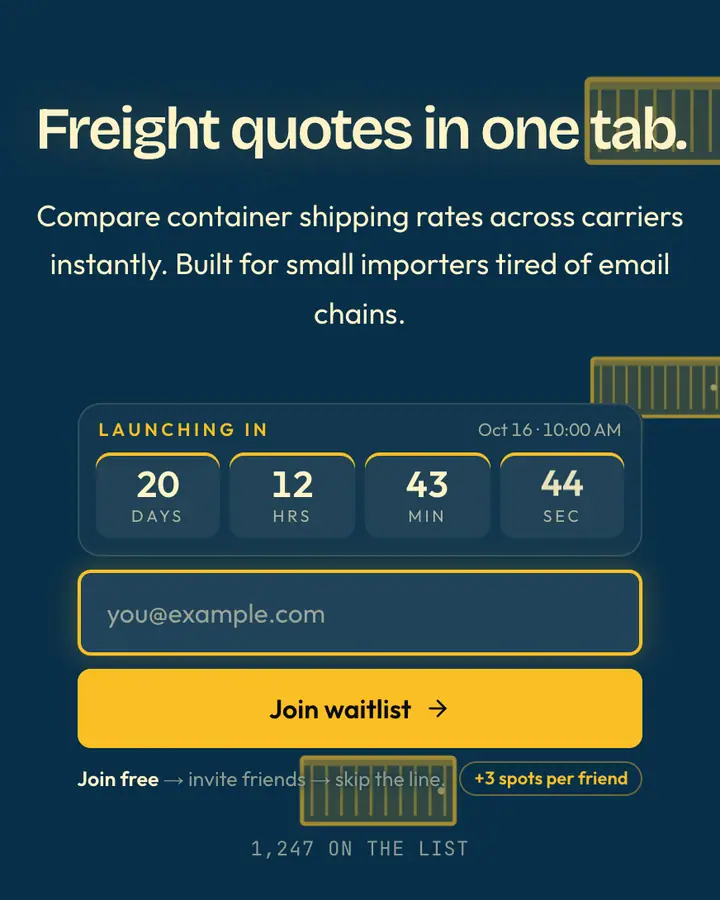
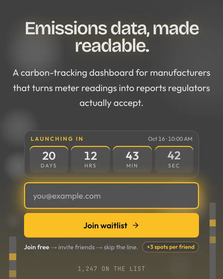
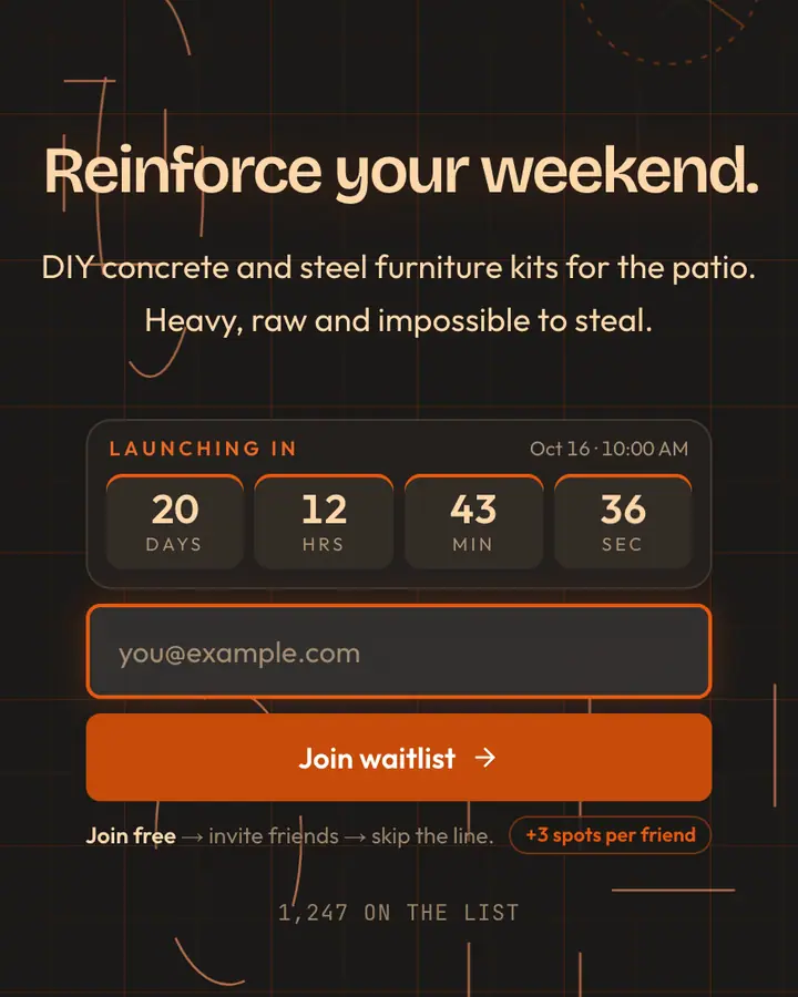
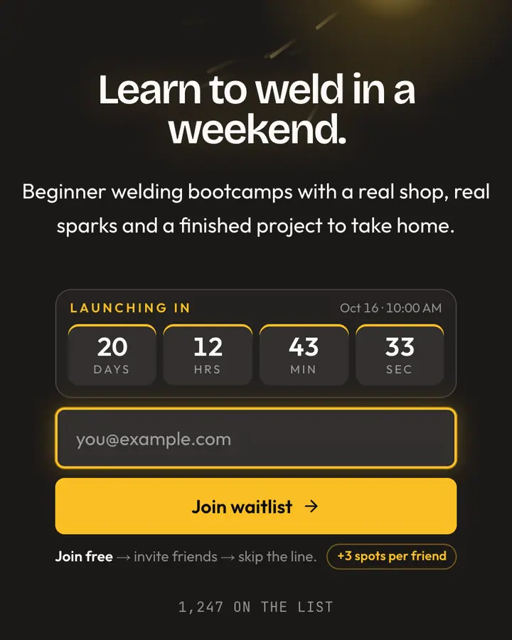
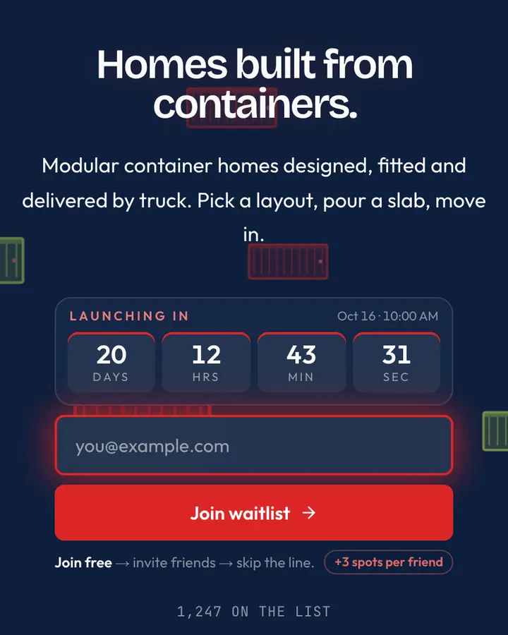
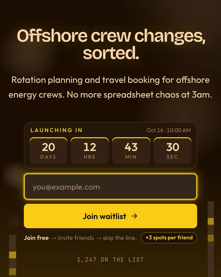
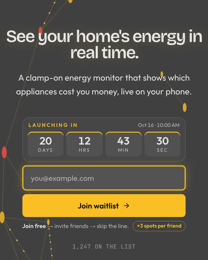
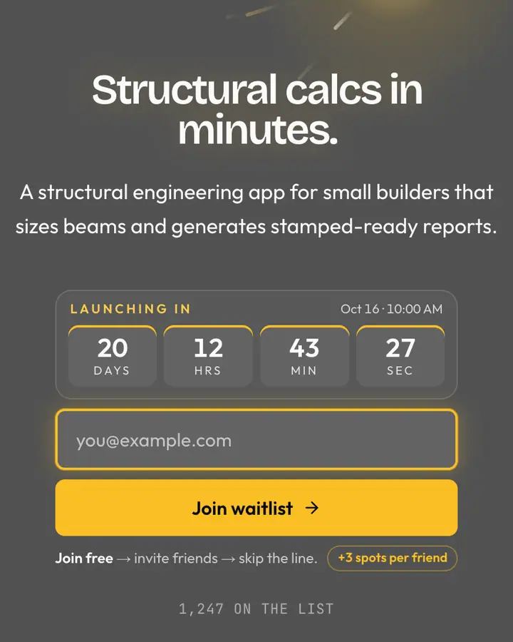
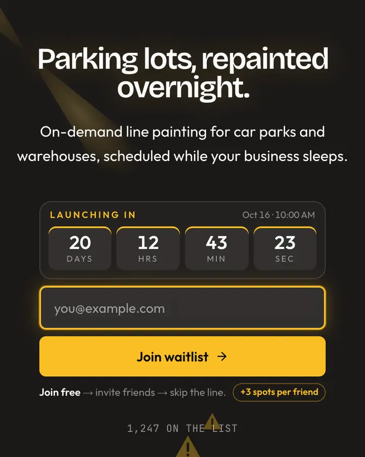
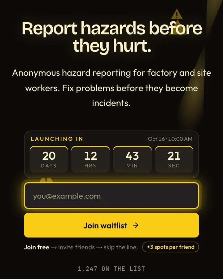
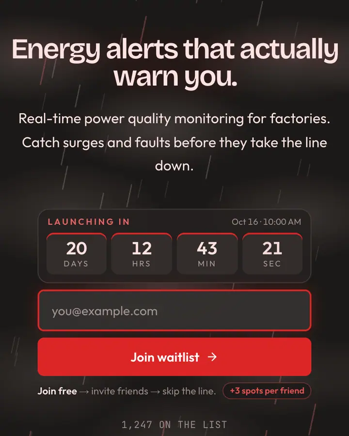
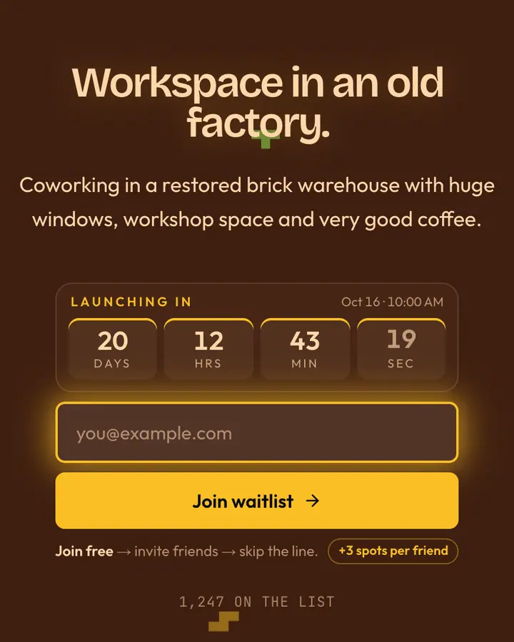
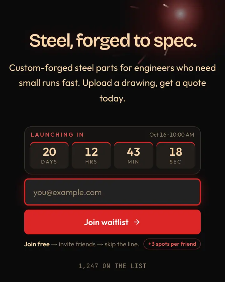
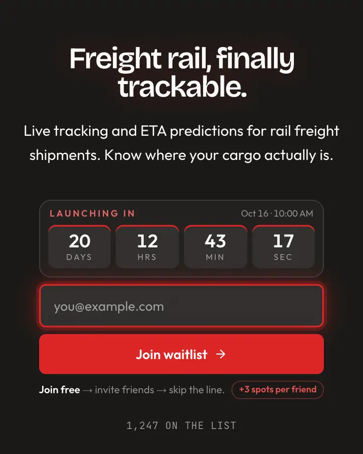
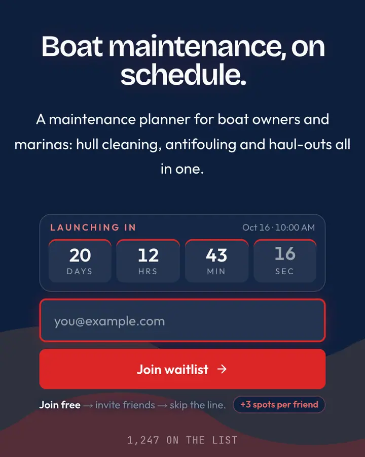
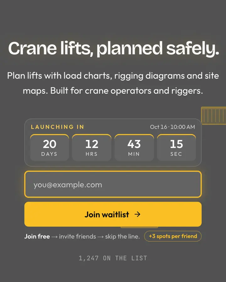
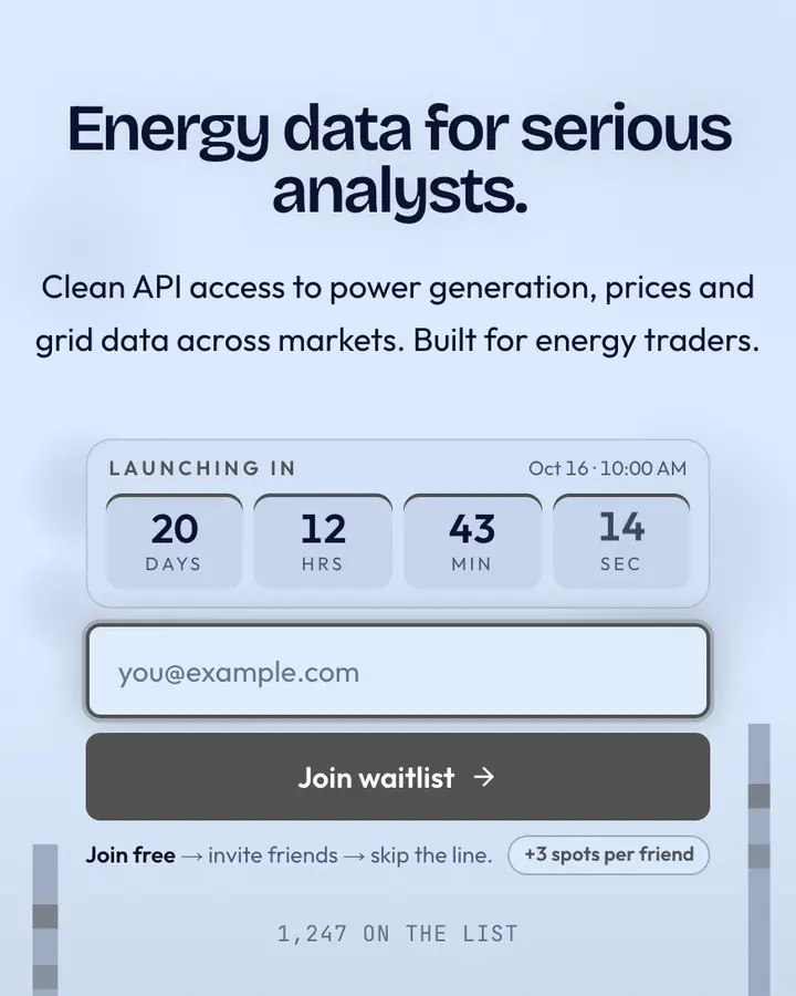
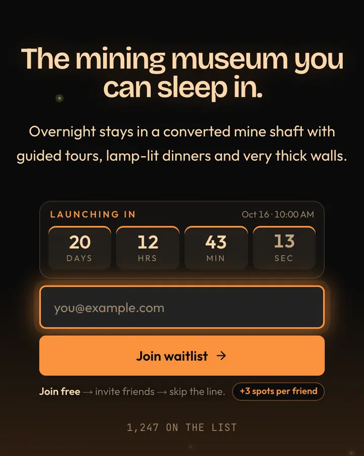
Industrial palettes are dark and material (concrete grey, steel, rust, cobalt) with one high-visibility accent such as safety yellow, hazard orange or signal red. Use that accent only on the button and the referral highlight so it keeps its warning-sign energy. This style suits B2B buyers who are tired of glossy SaaS pages, and hardware products where the physical build is the point. If you're running a pilot program, say how many slots exist and how people get picked.
Best industrial & brutalist templates for…
- For architecture and design studios: Architectural Brutalism, a hand-built layout of raw concrete texture and a heavy frame.
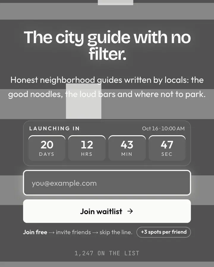
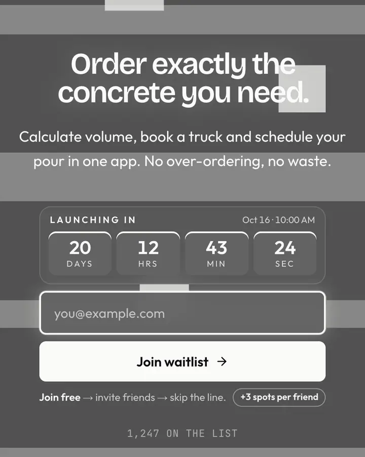
- For urban and construction tech: Concrete Jungle, raw urban grey, brutally honest.
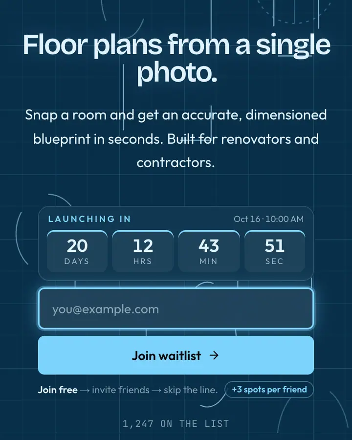
- For hardware and robotics: Blueprint Architect, a cyan drafting grid on a simulation-chamber layout.
- For field and workforce tools: Safety Yellow, high-visibility yellow on the Brutalist frame.
Industrial & Brutalist templates FAQ
What is brutalist web design?
A style that exposes structure: thick borders, visible grids, monospace or heavy grotesk type, flat blocks of color and few decorative effects. It takes its name from brutalist concrete architecture.
Is a brutalist page too harsh for B2B buyers?
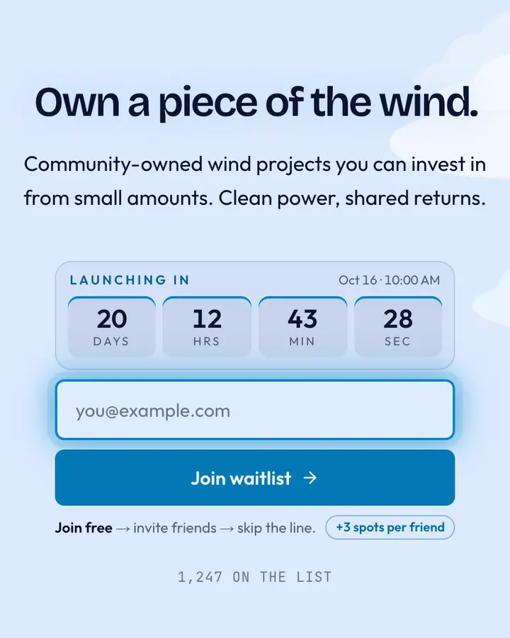
It depends on the buyer. Engineers and operators often find it refreshing and credible; if your audience expects polish, pair the layout with a calmer accent such as steel blue or cobalt.
Are all industrial templates brutalist?
Most use the Brutalist layout; a few use spotlight, manifesto or minimal layouts with industrial palettes for a softer look.