Waitlist Page Design: Structure Converts, Aesthetics Only Qualify
Waitlist page design has two jobs: the look tells visitors the page is for them, and the structure gets them to sign up. Pick fast, then fix structure.
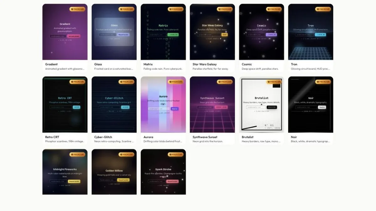
When we started building the Qubed template catalog, we assumed the loudest designs would matter most: more motion, more gradient, more spectacle. Building it changed our minds, and the reason is worth writing down.
A waitlist page answers two separate questions that founders often mix up. The aesthetic decides whether a visitor believes the page was made for them. The structure decides whether they act.
Choose the aesthetic to match your audience, then hold a few structural rules constant whichever look you pick. The first is a quick signaling decision. The second is where signups actually come from.
Pick the look your audience already lives in, not the one you'd hang on a wall
In our catalog, styles are built with particular audiences in mind. Terminal & developer templates are built for dev tools. Monochrome and brutalist layouts suit technical and editorial products. Gradient and glassmorphism templates suit consumer and AI apps. Creative tools can go loud with vaporwave, Y2K or starfields. Financial and B2B products usually want the quietest layouts.
This isn't self-expression; it's signaling that you belong. A developer landing on a soft pastel gradient with a rounded sans-serif reads it, correctly, as not built for them. The same page is exactly right for a consumer scheduling app.
Two things follow. Pick the aesthetic your reader already lives in, even if it isn't your favorite. And don't spend more than a few minutes on it. If you're launching a developer tool, something like Retro CRT sends the signal instantly.
One aside: dark designs are fashionable right now. Light layouts work fine too, and they stand out precisely because so many pages went dark.
A few structural rules hold on every page that gets signups, whatever it looks like
These hold across very different visual languages.
One action. An email field and a button, and nothing else competing for the click. A second call to action doesn't add a path; it splits the first one. "Join the waitlist" next to "Read the docs" invites people to do neither.
The form above the fold. Every scroll you require before the ask costs signups. Founders push the form down to make room for a value proposition. On a waitlist page, the form is the value proposition.
The button is the highest-contrast element on the page. Not the background, not the headline, not the logo. Contrast is attention, and attention should land on the thing you want clicked. This is the most common problem on otherwise beautiful pages.
One field, unless a second earns its place. Every extra input adds effort, and most are collected out of optimism rather than need. Ask for a name after signup, on the success screen, where it reads as onboarding rather than a toll.
Motion never moves the text. Animated backgrounds are fine. Animated copy isn't, because it delays reading, and reading is the whole job of the first few seconds.
The most impressive template isn't always the right one, and the reason is mobile
Heavy effects raise perceived production value, which helps credibility. They can also slow down how fast a visitor understands the page. On a fast laptop that trade usually works out. On a mid-range phone on mobile data, a visitor may leave before the effect that was supposed to impress them has finished.
Check where your traffic comes from before choosing. If most of it is mobile, as it usually is for consumer products, lean toward the calmer end of the catalog, like minimal templates. You can add motion later; you can't get back the visitors who left during it.
A useful rule: if the page isn't readable with animations turned off, the animation is doing too much.
Spend minutes here and the rest of the day on distribution
Template choice has a real but bounded effect. Copy has a bigger one. Distribution has the biggest, and it's the only one without a ceiling.
The trap is spending a week on the page because it's the part you can control from your desk. It feels like progress and usually isn't.
So pick the aesthetic that matches your reader, check the structural rules, change the colors to your brand and publish. Then close the tab and go find people to show it to.
Browse the catalog and pick one in the next two minutes. Every Qubed template already follows these rules: one action, form up front, a clear button and no motion on the headline. Filter by style, preview it live, publish it free. Launching a mobile app? The mobile app waitlist guide has picks that read well on small screens.
Your page doesn't need to win a design award. It needs to be understood and clicked.
Build your waitlist page free
Pick a template, write your headline and publish. Referrals, a launch countdown and stats are built in on every plan.
Browse free templatesRelated guides
- Waitlist Landing Page Copy: Name the Outcome in Six Words or Lose the VisitorHow to write waitlist landing page copy: name the outcome in six to ten words, add one line on how it works, one field, one button and a reason to join.
- How to Build a Waitlist: Step-by-Step Guide (2026)How to build a waitlist that grows before launch: write the promise, pick a template, add referrals and a countdown, publish, get signups, then launch.
- How to Get Your First 100 Waitlist Signups Without a Launch PlatformYour first 100 waitlist signups come from direct messages, two communities and one useful piece of writing, not a launch platform. Here's how to run it.