What makes a good glassmorphism launch page
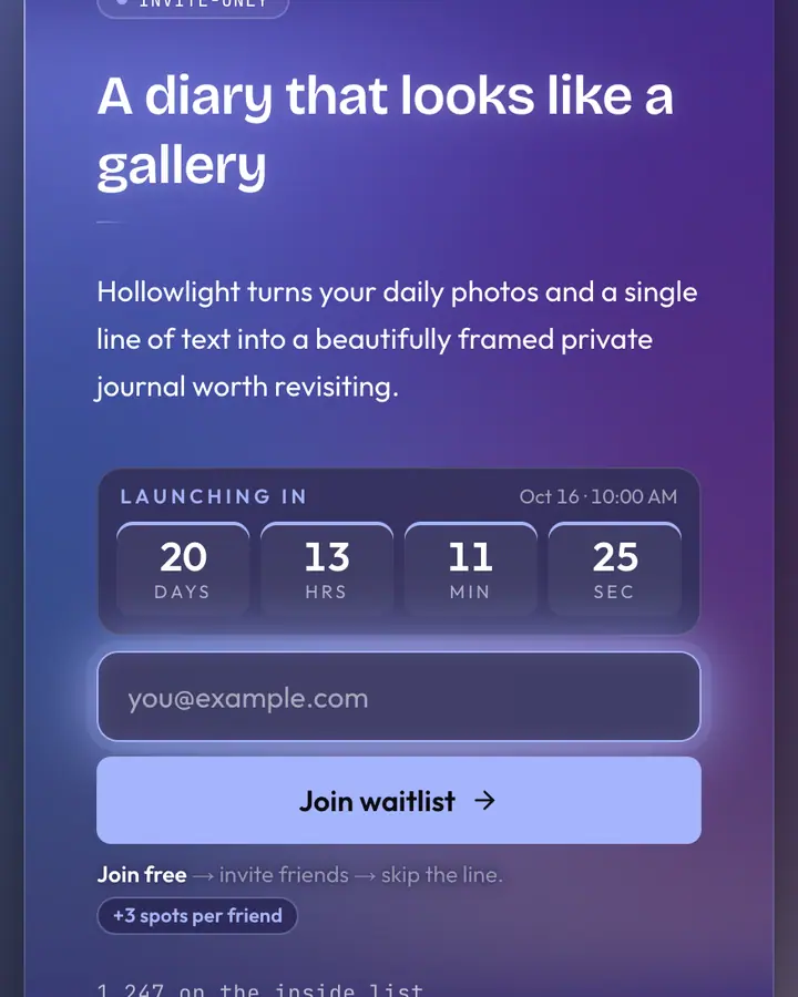
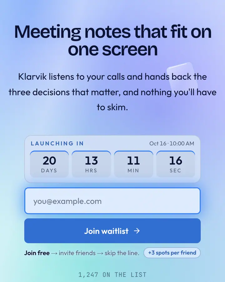
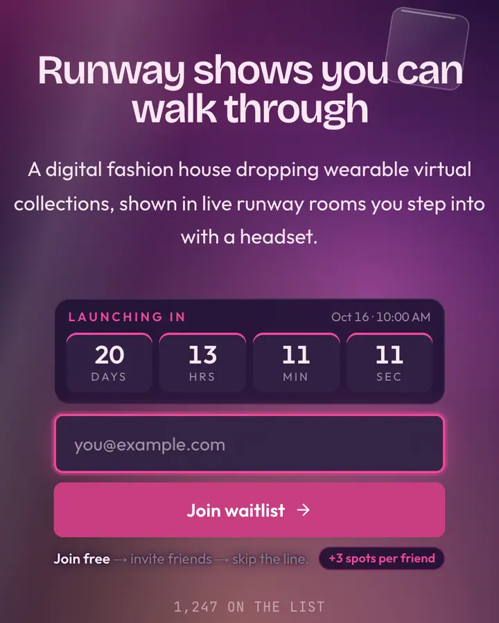
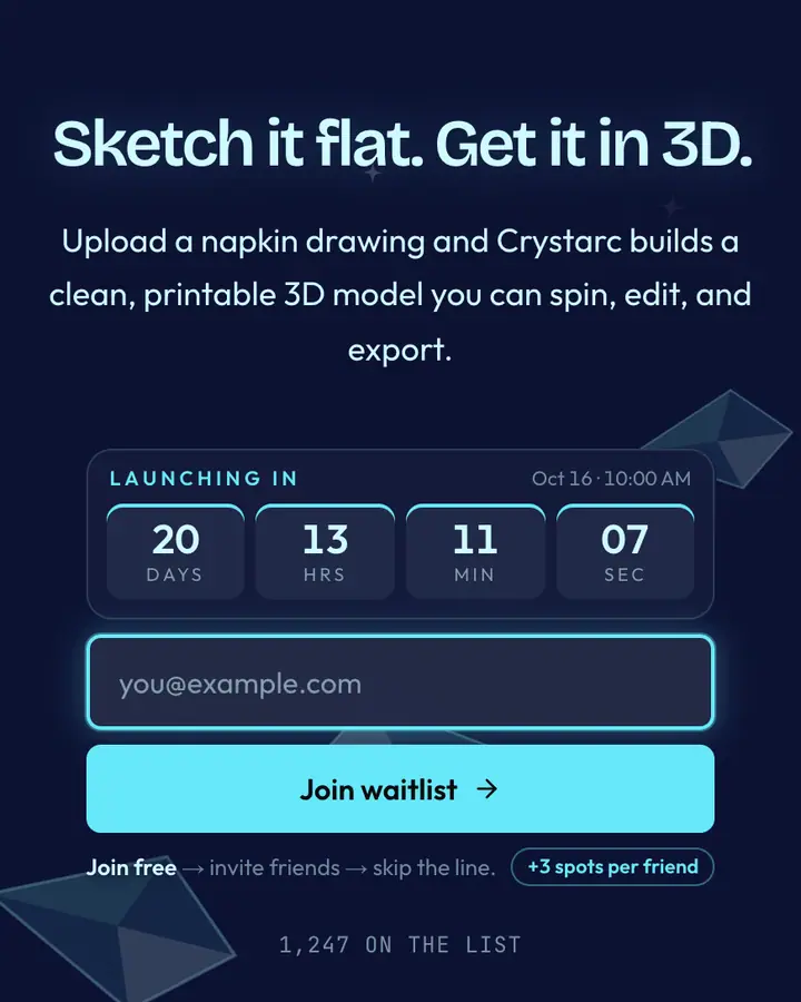
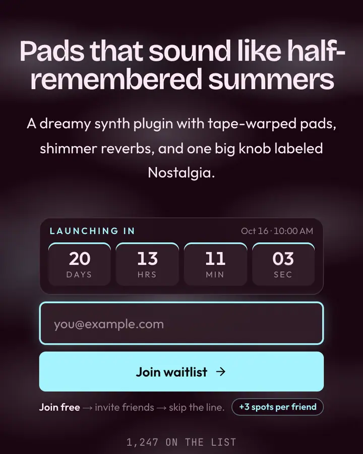
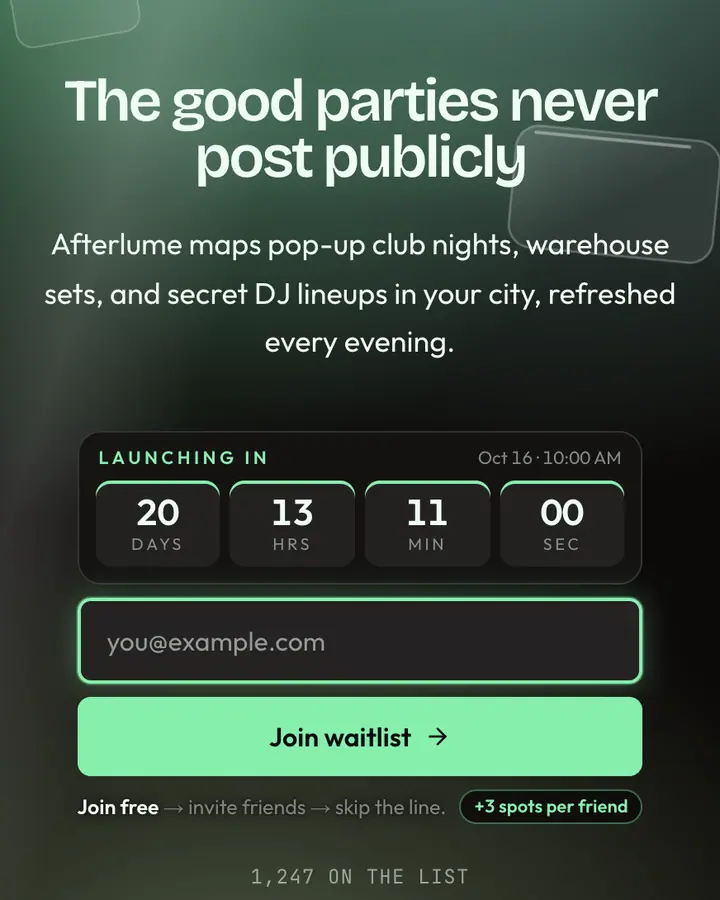
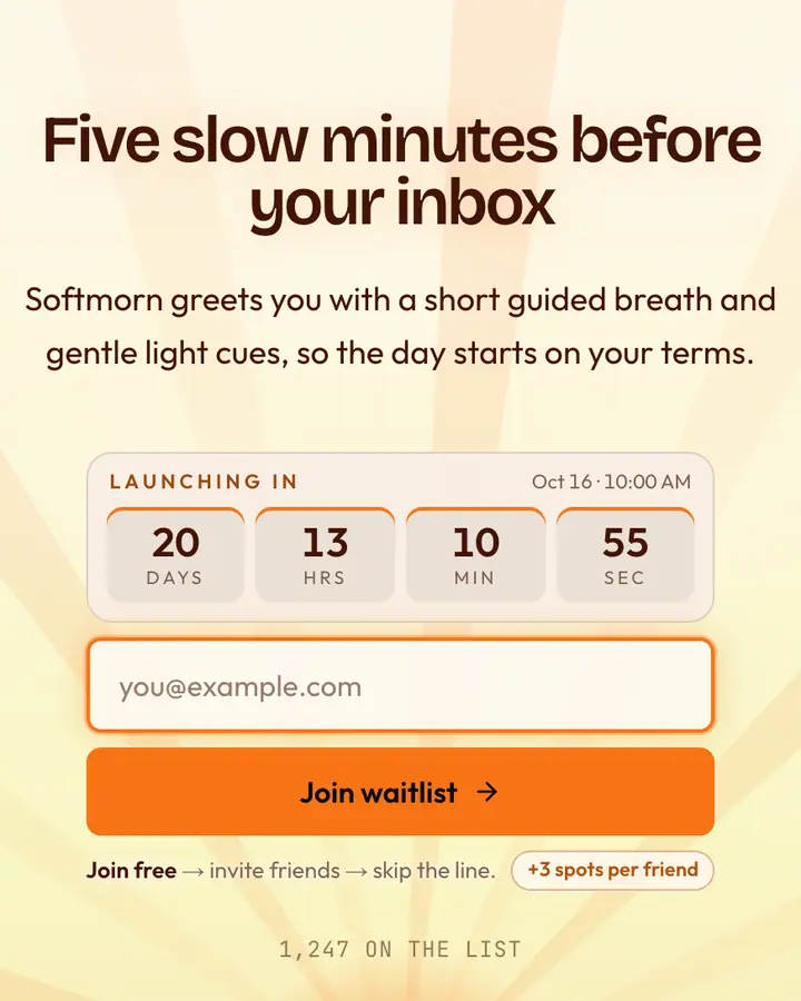
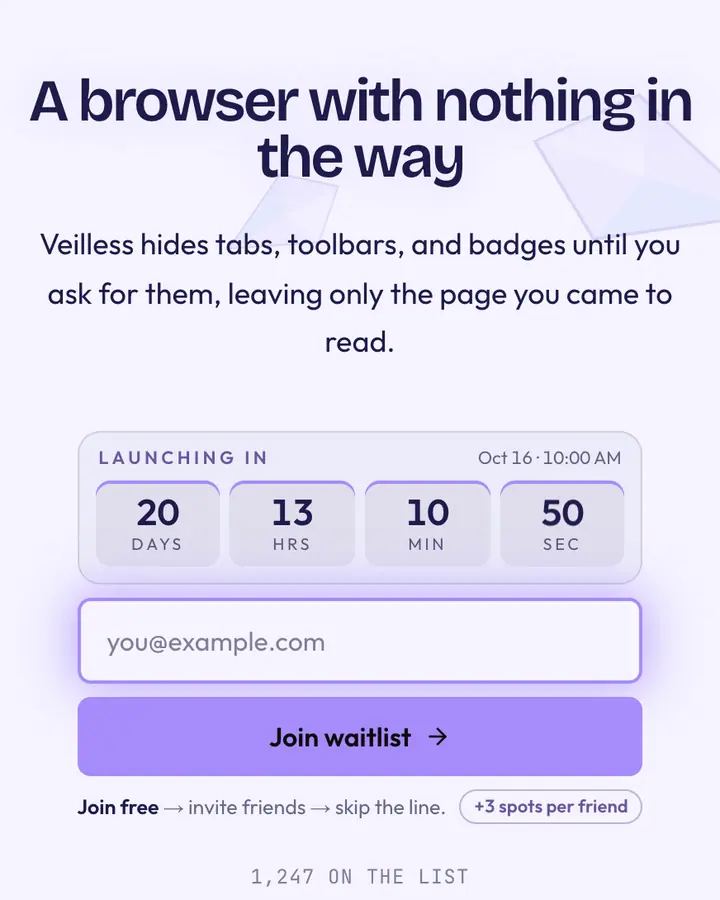
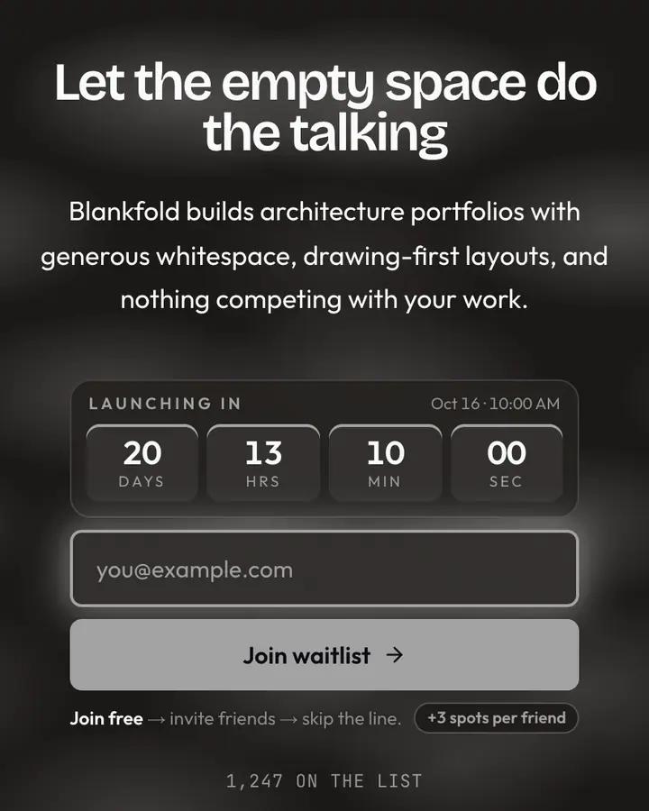
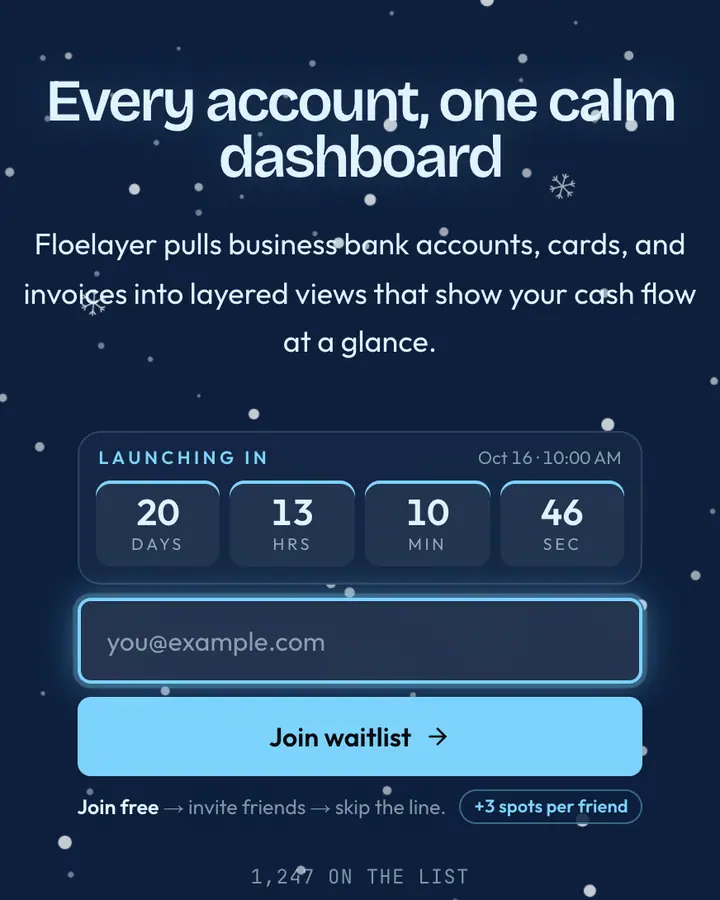
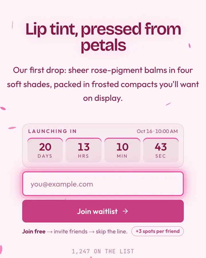
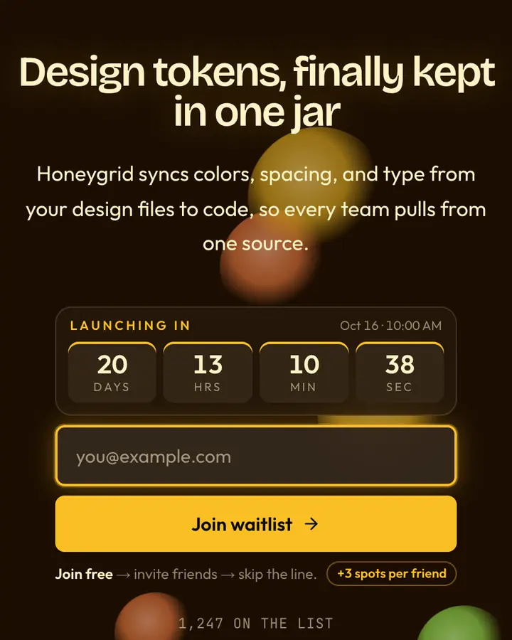
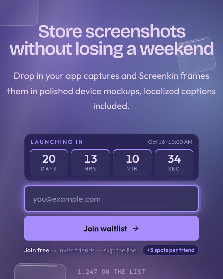
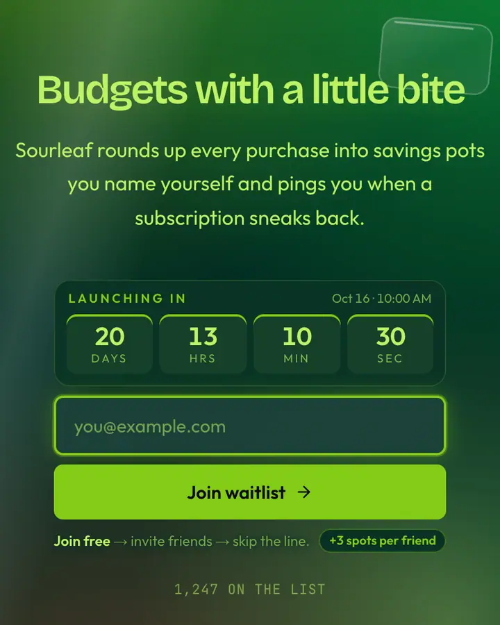
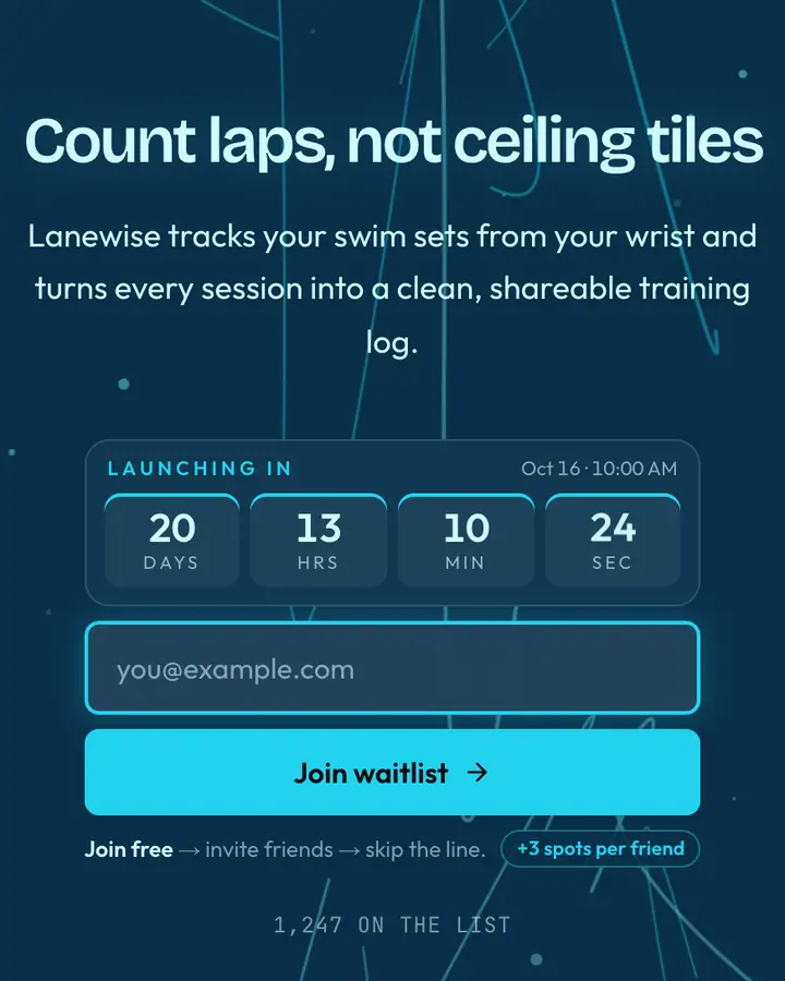
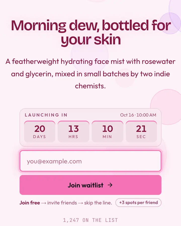
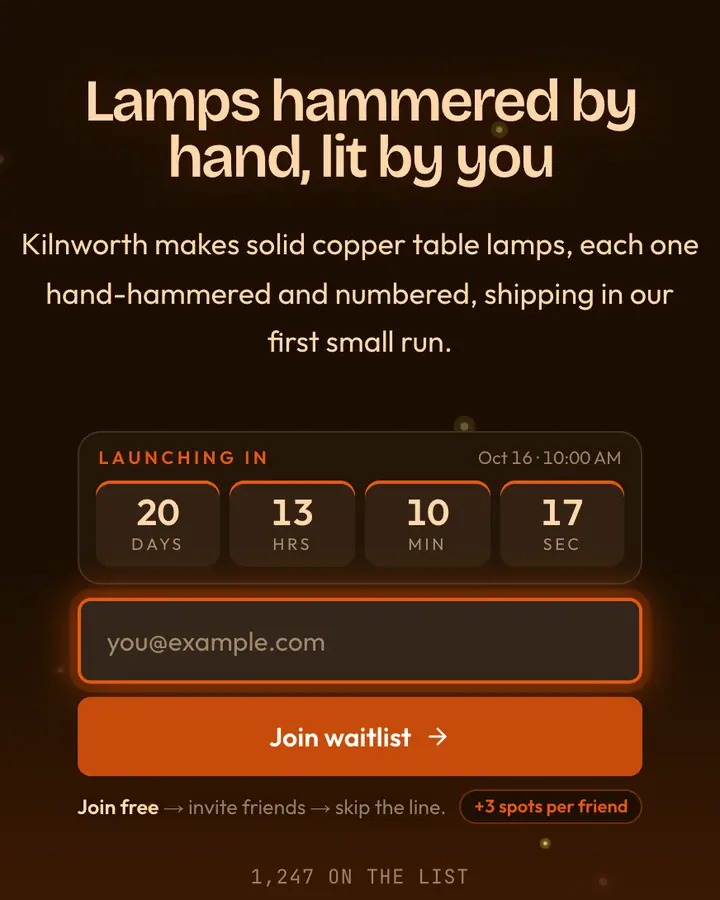
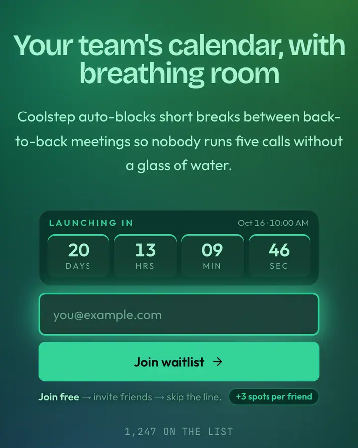
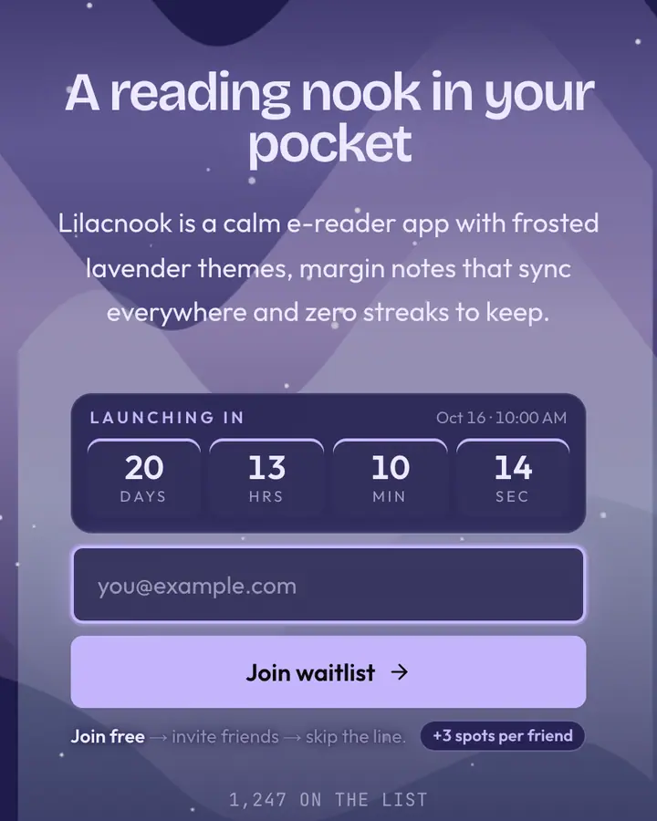
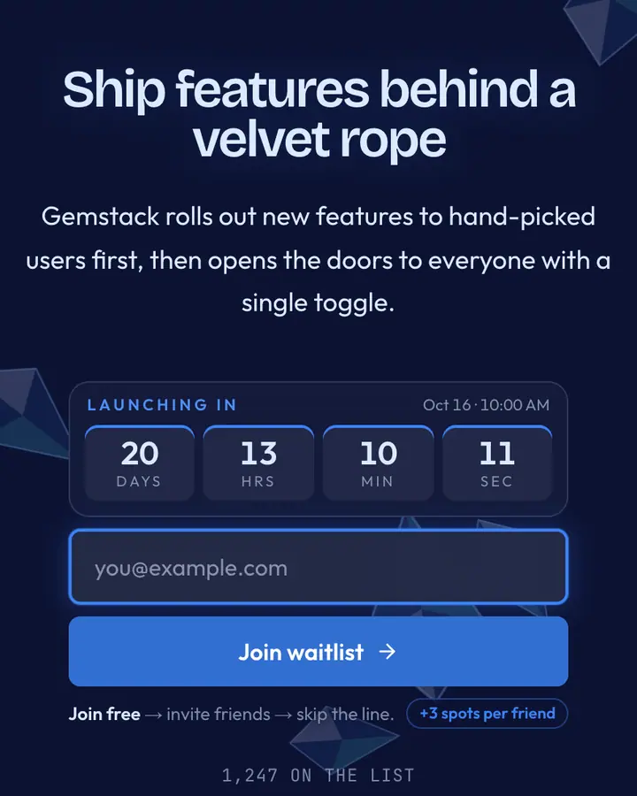
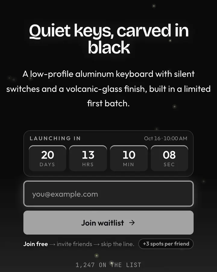
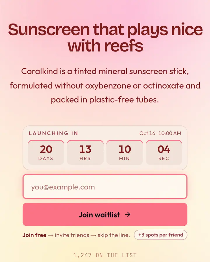
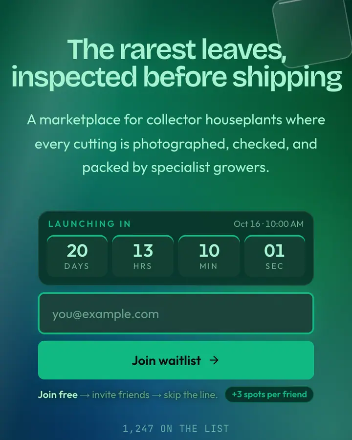
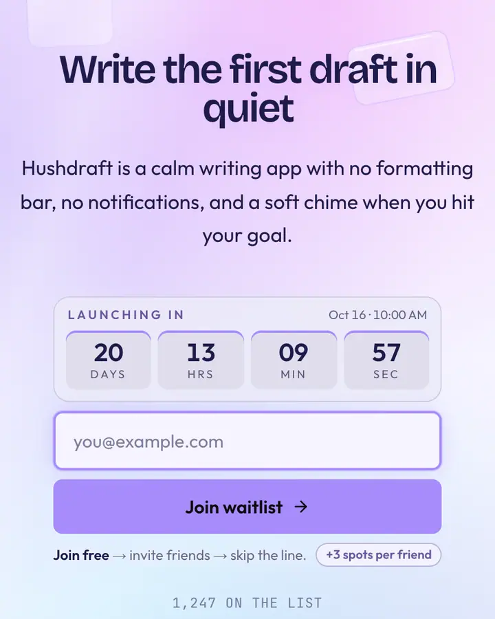
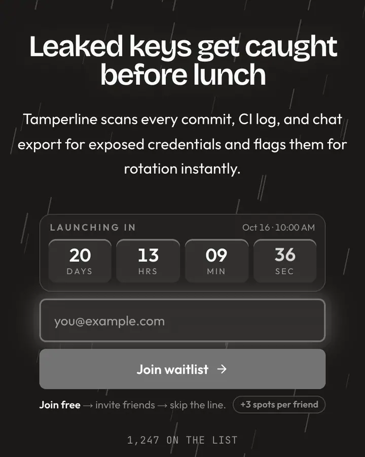
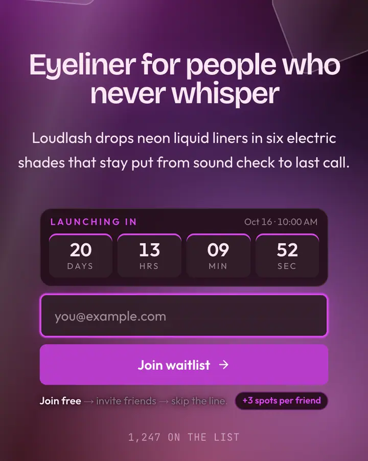
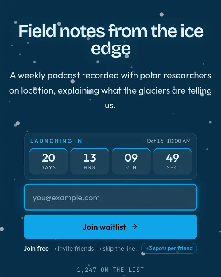
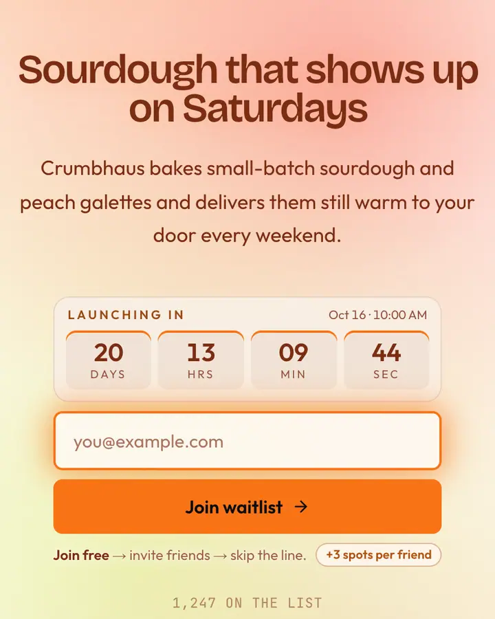
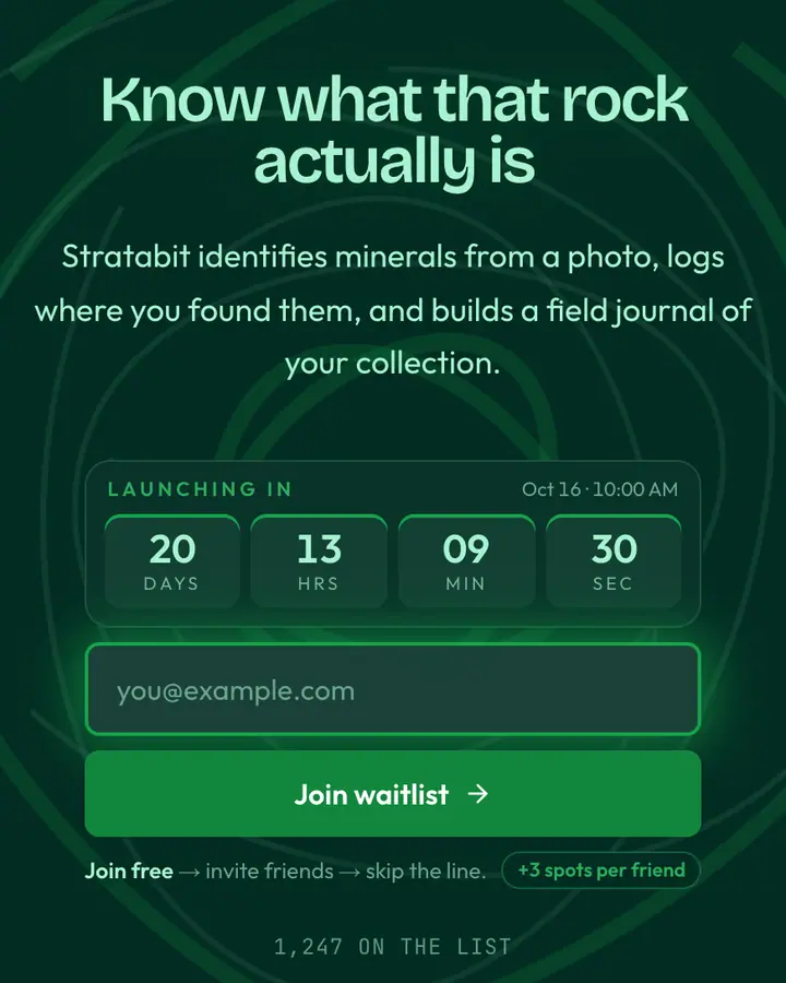
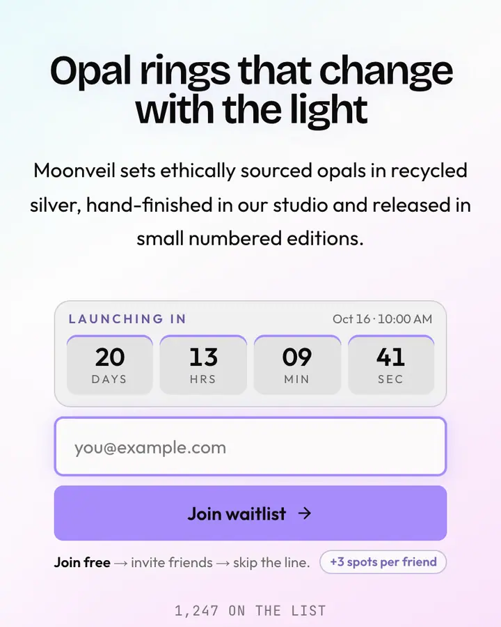
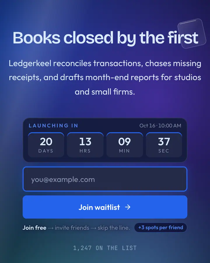
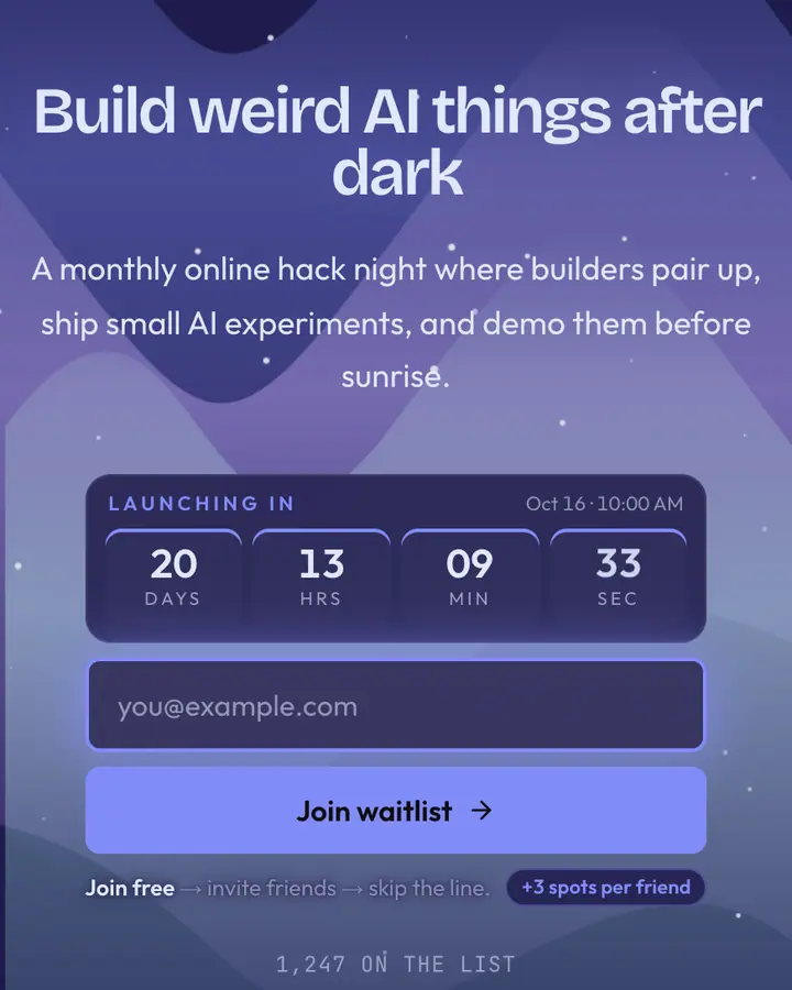
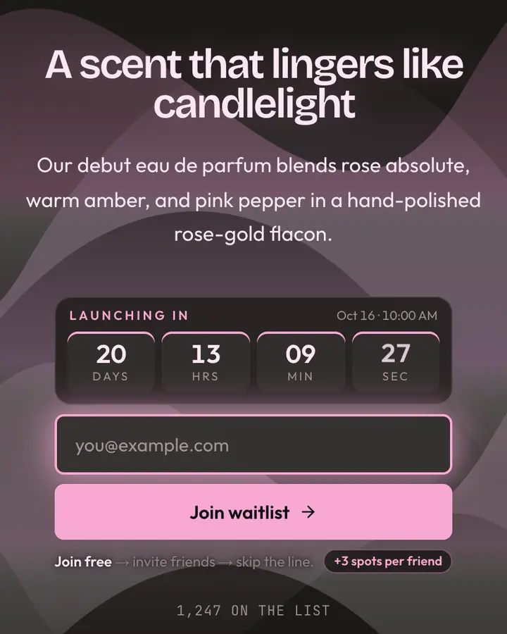
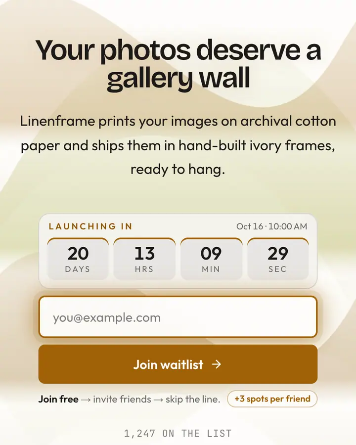
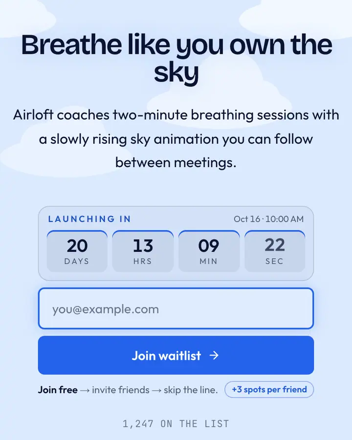
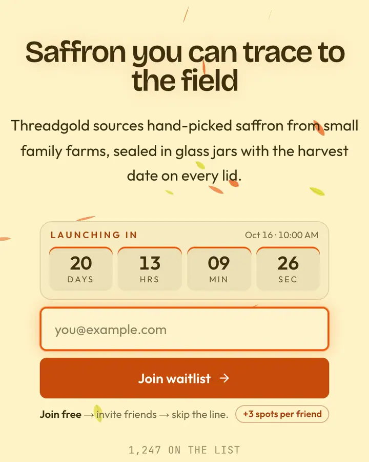
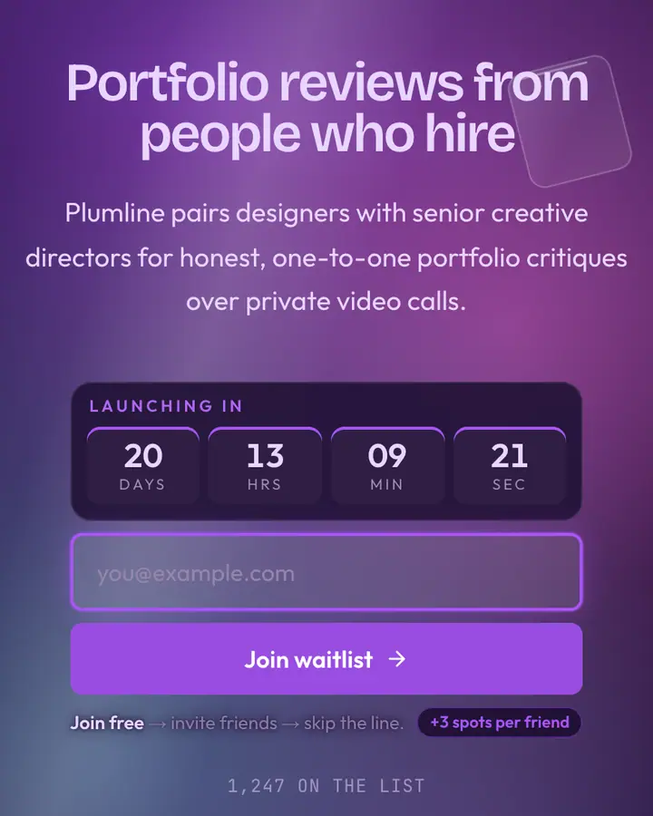
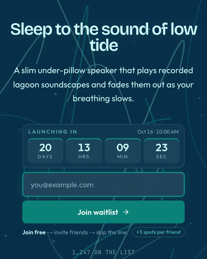
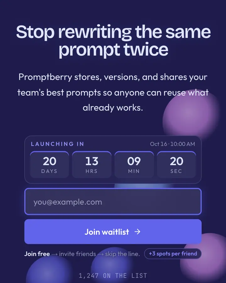
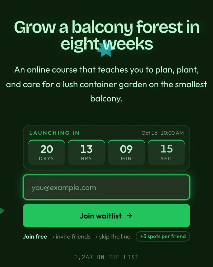
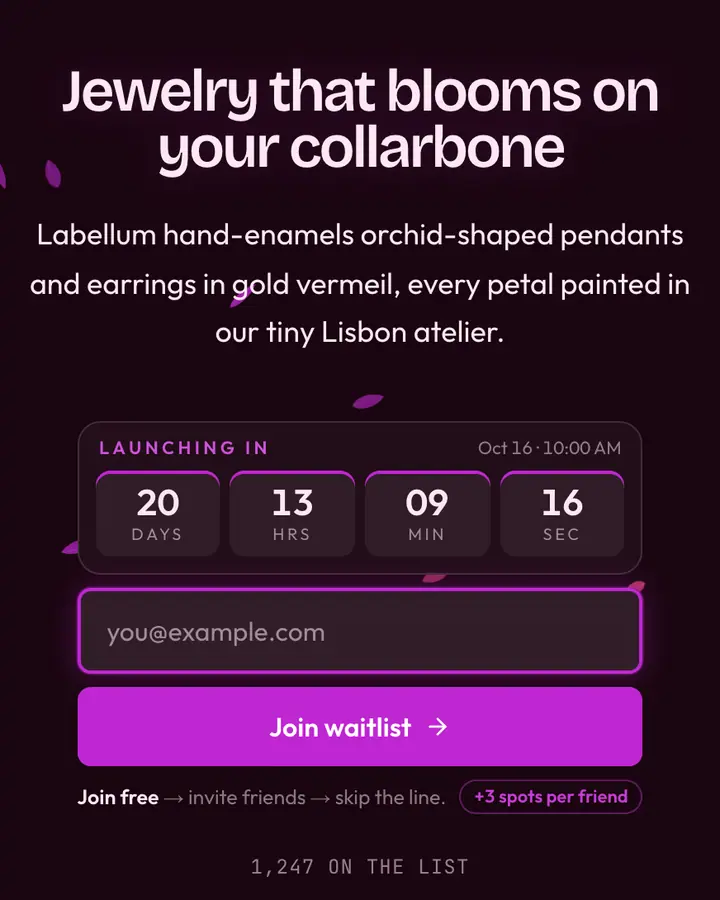
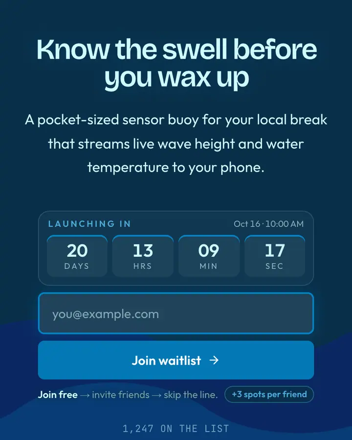
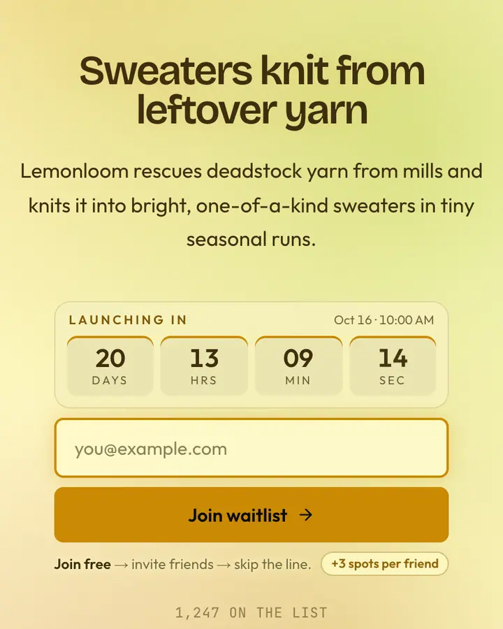
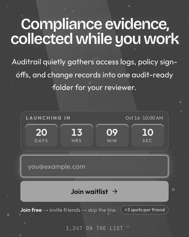
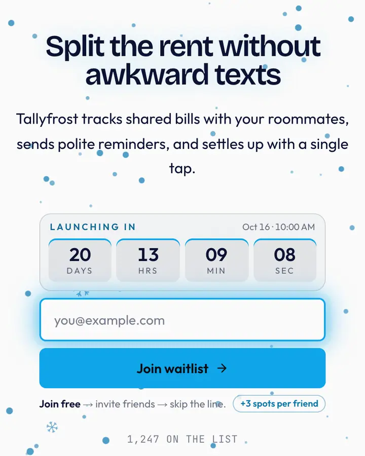
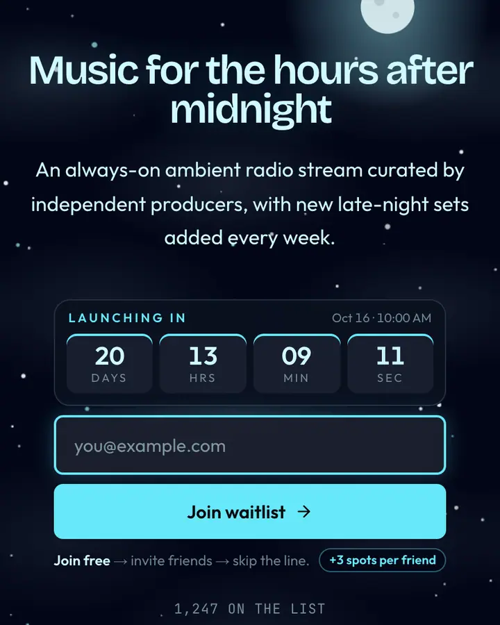
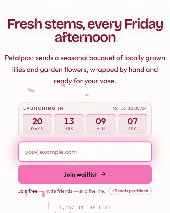
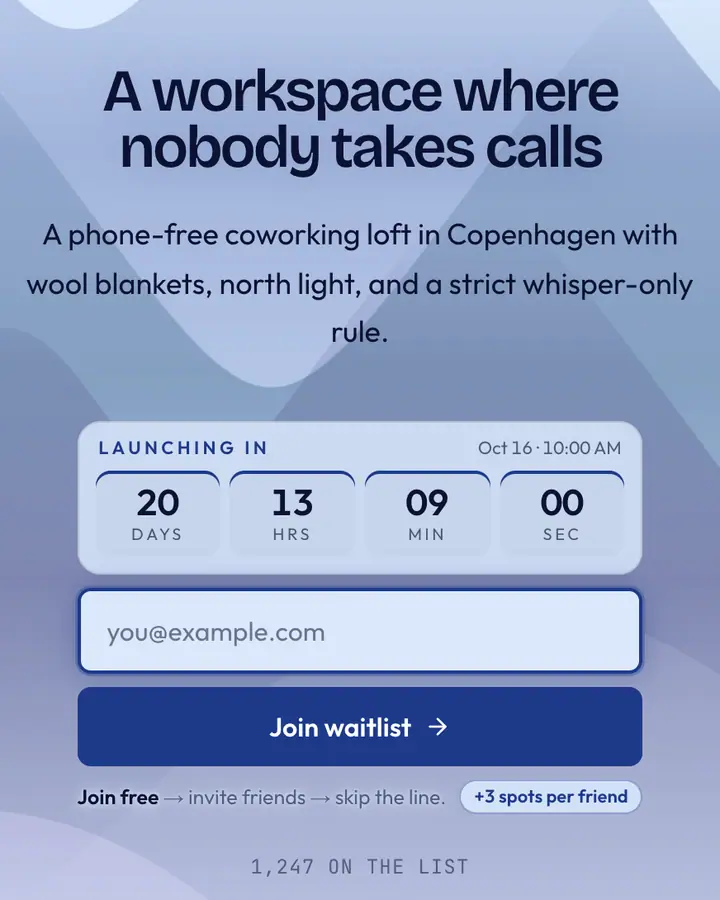
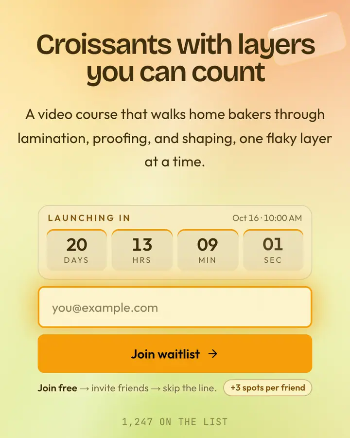
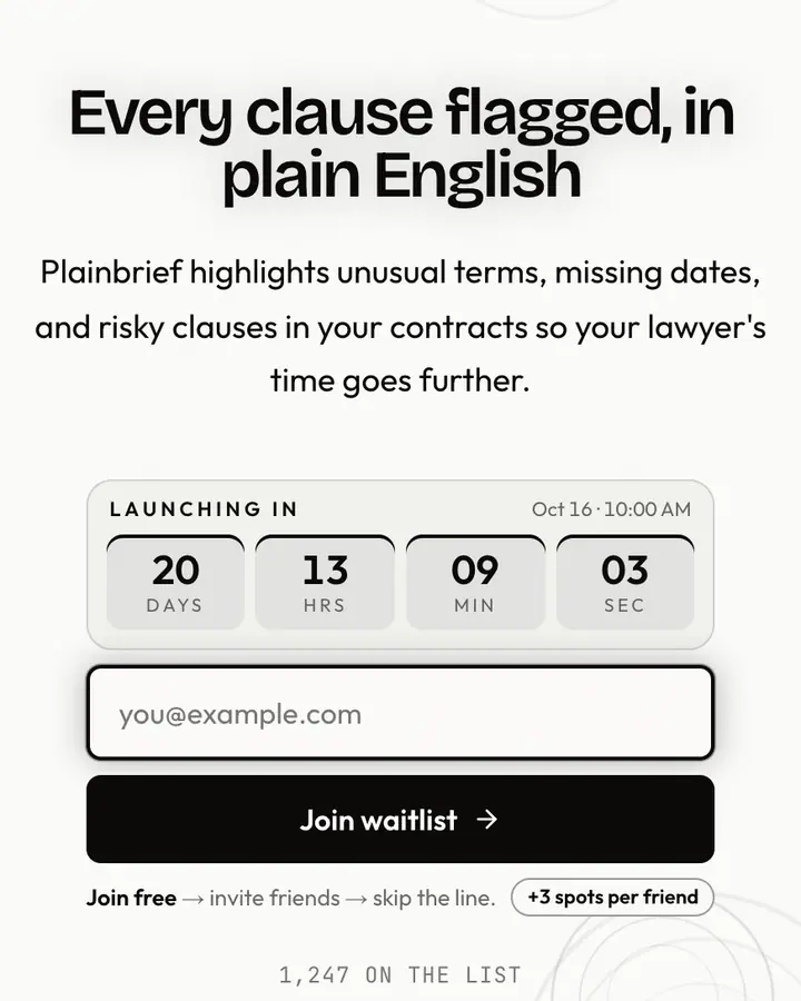
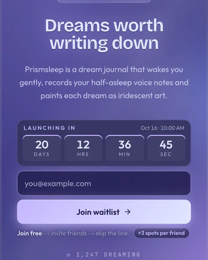
Glass only works when there's something behind it. The best glassmorphism pages pair a blurred, slowly moving backdrop (gradient blobs, petals, caustics) with a card that has a thin light border and enough opacity that text never swims. If you can read the subhead without squinting on a cheap phone screen, the balance is right.
Pick the backdrop hue for mood and the accent for action. Cool blues and teals read as trustworthy, which suits money and health apps; pinks, violets and ambers feel more playful and creator-led. Keep the headline short, since frosted cards get cramped fast, and let the referral panel sit on the same pane so the whole thing reads as one object. The blur and card styling come with the template, so you only change colors and copy.
Best glassmorphism templates for…
- For consumer and fintech apps: Glass, the original frosted card on a saturated backdrop.
- For design and creative tools: Ethereal Glass, a hand-built layout with an iridescent gradient rotating behind the glass.
- For wellness and health apps: Frost Pane, translucent white with soft blue blobs, the calmest glass in the set.
- For premium finance: Sapphire Pane, a deep blue jewel tone that reads as serious money.
Glassmorphism templates FAQ
What is glassmorphism?
A UI style where panels look like frosted glass: semi-transparent, blurred and lightly bordered, floating over colorful backgrounds. It became popular through modern operating-system and app design.
Is glassmorphism readable on mobile?
It can be if the card is opaque enough. These templates keep text on a frosted layer with a solid enough tint for body copy, and you can adjust text and background colors in the editor.
Can I change the backdrop colors?
Yes. The background, accent and text colors are all editable on every plan, and the frosted card picks up whatever palette you choose.