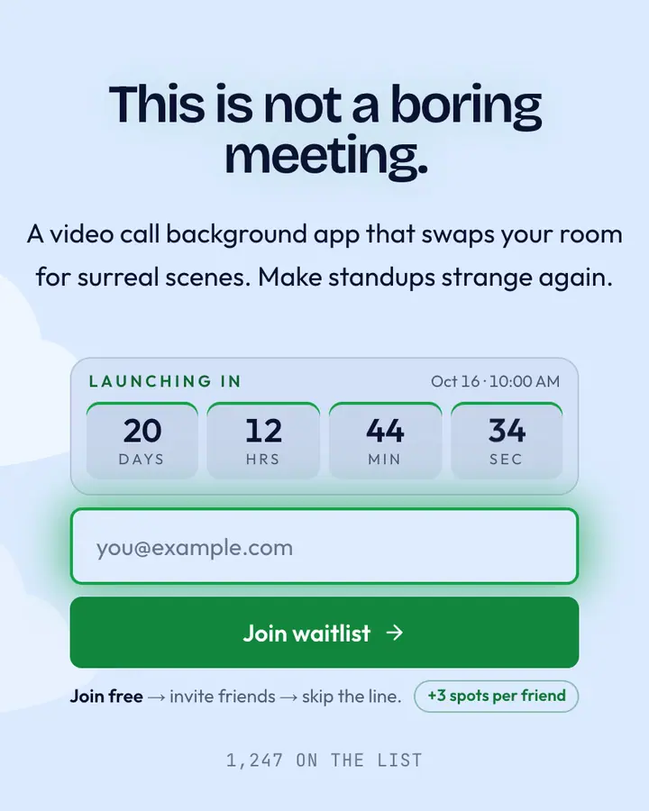
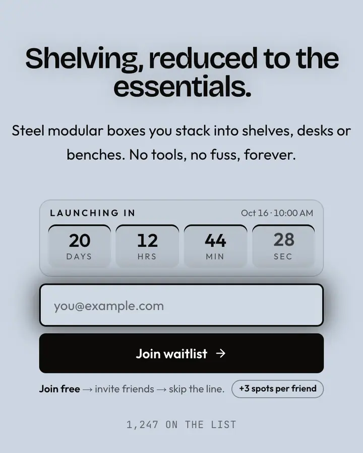
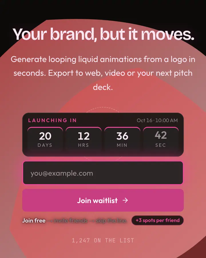
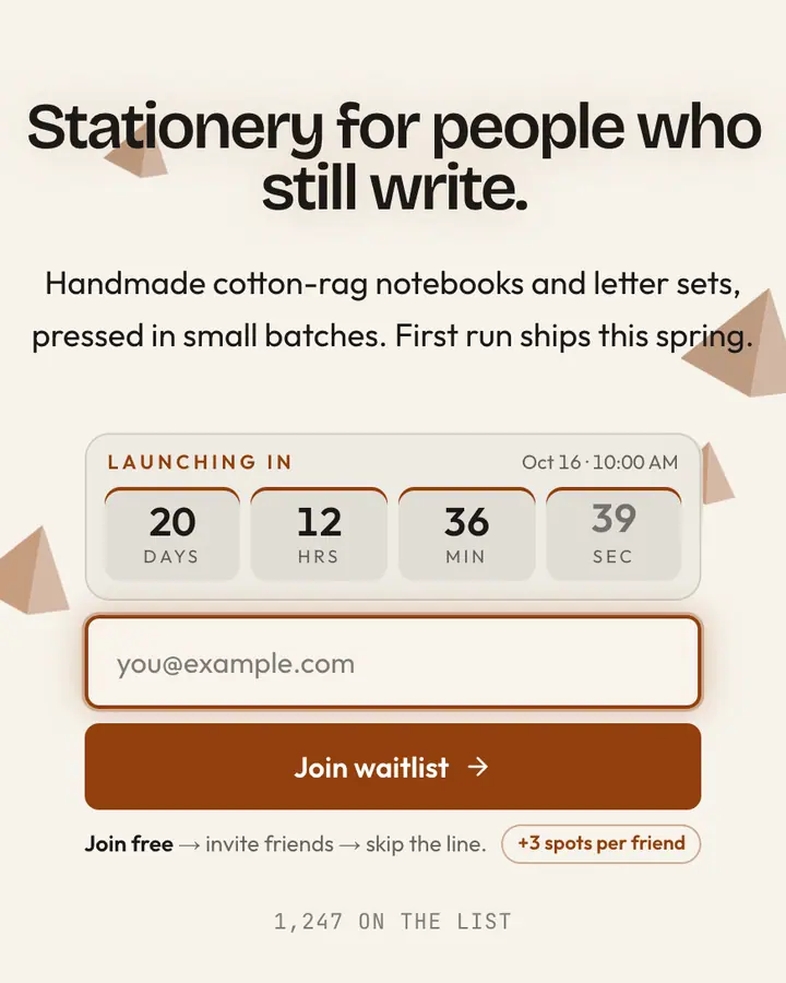
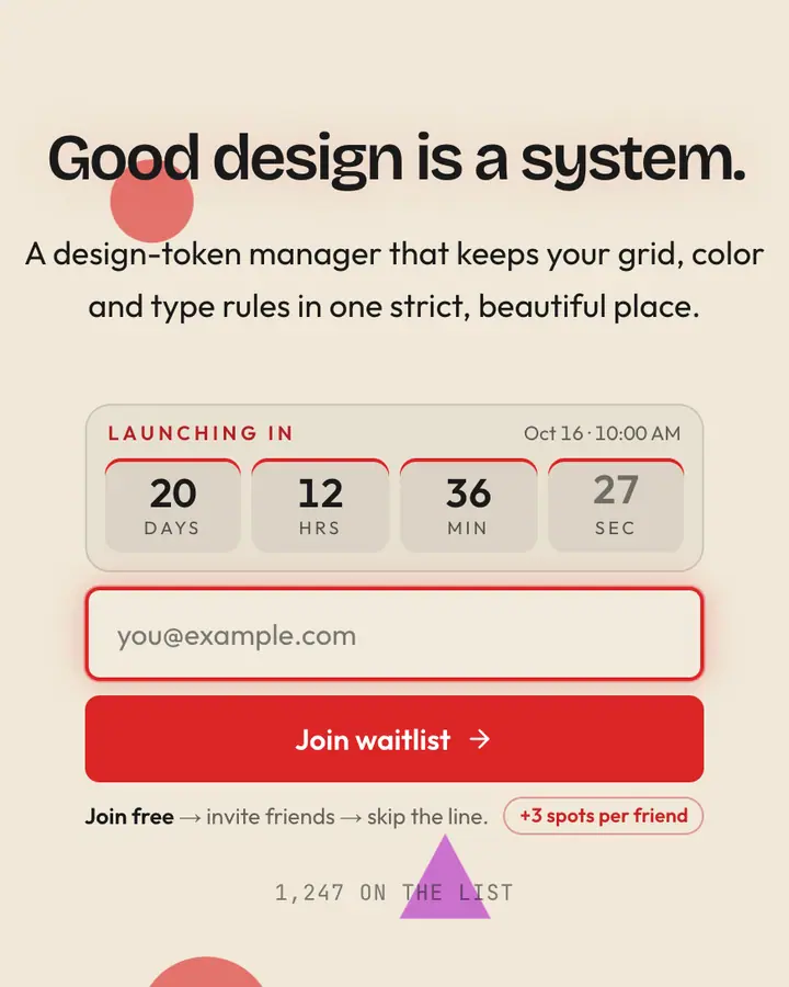
What makes a good editorial & abstract launch page
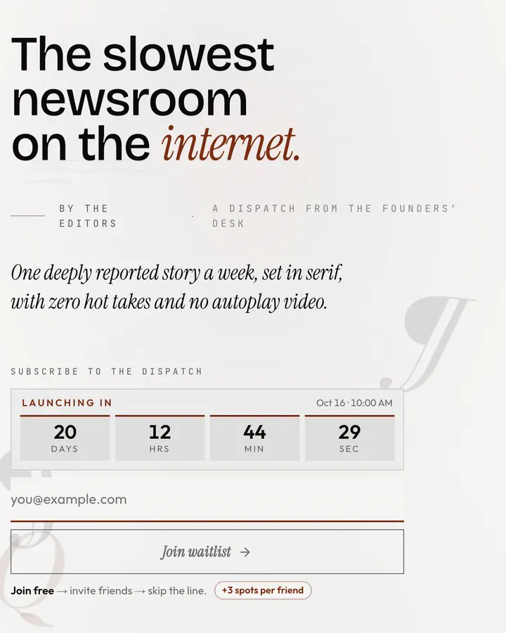
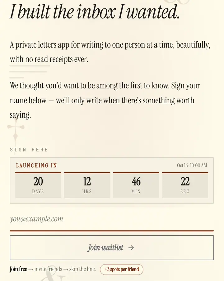
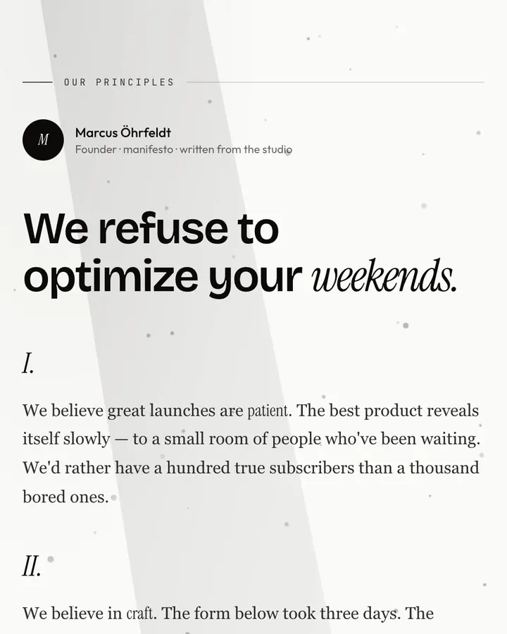
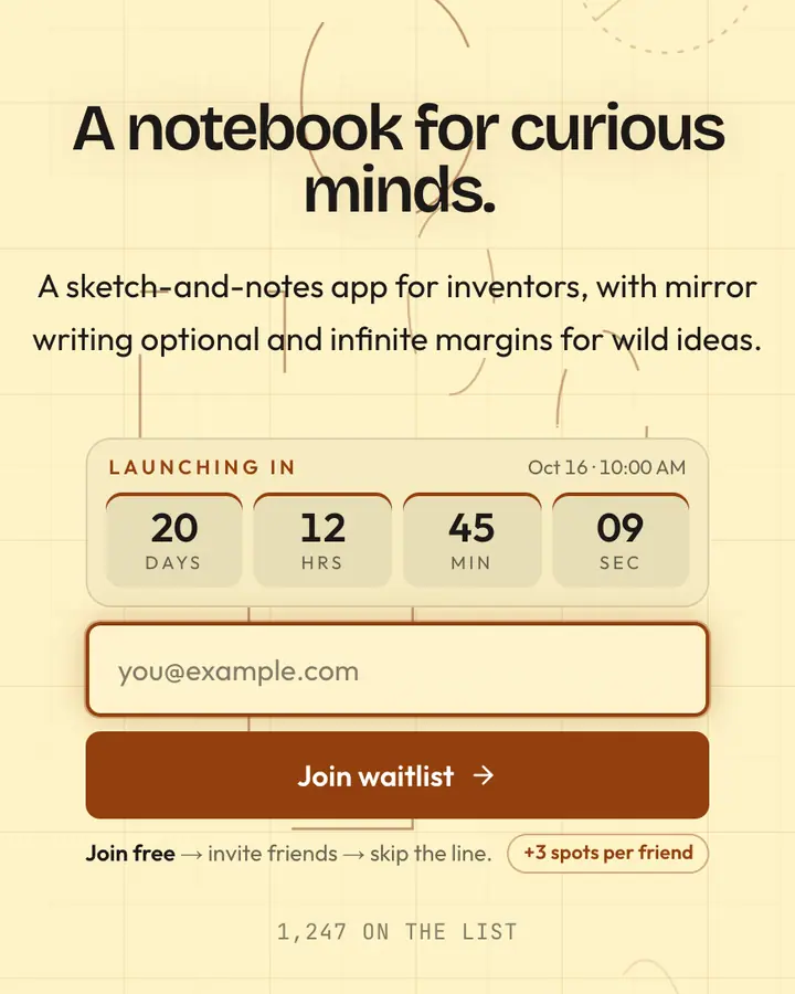
An editorial page is a reading experience, so let the words carry weight. These layouts can hold more copy than any other style: a two-sentence subhead, a short manifesto, a letter to your first readers. Use that room to explain why the thing exists, not just what it is.
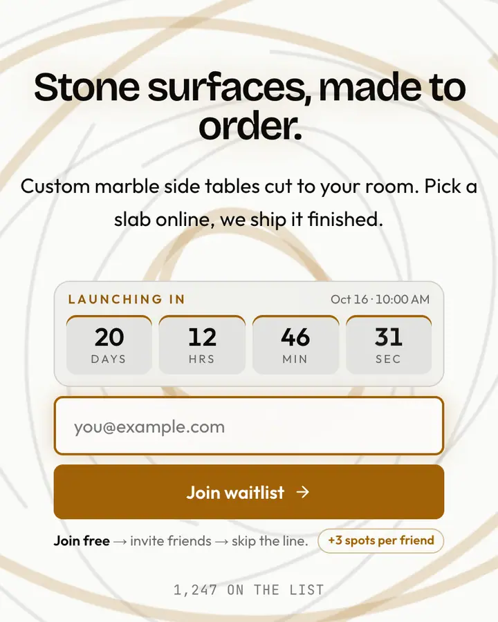
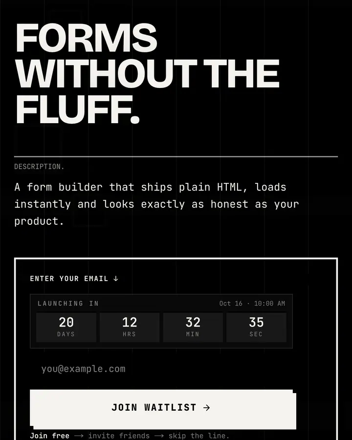
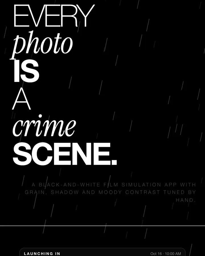
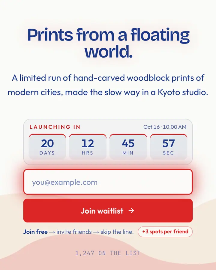
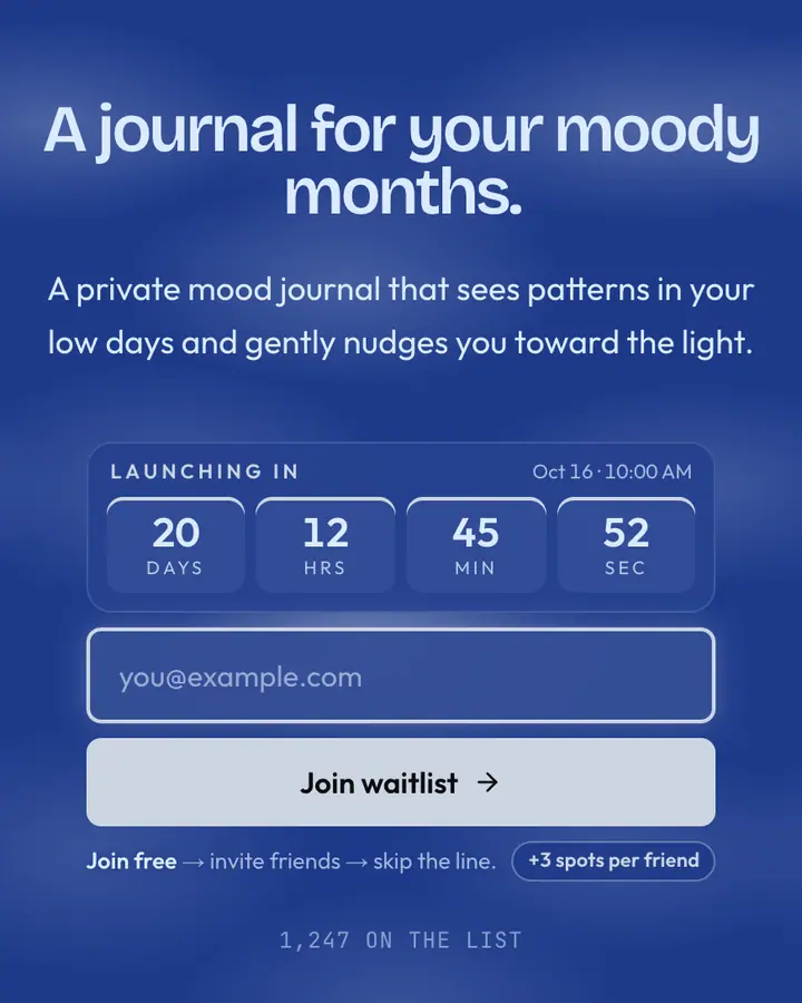
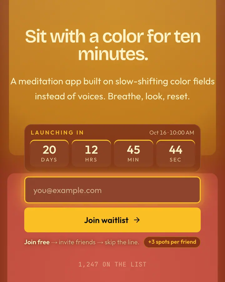
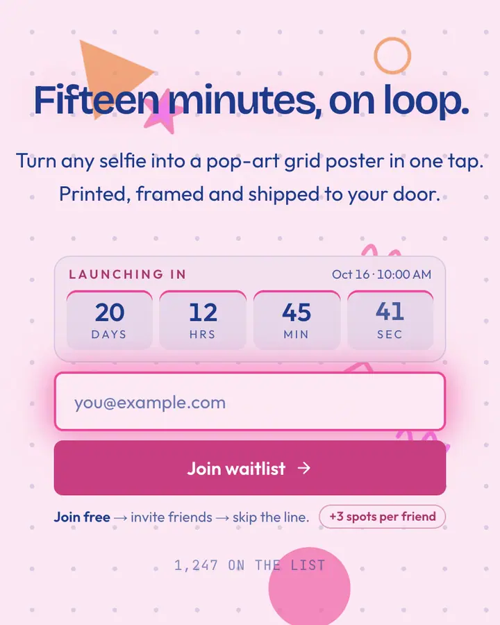
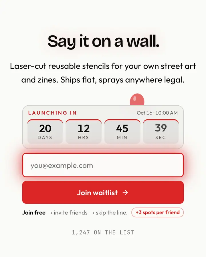
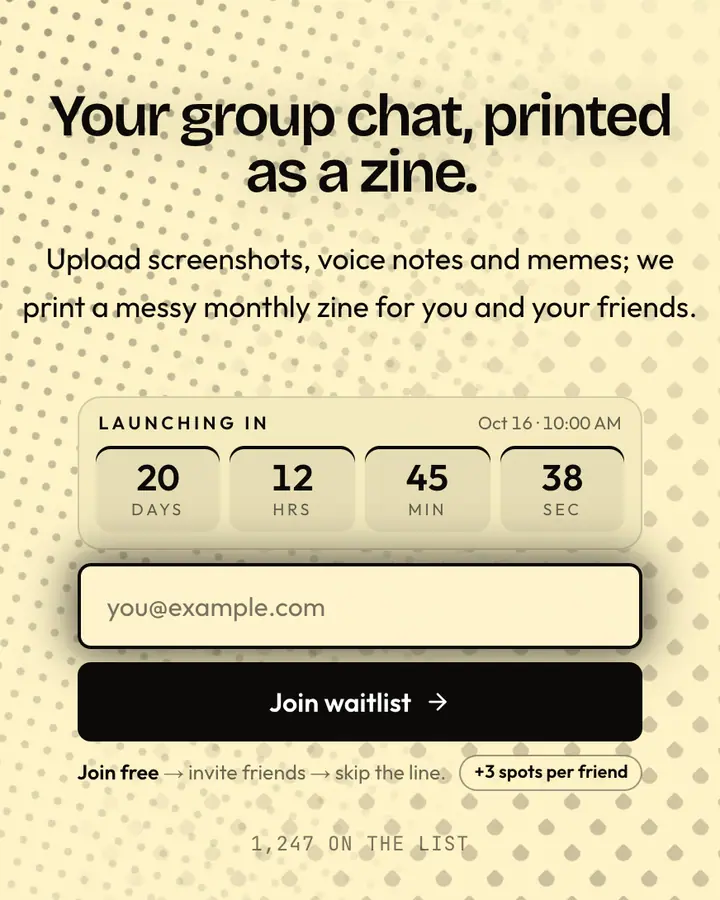
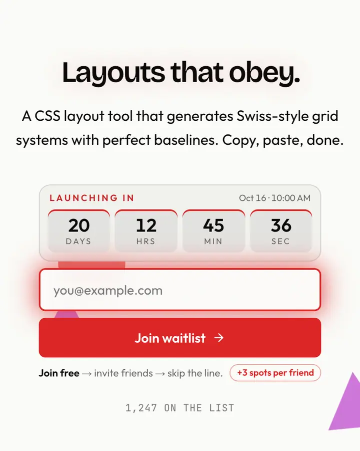
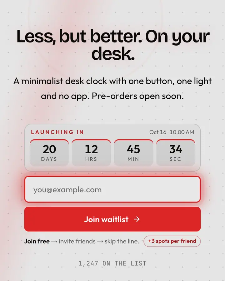
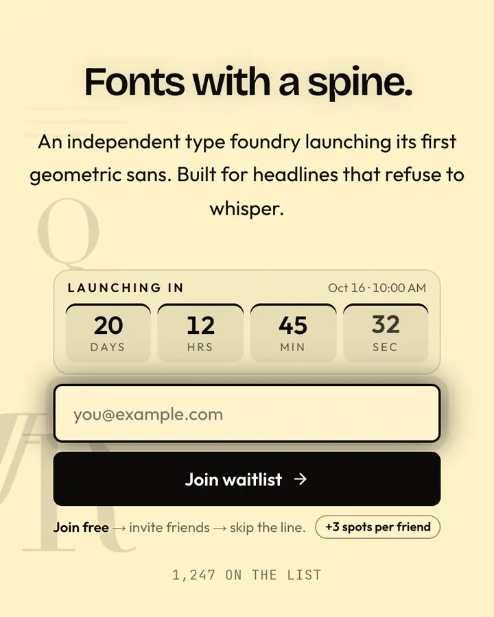
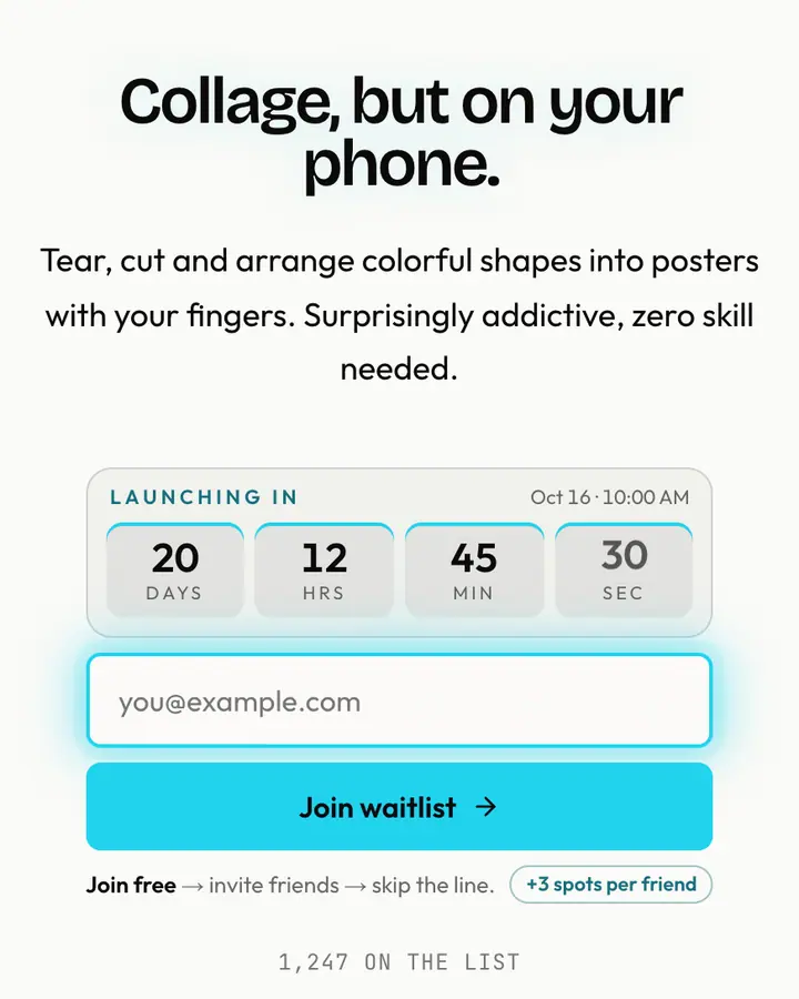
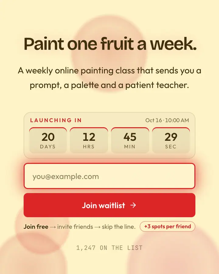
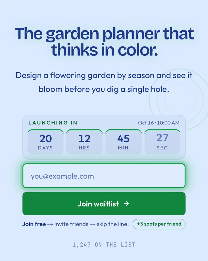
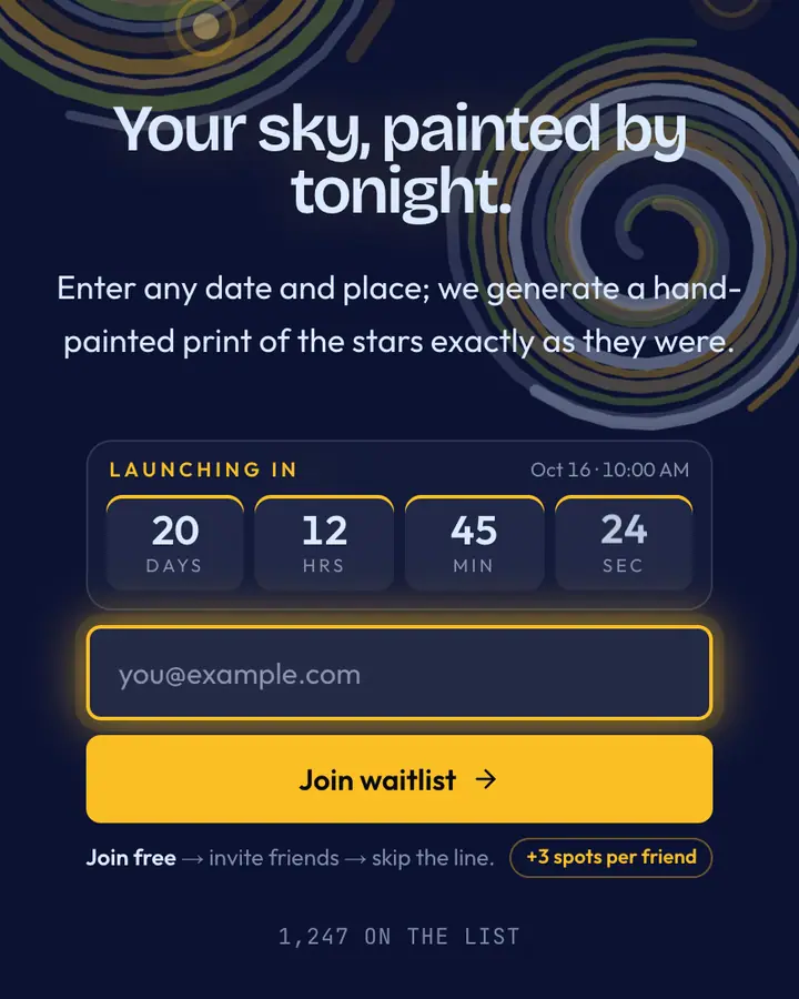
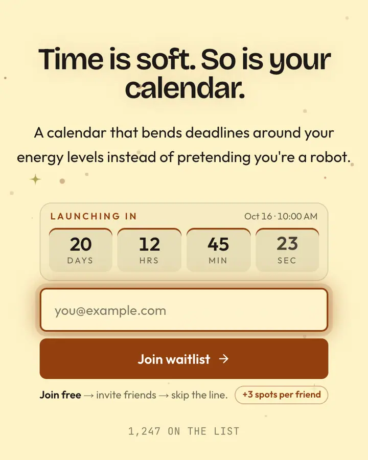
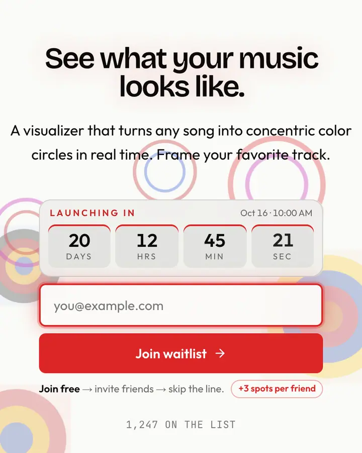
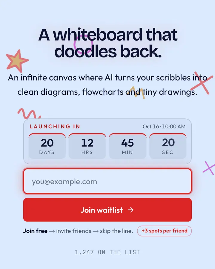
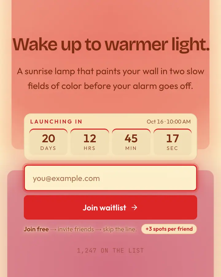
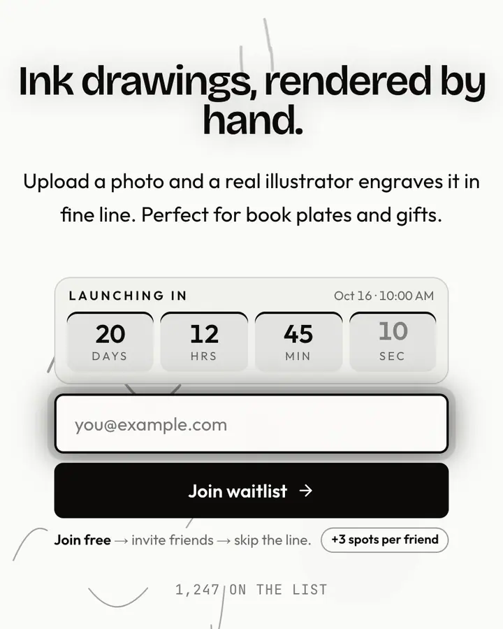
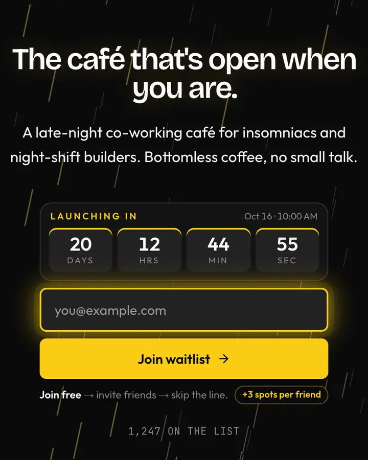
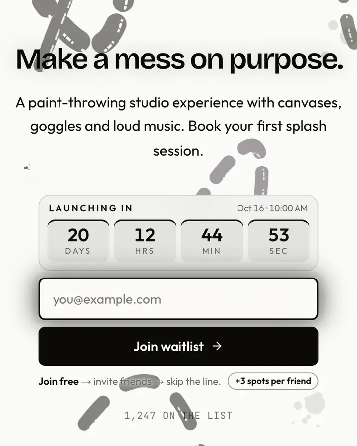
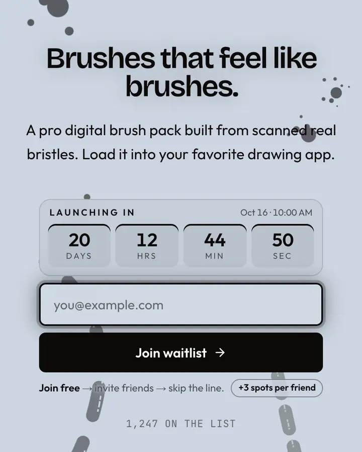
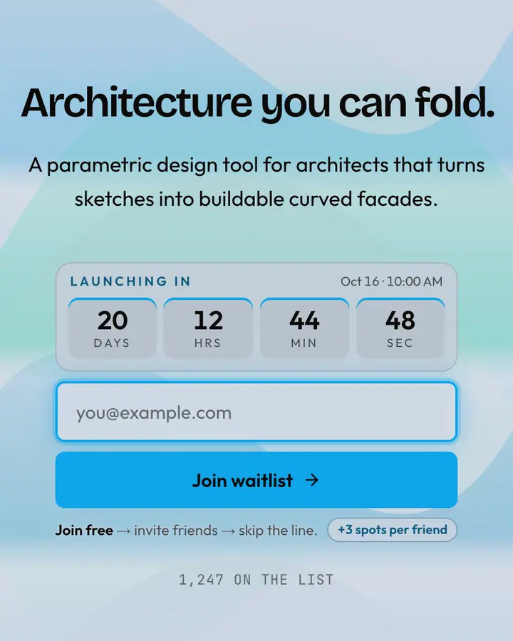
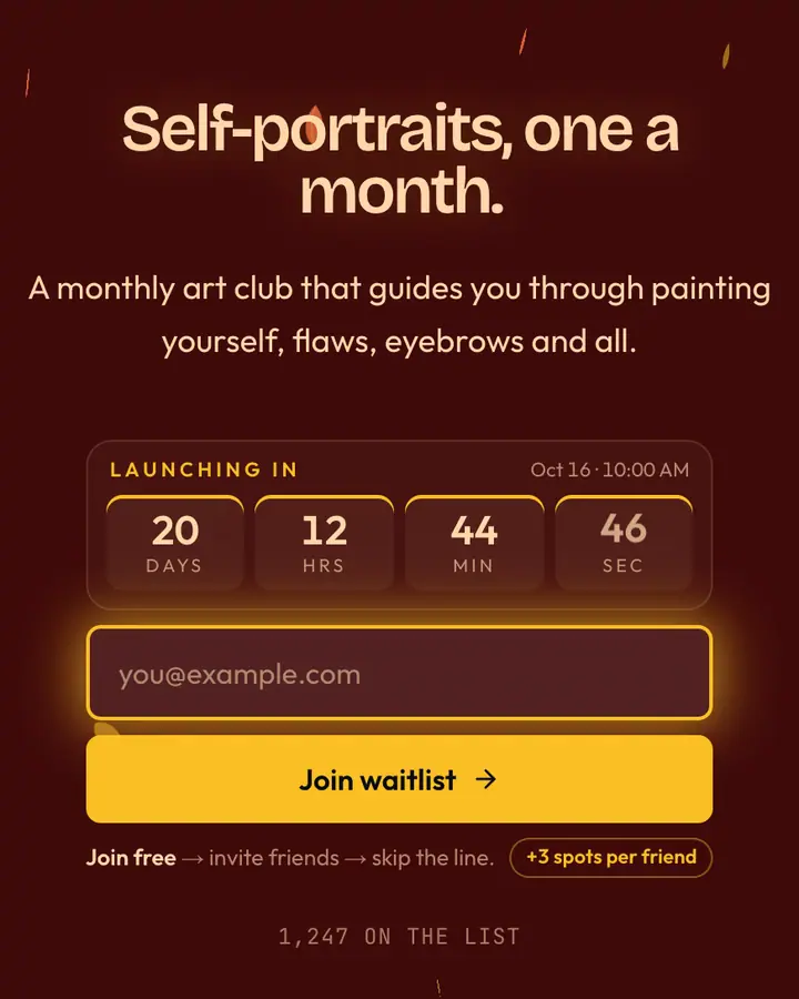
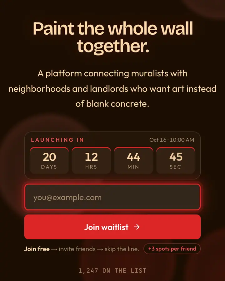
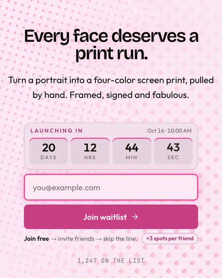
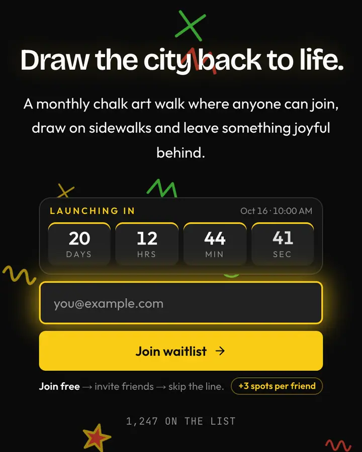
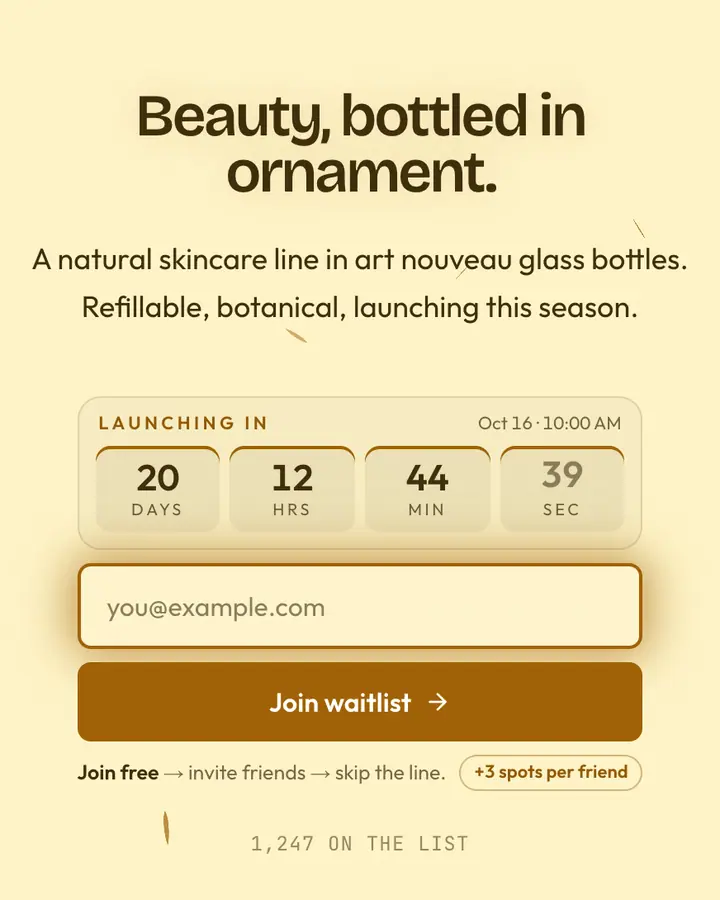
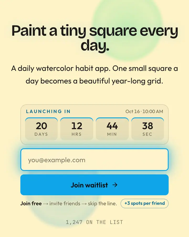
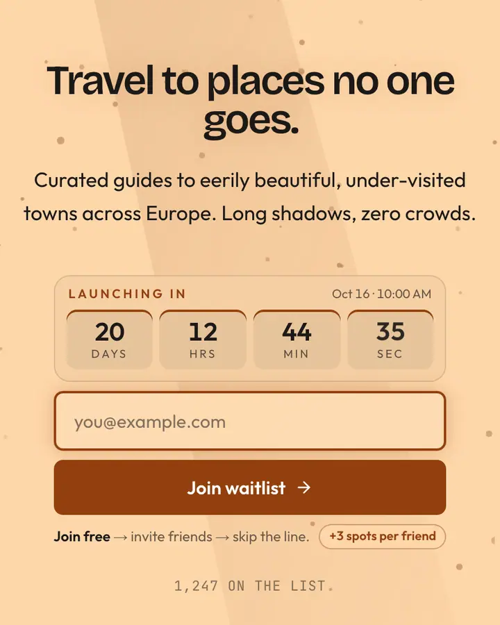
Typography does the branding here. A strong serif headline says "publication"; heavy grotesk type on a grid says "studio"; hand-drawn or painterly styles say "maker". Keep the palette to paper, ink and one accent, and let the art-style templates bring the color. For newsletters, promise a cadence and a first issue date, and set the countdown to it. For studios and portfolios, the referral panel works as an invitation to bring a friend to the launch, not a race.
Best editorial & abstract templates for…
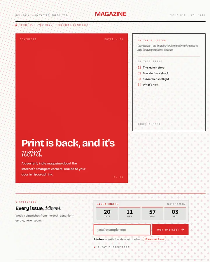
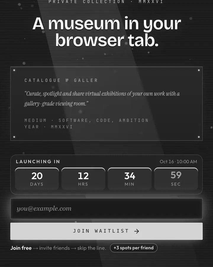
- For newsletters and magazines: Editorial, italic serif, a dateline and a cover-story layout.
- For founder-led launches: Manifesto, long-form prose in the founder's own voice.
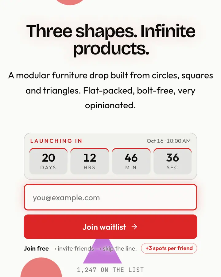
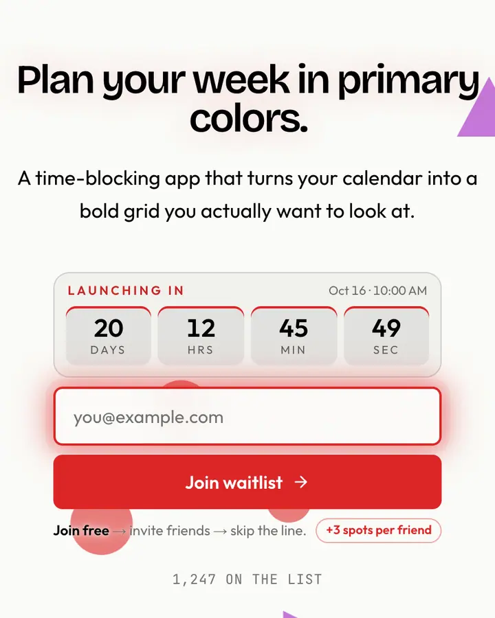
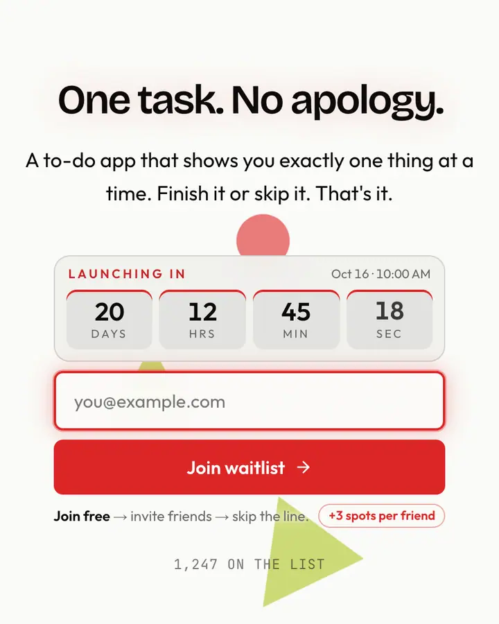
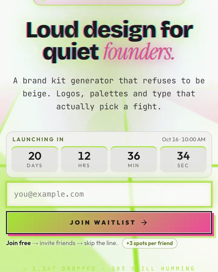
- For design studios: Bauhaus Grid, primary colors on a strict grid with geometric primitives.
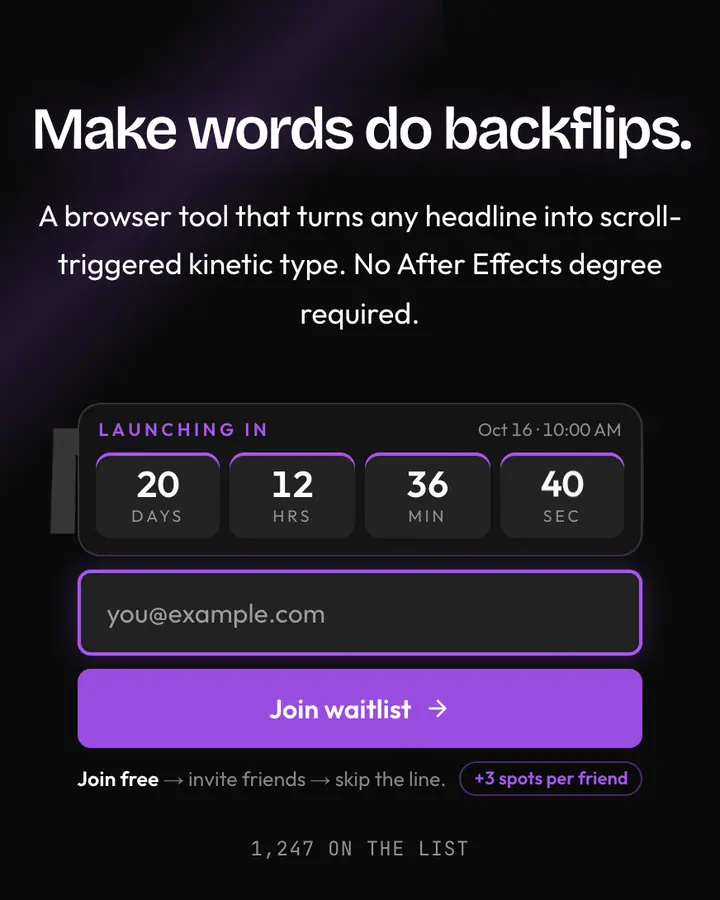
- For creative agencies: Kinetic Type, a wall of type that moves and reshapes itself.
Editorial & Abstract templates FAQ
Can I write a long intro on an editorial template?
Yes. Letter, Manifesto and Editorial are built for longer copy, and the subhead field accepts a few sentences. Keep the headline short so it still reads on a phone.
Are the art-style templates copies of famous paintings?
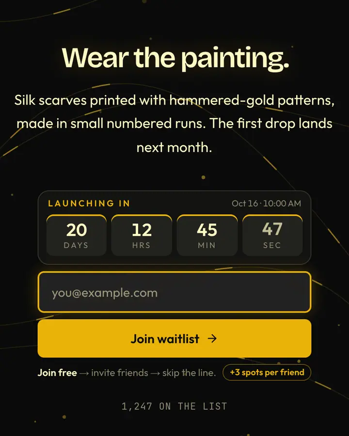
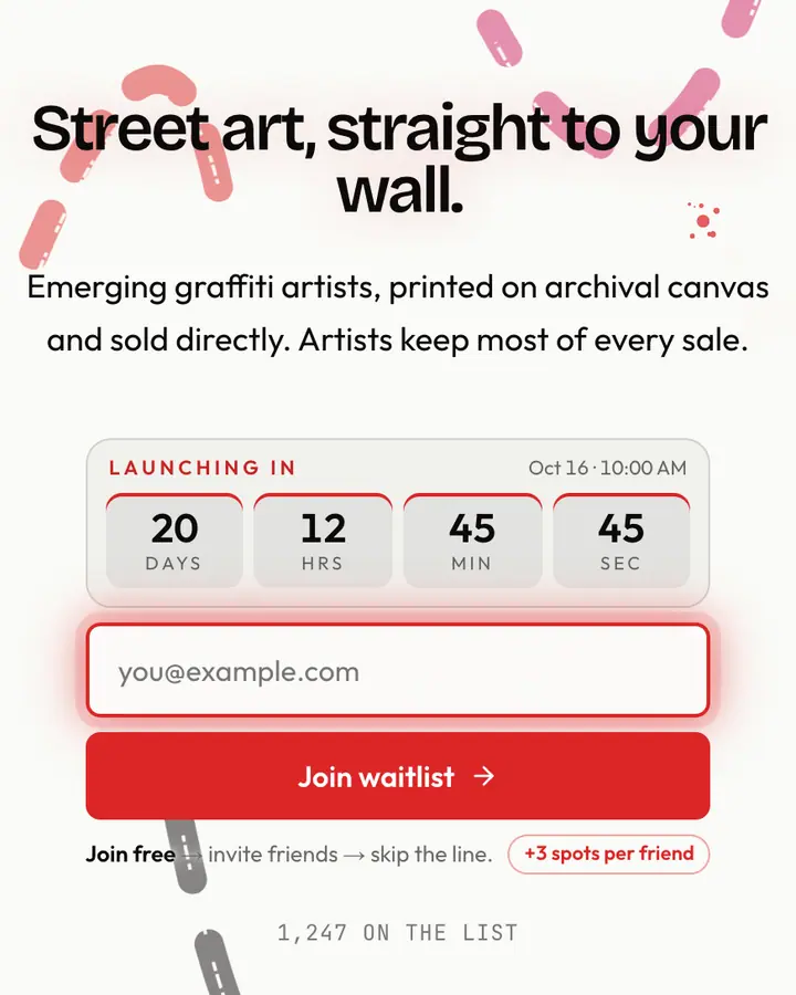
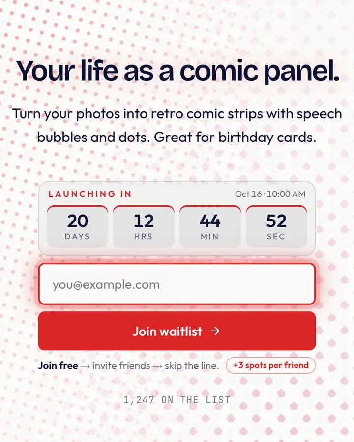
No. They are original designs that nod to movements and periods (Bauhaus, pop art, ukiyo-e, abstract expressionism) through palette and shape. No artwork is reproduced.
Which template suits a newsletter launch?
Editorial, Magazine and Letter read like publications. Set the countdown to your first issue's date so subscribers know when to expect it.