About the Hiroshige Rain template
Hiroshige Rain captures the mood of the Japanese master's Bridge in Rain print—cool slate-blue background evoking twilight, with cream-white accents suggesting lantern light cutting through mist. The palette feels contemplative and mature, appealing to art educators, gallery directors, and cultural institutions launching digital initiatives. Every element feels composed, painterly, intentional. Light text creates soft contrast; nothing jars. This template suits founders positioning their work as culturally significant rather than purely commercial. Watch engagement build with real-time analytics, understanding which audiences appreciate historical aesthetic depth.
What the demo shows
The live demo on this page launches Drizzle, a made-up product we wrote to show the template with realistic copy: the headline reads “Rain sounds, recorded on real bridges.” and the subhead says “A sleep app of field recordings from rainy evenings around the world. Fall asleep somewhere far away.” Below it you see the signup form, a demo launch countdown and the share-to-climb referral panel exactly as a visitor would. Try the form: in the demo nothing is stored. When you use Hiroshige Rain, you replace Drizzle with your own product name, headline, subhead and logo; the palette and motion come with it and every colour stays editable.
Design details
Hiroshige Rain is a dark template: a deep blue background (#0c1233), pale sky blue type (#dbeafe) and a white accent (#fafaf7) on the join button, the countdown and the referral highlights. Body text sits at a 15:1 contrast ratio against the background, comfortably past the WCAG AAA threshold. Behind the copy the page animates with falling rain streaks, front and centre; visitors who ask their device for reduced motion get a still frame instead. Structurally it uses the Editorial layout, shared with 55 other templates, but the palette, the motion and the demo copy are Hiroshige Rain's own.
- Background
- #0c1233
- Accent
- #fafaf7
- Text
- #dbeafe
How it compares
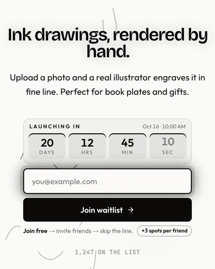
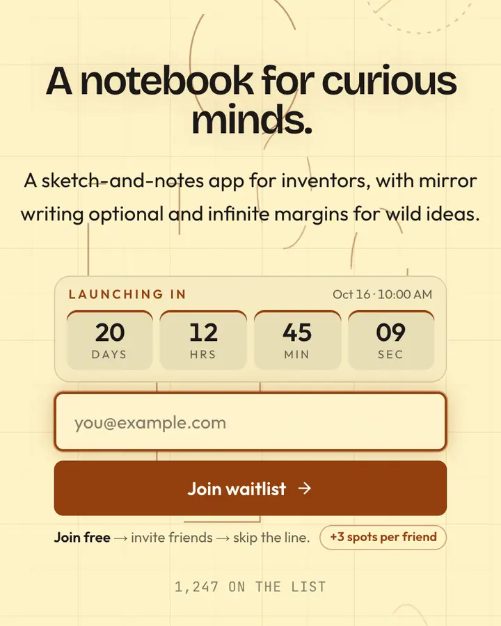
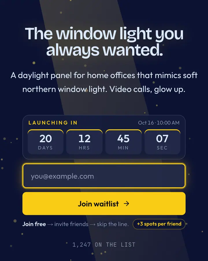
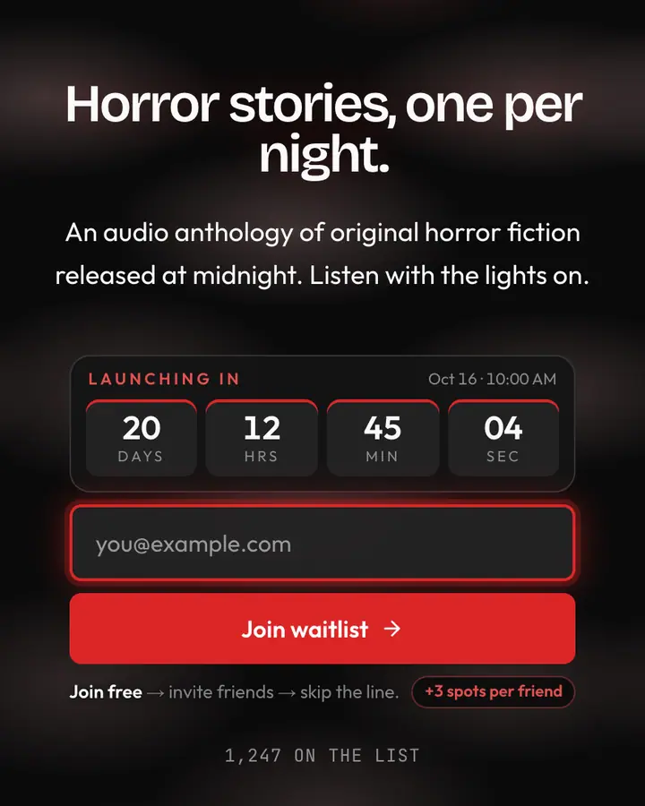
Within Art / Abstract, Hiroshige Rain stands out for its white accent on a deep blue ground. If it is not quite right, Durer Engraving flips to a light white canvas with a near-black accent and ink blooming through water (“Cross-hatch ink lines”). Da Vinci Sketch flips to a light cream canvas with a brown accent and blueprint lines drawing themselves (“Sepia silverpoint”). Vermeer Pearl is also dark but leans on a vivid amber accent and dust motes floating in the light (“Dutch light, lapis blue”). All of them share the same signup, referral and analytics features, so switching later only changes the look.
Launch with Hiroshige Rain in three steps
- Click “Use this template” and create a free account; Hiroshige Rain is preselected in the page wizard.
- Replace the Drizzle demo copy with your product's headline and one-line pitch, pick a URL, and optionally set a launch date to show a real countdown.
- Publish and share the link. Every subscriber gets a personal referral link, and you watch signups and top referrers arrive in the dashboard.