About the Picasso Blue template
Picasso Blue channels the artist's melancholic blue period—cobalt canvas with gaunt, muted forms. This is the template for art galleries, cultural institutions, and serious creative work where a university museum might hang your posters. The palette rejects commercialism; every color choice nods to 1901–1904 Barcelona. Fine art collectives and theater companies will feel the historical weight immediately; it's the template that tells visitors you have something to say, not something to sell. Track engagement with real-time analytics to understand your audience's sophistication.
What the demo shows
The live demo on this page launches Blue Period, a made-up product we wrote to show the template with realistic copy: the headline reads “A journal for your moody months.” and the subhead says “A private mood journal that sees patterns in your low days and gently nudges you toward the light.” Below it you see the signup form, a demo launch countdown and the share-to-climb referral panel exactly as a visitor would. Try the form: in the demo nothing is stored. When you use Picasso Blue, you replace Blue Period with your own product name, headline, subhead and logo; the palette and motion come with it and every colour stays editable.
Design details
Picasso Blue is a dark template: a dark blue background (#1e3a8a), pale sky blue type (#dbeafe) and a pale sky blue accent (#cbd5e1) on the join button, the countdown and the referral highlights. Body text sits at a 8.5:1 contrast ratio against the background, comfortably past the WCAG AAA threshold. Behind the copy the page animates with low rolling fog, clearly visible; visitors who ask their device for reduced motion get a still frame instead. Structurally it uses the Manifesto layout, shared with 93 other templates, but the palette, the motion and the demo copy are Picasso Blue's own.
- Background
- #1e3a8a
- Accent
- #cbd5e1
- Text
- #dbeafe
How it compares
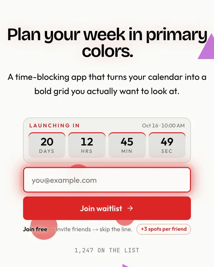
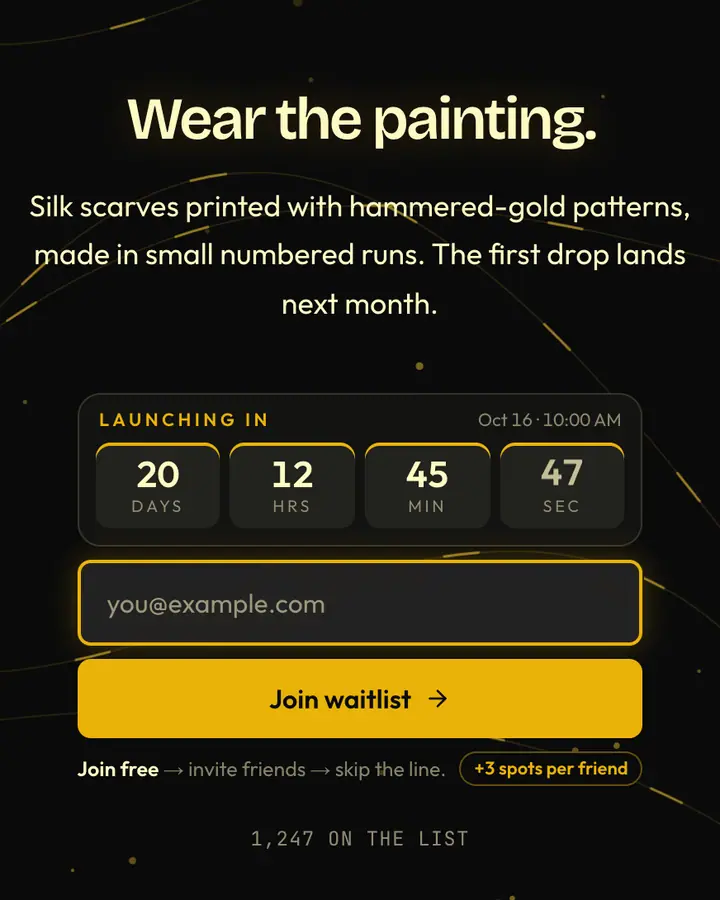
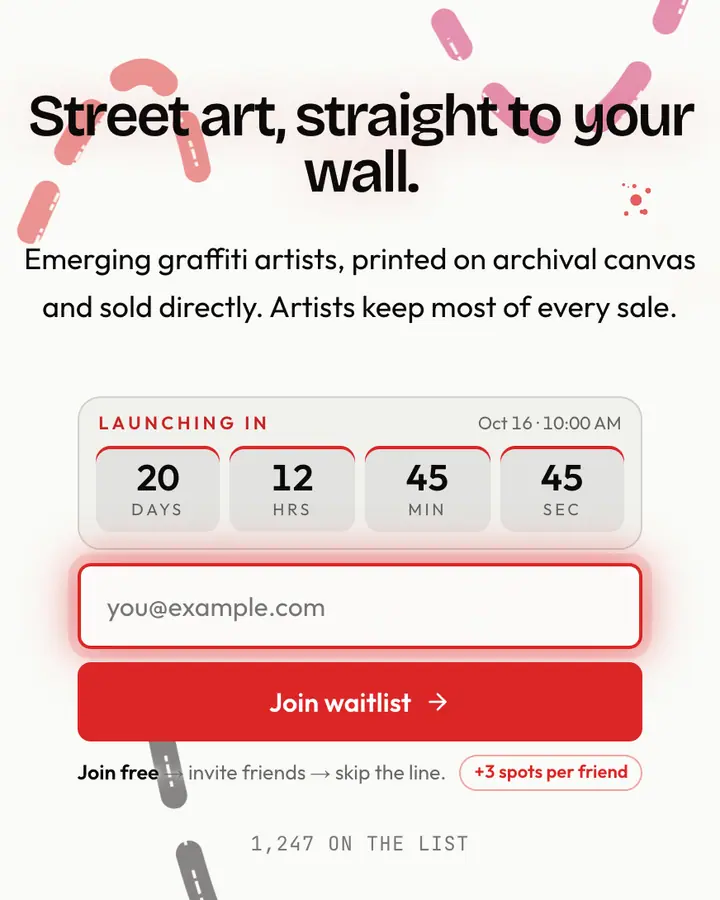
Within Art / Abstract, Picasso Blue stands out for its pale sky blue accent on a dark blue ground. If it is not quite right, Mondrian Grid flips to a light white canvas with a red accent and Bauhaus circles, squares and bars (“Black bars, primaries pop”). Klimt Gold is also dark but leans on a vivid amber accent and threads of gold weaving through (“Hammered gold, geometric”). Basquiat flips to a light white canvas with a red accent and an animated brush layer (“Crown scratch, bold scrawl”). All of them share the same signup, referral and analytics features, so switching later only changes the look.
Launch with Picasso Blue in three steps
- Click “Use this template” and create a free account; Picasso Blue is preselected in the page wizard.
- Replace the Blue Period demo copy with your product's headline and one-line pitch, pick a URL, and optionally set a launch date to show a real countdown.
- Publish and share the link. Every subscriber gets a personal referral link, and you watch signups and top referrers arrive in the dashboard.