About the Bento Grid 2.0 template
Bento Grid 2.0 is a static composition rather than an effect. On a warm off-white background (#fafaf7) with near-black type, a 12-column grid arranges rounded tiles with deep, soft shadows. The large hero tile holds your headline and the signup form, with one blurred accent flourish in its corner. Surrounding tiles show the page's real subscriber count or, before anyone has joined, a line saying the front of the queue is still open, plus a short How it works list and feature tiles for referrals and the 60-second setup. On mobile, the grid collapses to a single column.
It suits products whose pitch is organisation: calendar and task apps, dashboards, note tools, B2B SaaS, and minimalist hardware. The stats tile only ever shows numbers the page actually has, so nothing looks inflated. Subscribers receive a personal share link, and the built-in referral leaderboard moves them up the queue with each friend who joins. Change the colours, copy and logo in the editor, add an optional launch countdown, follow real-time signup analytics, and export your list as CSV. The template is free on every plan.
What the demo shows
The live demo on this page launches Tilebox, a made-up product we wrote to show the template with realistic copy: the headline reads “Your whole week, one tidy grid” and the subhead says “Tilebox arranges your calendar, tasks and notes into a single glanceable bento dashboard that rearranges itself as the day moves.” Below it you see the signup form, a demo launch countdown and the share-to-climb referral panel exactly as a visitor would. Try the form: in the demo nothing is stored. When you use Bento Grid 2.0, you replace Tilebox with your own product name, headline, subhead and logo; the palette and motion come with it and every colour stays editable.
Design details
Bento Grid 2.0 is a light template: a white background (#fafaf7), charcoal type (#1d1d1f) and a charcoal accent (#1d1d1f) on the join button, the countdown and the referral highlights. Body text sits at a 16.1:1 contrast ratio against the background, comfortably past the WCAG AAA threshold. Behind the copy the page animates with floating UI panels, kept quiet behind the copy; visitors who ask their device for reduced motion get a still frame instead. The layout is hand-built for Bento Grid 2.0 and not shared with any other template in the catalogue.
- Background
- #fafaf7
- Accent
- #1d1d1f
- Text
- #1d1d1f
How it compares
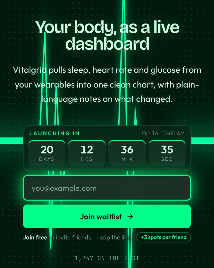
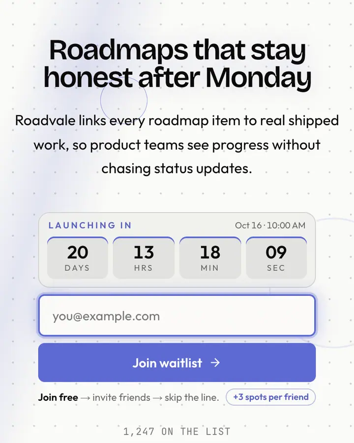
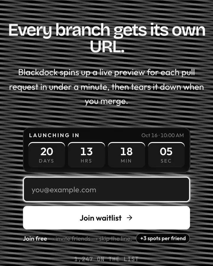
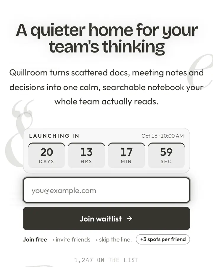
Within Tech, Bento Grid 2.0 stands out for its charcoal accent on a white ground. If it is not quite right, Bio-Hacker Dashboard flips to a dark near-black emerald canvas with a vivid emerald accent (“Heart-rate pulse on a clinical dot grid”). Linear is also light but leans on a blue accent and a pulsing dot grid (“Pristine grid, slate type, indigo CTA”). Vercel flips to a dark near-black canvas with a white accent and op-art stripes that vibrate (“Pure black + white. Ship-ready feel”). All of them share the same signup, referral and analytics features, so switching later only changes the look.
Launch with Bento Grid 2.0 in three steps
- Click “Use this template” and create a free account; Bento Grid 2.0 is preselected in the page wizard.
- Replace the Tilebox demo copy with your product's headline and one-line pitch, pick a URL, and optionally set a launch date to show a real countdown.
- Publish and share the link. Every subscriber gets a personal referral link, and you watch signups and top referrers arrive in the dashboard.