About the Notion template
Notion Paper is inspired by the warmth of physical stationery and the clarity of a well-organized workspace. It features a clean white background (#ffffff) paired with a rich, ink-toned charcoal serif (#37352f) that gives your digital landing page a tactile, human quality. It suggests an environment where ideas are nurtured and organization is the primary goal, making it perfect for brands that value clarity over digital gloss.
This template is a natural fit for documentation tools, personal knowledge bases, or collaborative agency platforms. It is likely too soft for a high-performance gaming app or a heavy industrial tool where a more aggressive visual language is required. The focus here is on readability and trust, ensuring that your audience feels comfortable sharing their email. It remains perfectly legible on mobile devices and tablet screens.
Like all Qubed templates, it includes our viral referral leaderboard and real-time analytics to track your launch progress. Pro users can also enjoy custom domains and email broadcasts to stay in touch with their growing community. The code is lightweight and SEO-friendly.
What the demo shows
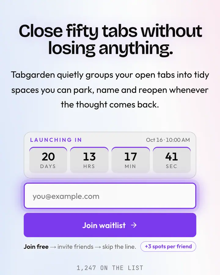
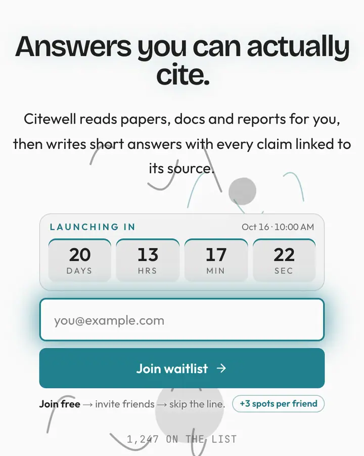
The live demo on this page launches Quillroom, a made-up product we wrote to show the template with realistic copy: the headline reads “A quieter home for your team's thinking” and the subhead says “Quillroom turns scattered docs, meeting notes and decisions into one calm, searchable notebook your whole team actually reads.” Below it you see the signup form, a demo launch countdown and the share-to-climb referral panel exactly as a visitor would. Try the form: in the demo nothing is stored. When you use Notion, you replace Quillroom with your own product name, headline, subhead and logo; the palette and motion come with it and every colour stays editable.
Design details
Notion is a light template: a white background (#ffffff), charcoal type (#37352f) and a charcoal accent (#37352f) on the join button, the countdown and the referral highlights. Body text sits at a 12.3:1 contrast ratio against the background, comfortably past the WCAG AAA threshold. Behind the copy the page animates with an animated type layer, clearly visible; visitors who ask their device for reduced motion get a still frame instead. Structurally it uses the Letter layout, shared with 77 other templates, but the palette, the motion and the demo copy are Notion's own.
- Background
- #ffffff
- Accent
- #37352f
- Text
- #37352f
How it compares
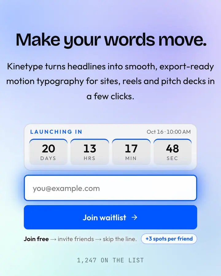
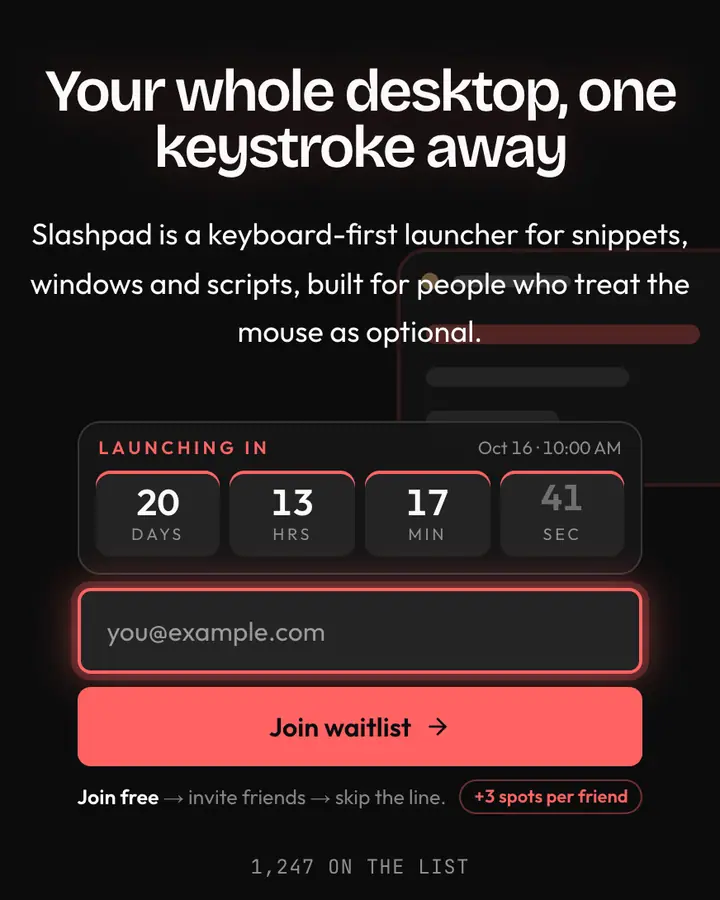
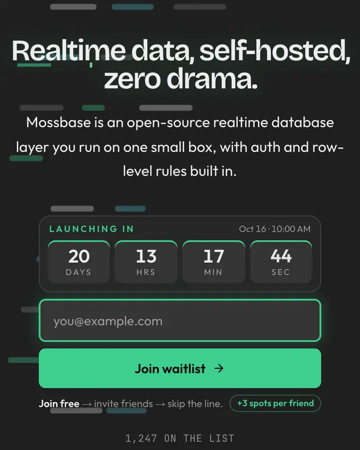
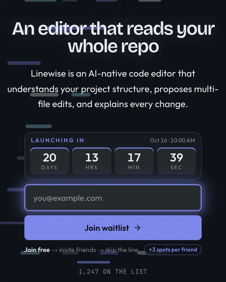
Within Tech, Notion stands out for its charcoal accent on a white ground. If it is not quite right, Framer is also light but leans on a vivid blue accent and slow-morphing gradient blobs (“Drift motion, vibrant blue, big type”). Raycast flips to a dark near-black canvas with a light red accent and floating UI panels (“Compact red glow, command-bar feel”). Supabase flips to a dark charcoal canvas with an emerald accent and scrolling terminal output (“Lime green energy, terminal-clean”). All of them share the same signup, referral and analytics features, so switching later only changes the look.
Launch with Notion in three steps
- Click “Use this template” and create a free account; Notion is preselected in the page wizard.
- Replace the Quillroom demo copy with your product's headline and one-line pitch, pick a URL, and optionally set a launch date to show a real countdown.
- Publish and share the link. Every subscriber gets a personal referral link, and you watch signups and top referrers arrive in the dashboard.