About the Perplexity template
Perplexity Zen is a study in informational clarity. It pairs a clean white background (#fafafa) with deep ink-toned typography (#1f1f1f) and soft cyan accents (#20808d) to create an environment that feels academic, reliable, and profoundly focused. It suggests an experience where data is valued above all else, making it the perfect home for products that aim to simplify complex information for their users.
Choose this for an AI research tool, a search startup, or a technical documentation platform. It is probably too sterile for a high-energy consumer brand or a playful mobile game. The visual identity here is entirely about delivering the message without distraction, building trust through its professional and unadorned structure. It remains incredibly legible on all mobile and desktop screens, even in high-glare environments.
Every Qubed template, including Perplexity Zen, includes a viral referral leaderboard to help your launch go viral. You also get detailed analytics and the ability to export your waitlist as a CSV file at any time. Pro users can map a custom domain and use email broadcasts to keep their leads engaged until launch day.
What the demo shows
The live demo on this page launches Citewell, a made-up product we wrote to show the template with realistic copy: the headline reads “Answers you can actually cite.” and the subhead says “Citewell reads papers, docs and reports for you, then writes short answers with every claim linked to its source.” Below it you see the signup form, a demo launch countdown and the share-to-climb referral panel exactly as a visitor would. Try the form: in the demo nothing is stored. When you use Perplexity, you replace Citewell with your own product name, headline, subhead and logo; the palette and motion come with it and every colour stays editable.
Design details
Perplexity is a light template: a white background (#fafafa), charcoal type (#1f1f1f) and a dark cyan accent (#20808d) on the join button, the countdown and the referral highlights. Body text sits at a 15.8:1 contrast ratio against the background, comfortably past the WCAG AAA threshold. Behind the copy the page animates with ink blooming through water, clearly visible; visitors who ask their device for reduced motion get a still frame instead. Structurally it uses the Editorial layout, shared with 55 other templates, but the palette, the motion and the demo copy are Perplexity's own.
- Background
- #fafafa
- Accent
- #20808d
- Text
- #1f1f1f
How it compares
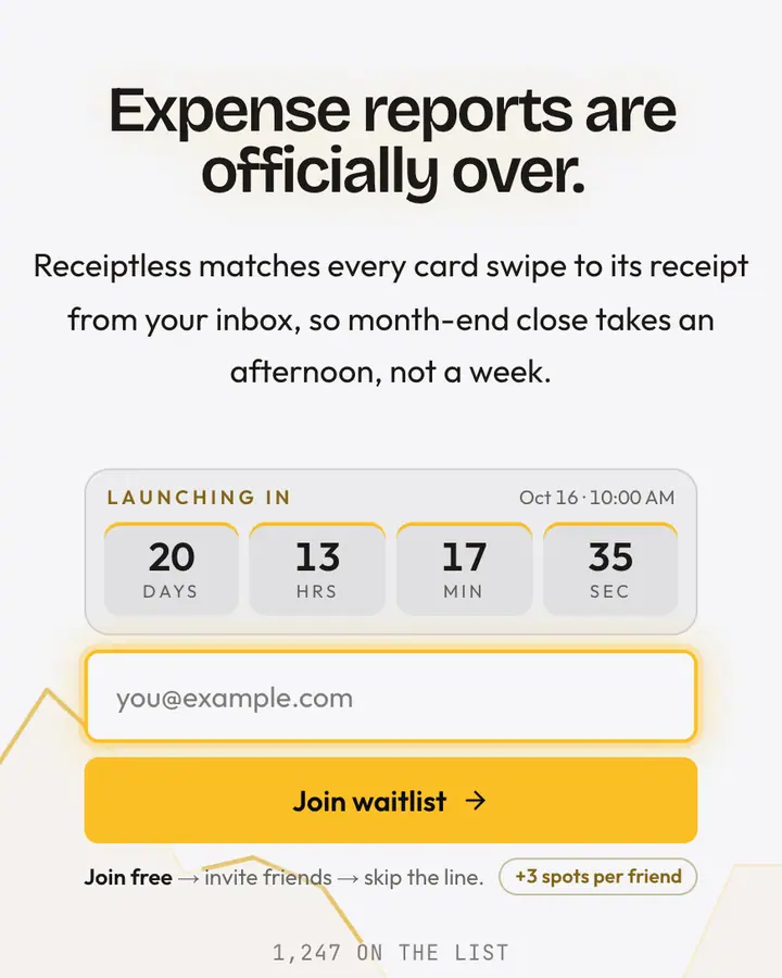
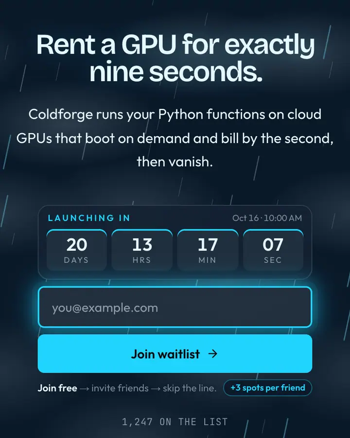
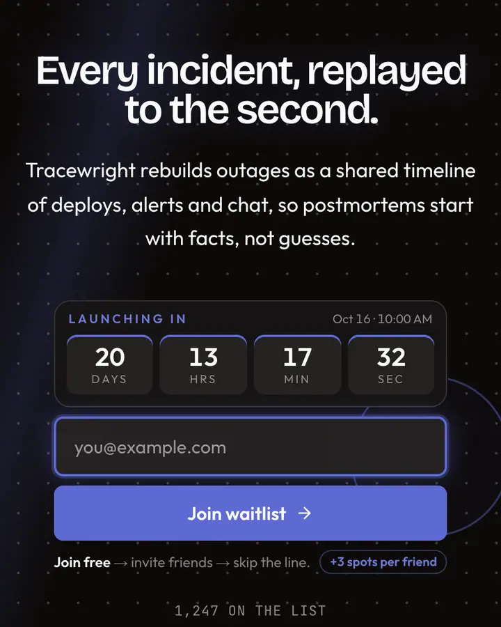
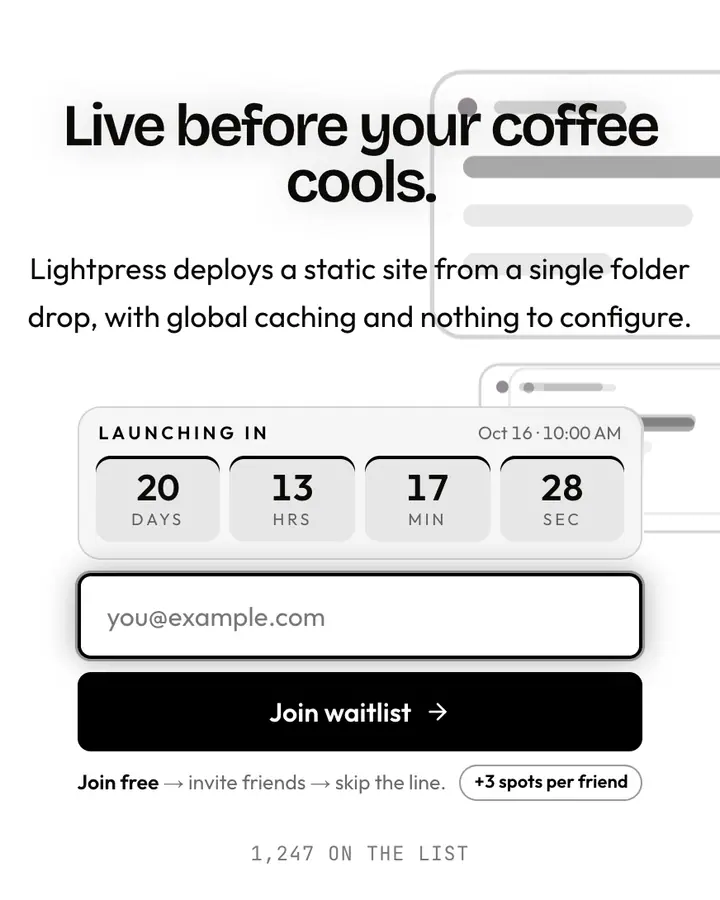
Within Tech, Perplexity stands out for its dark cyan accent on a white ground. If it is not quite right, Ramp is also light but leans on a vivid amber accent and an animated charts layer (“Cool grey + acid yellow, fintech”). Modal flips to a dark deep sky blue canvas with a vivid cyan accent and storm clouds and flashes of lightning (“Saturated electric blue, studio polish”). Linear Grid flips to a dark near-black canvas with a blue accent and a pulsing dot grid (“Dotted graph, indigo cursor”). All of them share the same signup, referral and analytics features, so switching later only changes the look.
Launch with Perplexity in three steps
- Click “Use this template” and create a free account; Perplexity is preselected in the page wizard.
- Replace the Citewell demo copy with your product's headline and one-line pitch, pick a URL, and optionally set a launch date to show a real countdown.
- Publish and share the link. Every subscriber gets a personal referral link, and you watch signups and top referrers arrive in the dashboard.