About the Low Contrast template
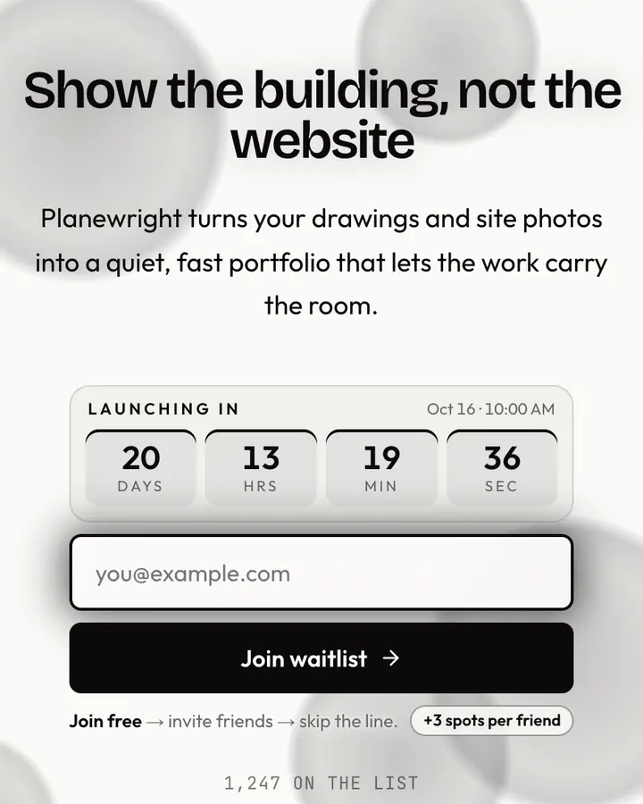
Neutral greys with a #737373 accent sit on a whisper-soft #e5e5e5 — no visual shouting, all restraint. Suited to wellness brands, quiet meditation apps, and B2B platforms where excess decoration erodes trust. Accessibility shines here: the muted palette respects reading fatigue and simplifies focus to your core message. With Qubed's custom domains for Pro users, give this template a branded home that feels as understated as its design.
What the demo shows
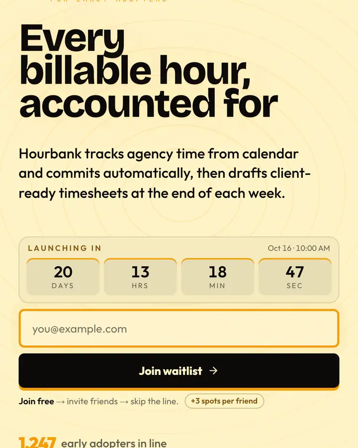
The live demo on this page launches Gentleread, a made-up product we wrote to show the template with realistic copy: the headline reads “Long reads, finally easy on the eyes” and the subhead says “Gentleread reformats dense articles into calm, adjustable-contrast text with steady line spacing and no pop-ups in sight.” Below it you see the signup form, a demo launch countdown and the share-to-climb referral panel exactly as a visitor would. Try the form: in the demo nothing is stored. When you use Low Contrast, you replace Gentleread with your own product name, headline, subhead and logo; the palette and motion come with it and every colour stays editable.
Design details
Low Contrast is a light template: an off-white background (#e5e5e5), charcoal type (#262626) and a mid grey accent (#737373) on the join button, the countdown and the referral highlights. Body text sits at a 12:1 contrast ratio against the background, comfortably past the WCAG AAA threshold. Behind the copy the page animates with threads of gold weaving through, clearly visible; visitors who ask their device for reduced motion get a still frame instead. Structurally it uses the Minimal layout, shared with 137 other templates, but the palette, the motion and the demo copy are Low Contrast's own.
- Background
- #e5e5e5
- Accent
- #737373
- Text
- #262626
How it compares
Within Essentials, Low Contrast stands out for its mid grey accent on an off-white ground. If it is not quite right, Minimal flips to a dark deep blue canvas with an indigo accent and slow-morphing gradient blobs (“Clean, centered, focus-on-the-form”). White Room is also light but leans on a near-black accent and an animated single line layer (“Pure space, single line”). Dawn Grey is also light but leans on a red accent and a rising sun and warm light (“Pre-light grey, soft accent”). All of them share the same signup, referral and analytics features, so switching later only changes the look.
Launch with Low Contrast in three steps
- Click “Use this template” and create a free account; Low Contrast is preselected in the page wizard.
- Replace the Gentleread demo copy with your product's headline and one-line pitch, pick a URL, and optionally set a launch date to show a real countdown.
- Publish and share the link. Every subscriber gets a personal referral link, and you watch signups and top referrers arrive in the dashboard.