About the Inkwell template
Dip a steel nib into vintage ink, then draw across aged parchment—this template evokes fountain pens and leather-bound journals, with warm cream background (#fef9e7) recalling old paper yellowed by decades. Dark charcoal text appears as though written by hand, though rendered in typography, suggesting handcraft through precision; the effect is both nostalgic and authoritative. Publishing houses, literary journals, and heritage brands will recognize this palette as the language of permanence; real-time analytics let you watch your audience arrive like readers entering a library.
What the demo shows
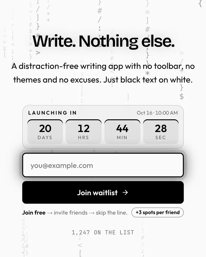
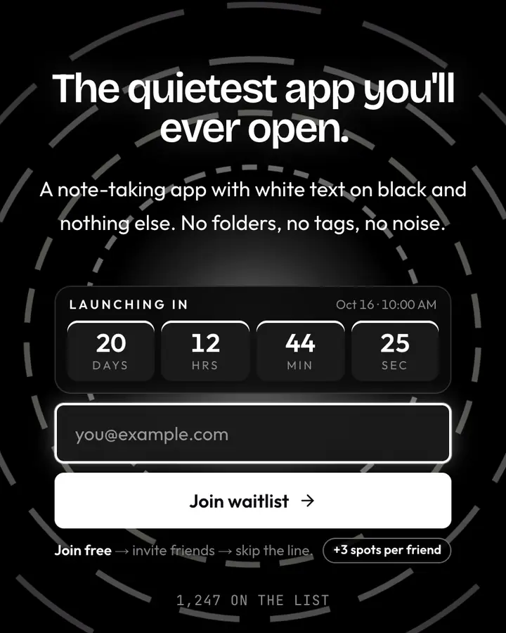
The live demo on this page launches Steelnib, a made-up product we wrote to show the template with realistic copy: the headline reads “Fountain pens for first-timers.” and the subhead says “A starter fountain pen, ink and practice pad bundle. Your handwriting will thank you by week two.” Below it you see the signup form, a demo launch countdown and the share-to-climb referral panel exactly as a visitor would. Try the form: in the demo nothing is stored. When you use Inkwell, you replace Steelnib with your own product name, headline, subhead and logo; the palette and motion come with it and every colour stays editable.
Design details
Inkwell is a light template: an amber-tinted white background (#fef9e7), near-black type (#0c0a09) and a near-black accent (#0c0a09) on the join button, the countdown and the referral highlights. Body text sits at a 18.7:1 contrast ratio against the background, comfortably past the WCAG AAA threshold. Behind the copy the page animates with ink blooming through water, clearly visible; visitors who ask their device for reduced motion get a still frame instead. Structurally it uses the Letter layout, shared with 77 other templates, but the palette, the motion and the demo copy are Inkwell's own.
- Background
- #fef9e7
- Accent
- #0c0a09
- Text
- #0c0a09
How it compares
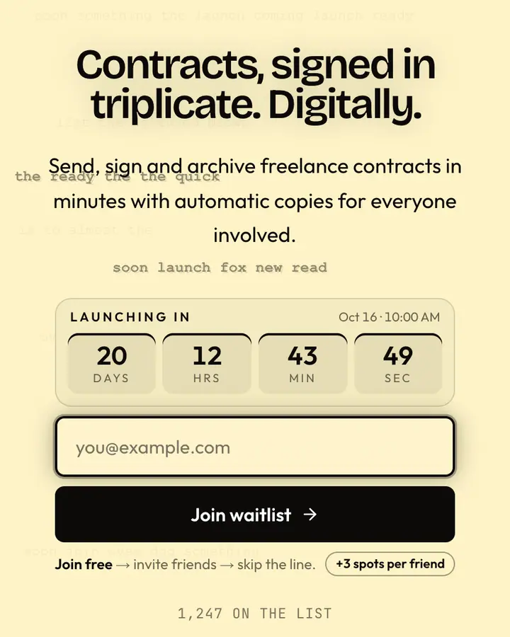
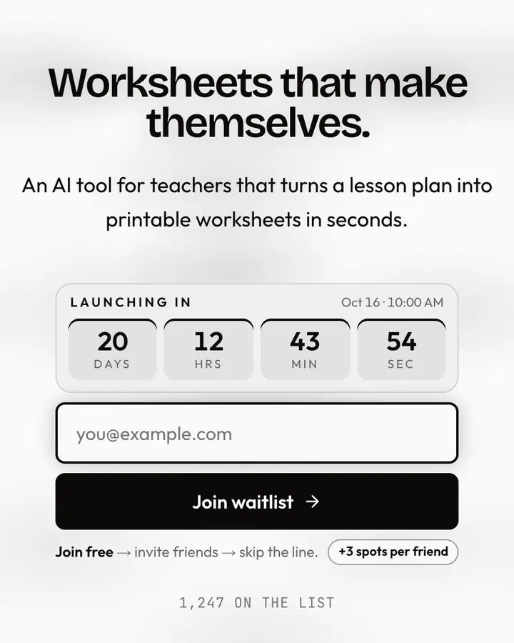
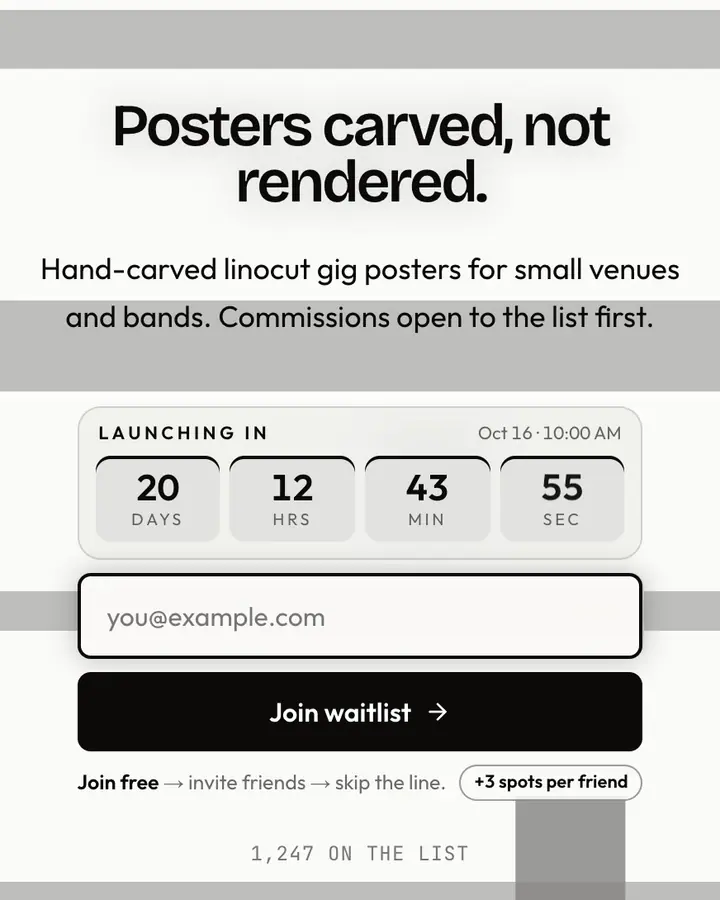
Within Monochrome, Inkwell stands out for its near-black accent on an amber-tinted white ground. If it is not quite right, Carbon Paper is also light but leans on a near-black accent and an animated typewriter layer (“Triplicate purple ghost”). Mimeograph is also light but leans on a near-black accent and low rolling fog (“Purple stencil school”). Linocut Print is also light but leans on a near-black accent and hard-edged brutalist blocks (“Carved relief, bold ink”). All of them share the same signup, referral and analytics features, so switching later only changes the look.
Launch with Inkwell in three steps
- Click “Use this template” and create a free account; Inkwell is preselected in the page wizard.
- Replace the Steelnib demo copy with your product's headline and one-line pitch, pick a URL, and optionally set a launch date to show a real countdown.
- Publish and share the link. Every subscriber gets a personal referral link, and you watch signups and top referrers arrive in the dashboard.