What the Glide Grid demo shows
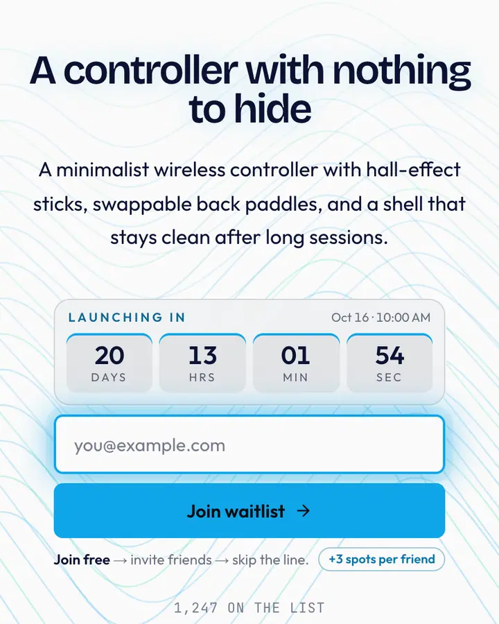
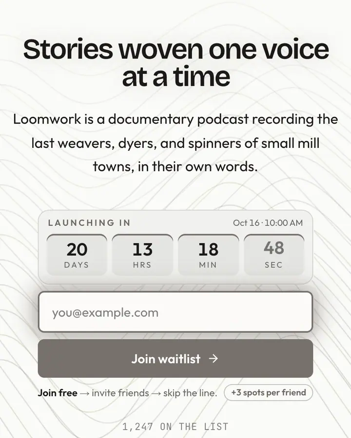
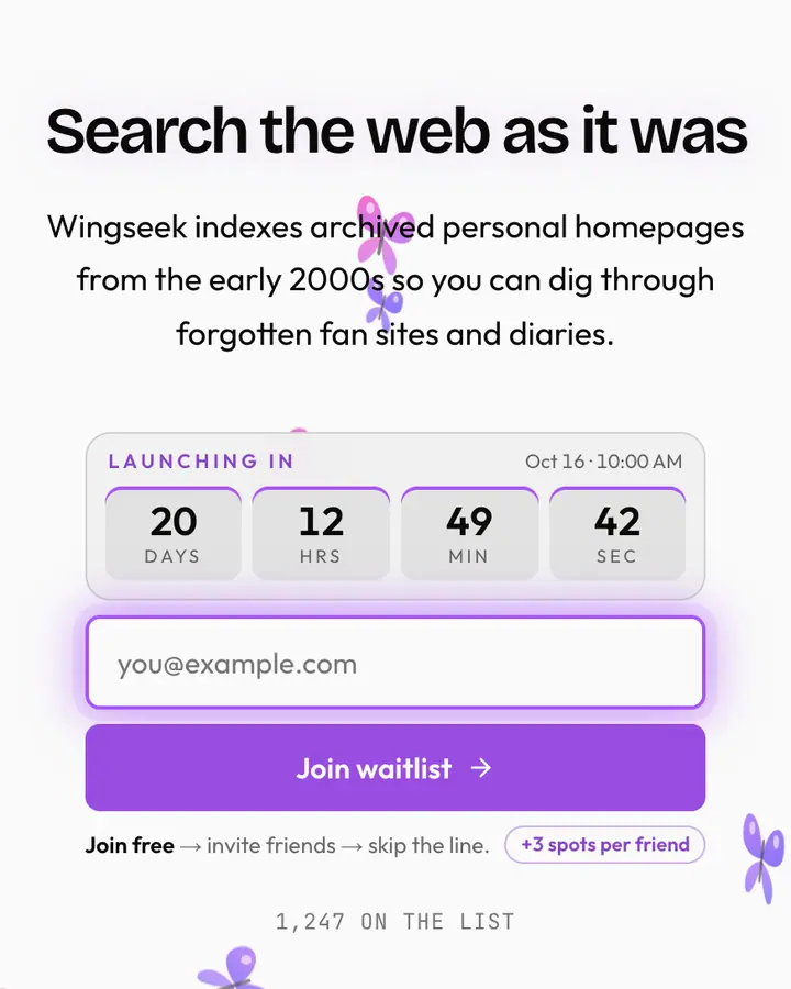
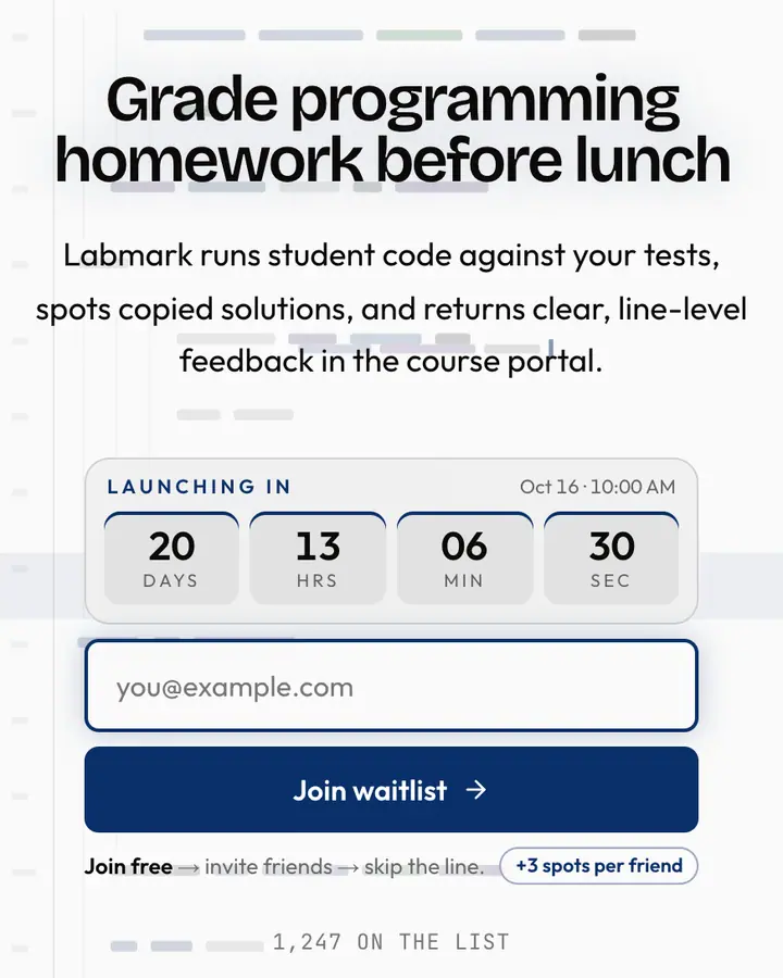
The live demo on this page launches Easecurve, a made-up product we wrote to show the template with realistic copy: the headline reads “Motion specs your engineers won't misread.” and the subhead says “Easecurve exports animations from your design files as exact timing, easing curves and code snippets for web and mobile.” Below it you see the signup form, a demo launch countdown and the share-to-climb referral panel exactly as a visitor would. Try the form: in the demo nothing is stored. When you use Glide Grid, you replace Easecurve with your own product name, headline, subhead and logo; the palette and motion come with it and every color stays editable.
Who Glide Grid is for
For B2B SaaS founders and design-led engineering teams who want a landing page that feels as polished and smooth as their software.
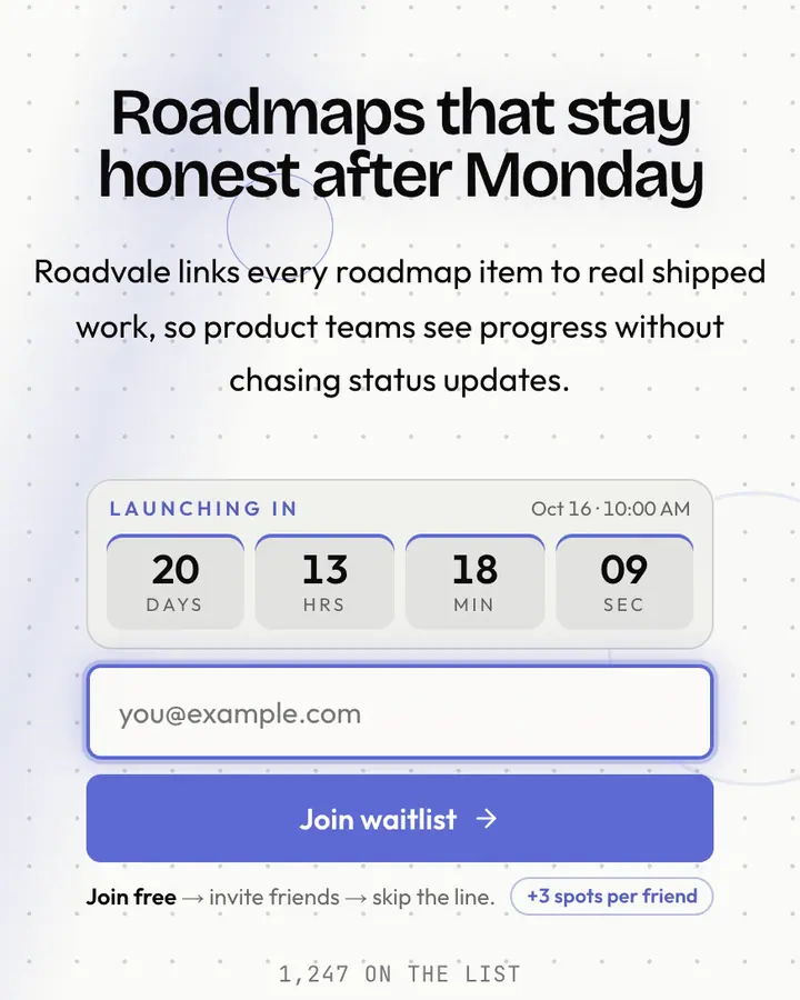
Glide Grid is inspired by the high-water mark of modern software aesthetics. It features a pristine, off-white background (#fafaf7) paired with a sophisticated violet call-to-action (#7c3aed) and sharp charcoal typography (#0c0a09). The layout utilizes a subtle sub-pixel grid to suggest structural integrity and professional polish, making it the perfect home for products that promise to streamline workflows through thoughtful design.
Choose this if you are building a productivity tool, a design-system platform, or a high-performance technical suite. It is likely too sterile for a luxury fashion brand or a playful consumer app. The aesthetic is focused on clarity and motion, ensuring that your value proposition is delivered with the same precision as the code behind your product. It looks stunning on mobile and high-resolution retina screens, maintaining its high-end feel.
Functionally, Glide Grid includes a viral referral leaderboard to help you grow your waitlist organically.
Palette, typography and motion
Glide Grid is a light template: a white background (#fafaf7), near-black type (#0c0a09) and a vivid violet accent (#7c3aed) on the join button, the countdown and the referral highlights. Body text sits at an 18.9:1 contrast ratio against the background, comfortably past the WCAG AAA threshold. Behind the copy the page animates with flowing contour lines, clearly visible; visitors who ask their device for reduced motion get a still frame instead. Structurally it uses the Minimal layout, shared with 137 other templates, but the palette, the motion and the demo copy are Glide Grid's own.
- Background
- #fafaf7
- Accent
- #7c3aed
- Text
- #0c0a09
Best-fit products and example copy
Glide Grid fits a fintech dashboard, a developer tool or an API-first startup. On a white page, keep the headline short and let the vivid violet button carry the action. A headline like “The dashboard you'd build yourself.” with the subhead “If you had a spare quarter. Get on the list for beta access.” matches the tech & SaaS tone. Because the flow-line motion is clearly visible, a two-line subhead is plenty; longer copy fights the background.
How it compares
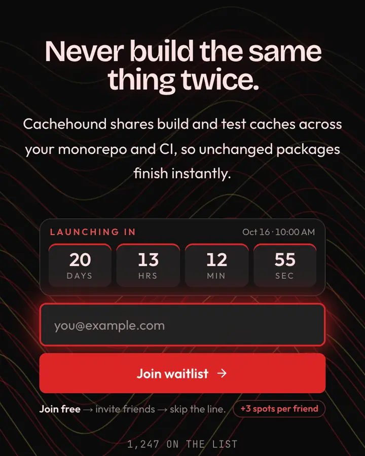
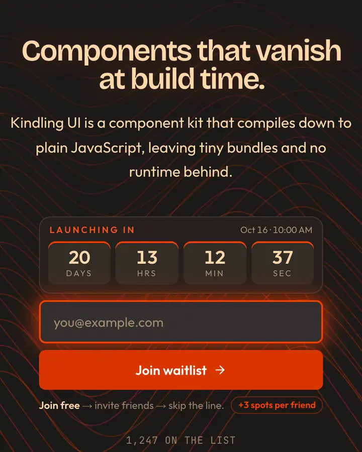
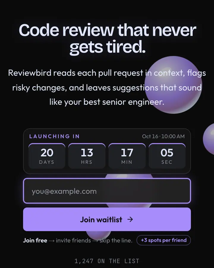
Among the Tech & SaaS templates, Glide Grid stands out for its vivid violet accent on a white ground. If it is not quite right, Slate Grid is also light but leans on a blue accent and a pulsing dot grid (“Pristine grid, slate type, indigo CTA”). Monorepo Red flips to a near-black canvas with a red accent and flowing contour lines (“Repo red, cache hit”). Compiler Orange flips to a charcoal canvas with a vivid vermilion accent and flowing contour lines (“Compile orange, pure JS”). All of them share the same signup, referral and analytics features, so switching later only changes the look.
Three steps to a live waitlist
- Click “Use Glide Grid free” and create a free account; Glide Grid is preselected in the page wizard.
- Replace the Easecurve demo copy with your product's headline and one-line pitch, pick a URL, and optionally set a launch date to show a real countdown.
- Publish and share the link. Every subscriber gets a personal referral link, and you watch signups and top referrers arrive in the dashboard.
Glide Grid template FAQ
Is the Glide Grid template free?
Yes. Glide Grid is free on every plan, including the Free plan (1 page and 100 subscribers). All 1,000 Qubed templates are included on every plan; paying for Pro raises limits, it doesn't unlock designs.
Can I change Glide Grid's colors, copy and logo?
Colors and copy are editable on every plan: the white background, the vivid violet accent, the text color, the headline, subhead and button text. Uploading your own logo is part of Pro ($9.95/month).
Does Glide Grid include the referral leaderboard and countdown?
Yes. Every signup gets a personal referral link and moves up the line as friends join through it (3 spots per referral by default), and the page shows a countdown when you set a launch date. Leave the date empty and the countdown stays hidden.
Does Glide Grid work on mobile?
Yes. The layout is responsive, so the headline, signup form, countdown and share panel stack cleanly on a phone. Visitors who turn on reduced motion get a still background instead of the animation.
Can I remove the Qubed badge from a Glide Grid page?
Yes, on Pro. Free pages show a small "Built with Qubed" badge; Pro ($9.95/month) removes it and adds unlimited pages with up to 10,000 subscribers each.