About the Contrast Max template
Absolute maximum contrast—jet black against pure white—screams without a decibel lost. This accessibility champion template ensures everyone sees your message, regardless of vision. No gradients, no subtlety, no room for misinterpretation. Legally conscious brands, government services, and accessibility-first creators choose this palette because clarity is non-negotiable. WCAG AAA compliance built into the aesthetic.
What the demo shows
The live demo on this page launches LOUDER, a made-up product we wrote to show the template with realistic copy: the headline reads “Headlines that punch through.” and the subhead says “An AI copywriter that writes one thing only: headlines. Brutal, clear and impossible to scroll past.” Below it you see the signup form, a demo launch countdown and the share-to-climb referral panel exactly as a visitor would. Try the form: in the demo nothing is stored. When you use Contrast Max, you replace LOUDER with your own product name, headline, subhead and logo; the palette and motion come with it and every colour stays editable.
Design details
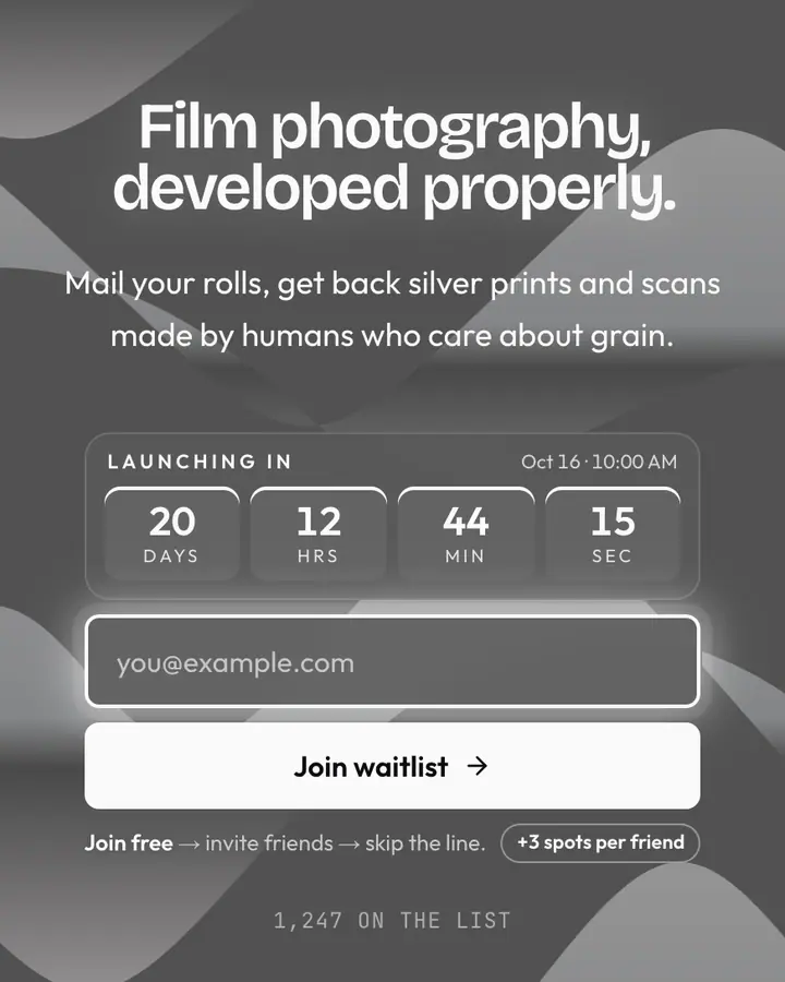
Contrast Max is a dark template: a near-black background (#000000), white type (#ffffff) and a white accent (#ffffff) on the join button, the countdown and the referral highlights. Body text sits at a 21:1 contrast ratio against the background, comfortably past the WCAG AAA threshold. Behind the copy the page animates with op-art stripes that vibrate, clearly visible; visitors who ask their device for reduced motion get a still frame instead. Structurally it uses the Brutalist layout, shared with 39 other templates, but the palette, the motion and the demo copy are Contrast Max's own.
- Background
- #000000
- Accent
- #ffffff
- Text
- #ffffff
How it compares
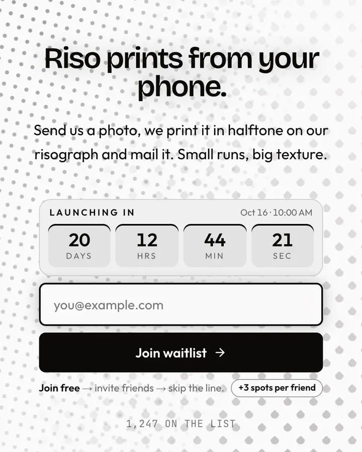
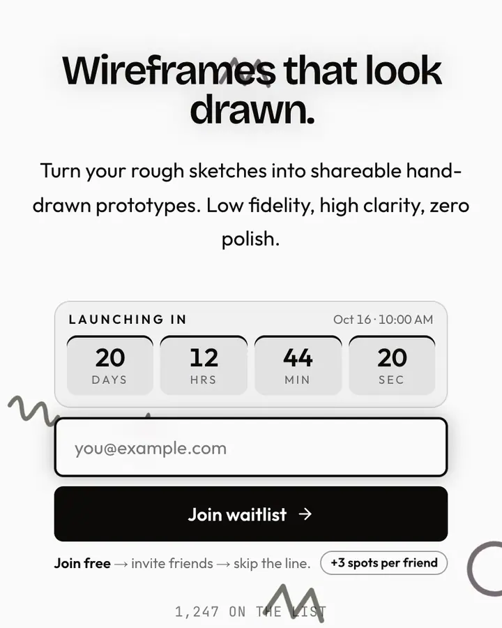
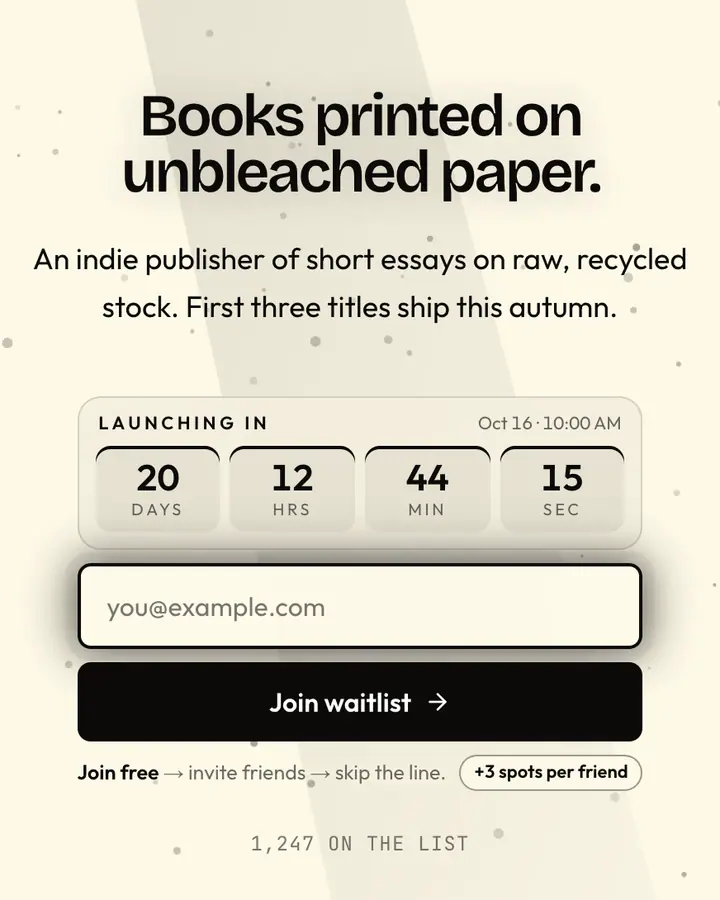
Within Monochrome, Contrast Max stands out for its white accent on a near-black ground. If it is not quite right, Halftone flips to a light white canvas with a near-black accent and halftone dot patterns (“Dot screen print effect”). Marker Sketch flips to a light white canvas with a near-black accent and hand-drawn doodles (“Hand-drawn lines, scrappy”). Raw Paper flips to a light amber-tinted white canvas with a near-black accent and dust motes floating in the light (“Coarse paper, ink alone”). All of them share the same signup, referral and analytics features, so switching later only changes the look.
Launch with Contrast Max in three steps
- Click “Use this template” and create a free account; Contrast Max is preselected in the page wizard.
- Replace the LOUDER demo copy with your product's headline and one-line pitch, pick a URL, and optionally set a launch date to show a real countdown.
- Publish and share the link. Every subscriber gets a personal referral link, and you watch signups and top referrers arrive in the dashboard.